During the course of a year (or almost), I have worked on a large canvas, which as far as I’m concerned, is now finished. It started out as something entirely different, this is it’s story:

I used stencils, collaged symbols that had been monotyped onto tissue paper, old Rune words, celtic designs, charcoal. It was worked in inks, acrylics and soft pastels (I used Golden pastel ground over most of the surface). I based it on a false colour image of one of my own photos that I took of a tree in a local wood. It stayed in its ‘tree’ form for a long time, driving me nuts.

In a fit of desperation, I painted over the entire thing one night using red paint and white gesso and left it for a few weeks before starting on it again.

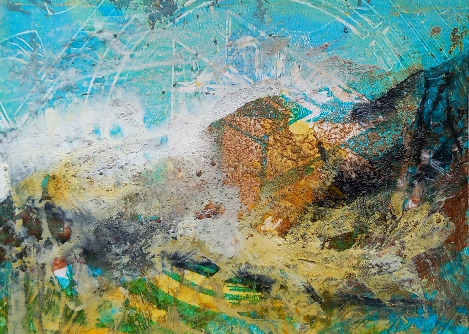
For its second ‘outing’, I decided to try and recreate a similar scene to another painting of mine, this time using acrylics and watercolours (I eventually also ended up using soft pastels).

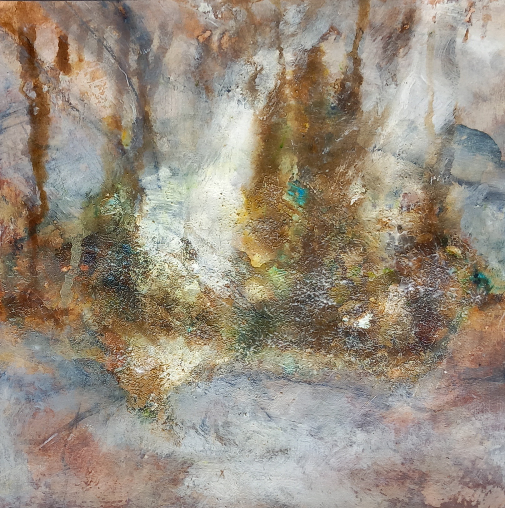
I used structure gel, modelling paste, crackle paste on the surface for the tree trunk and this is still visible in the final painting (at bottom of this post).
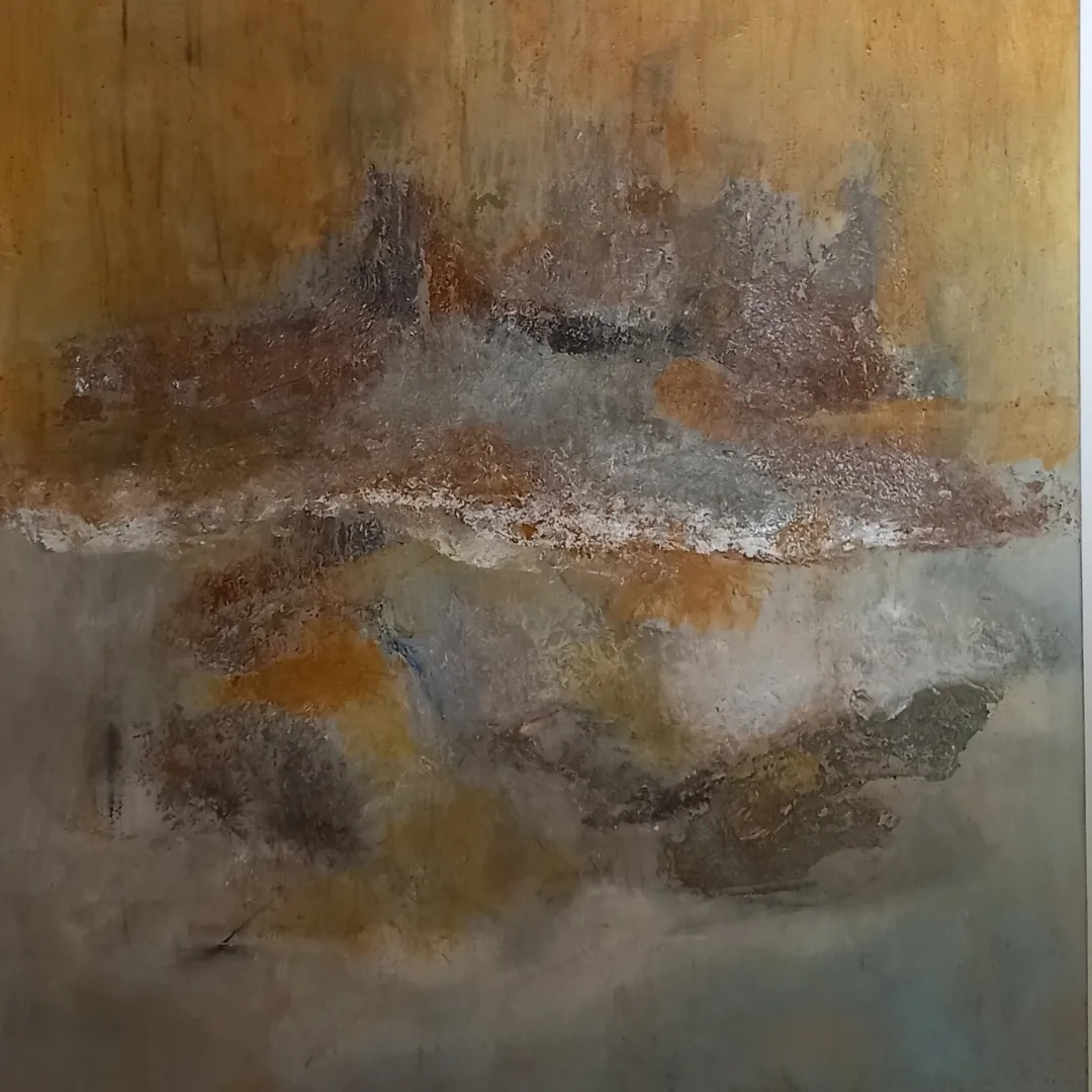
It was taking shape and full of colour …


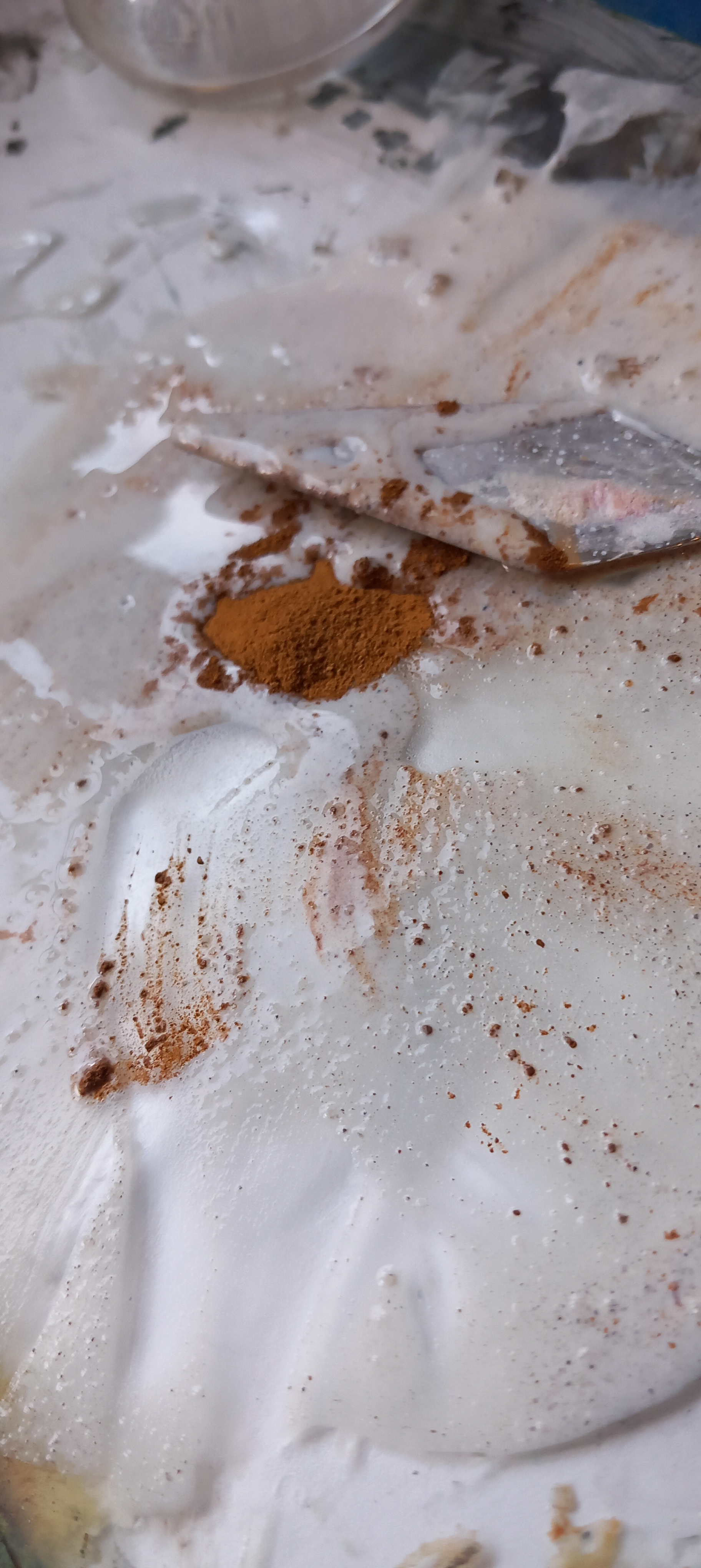
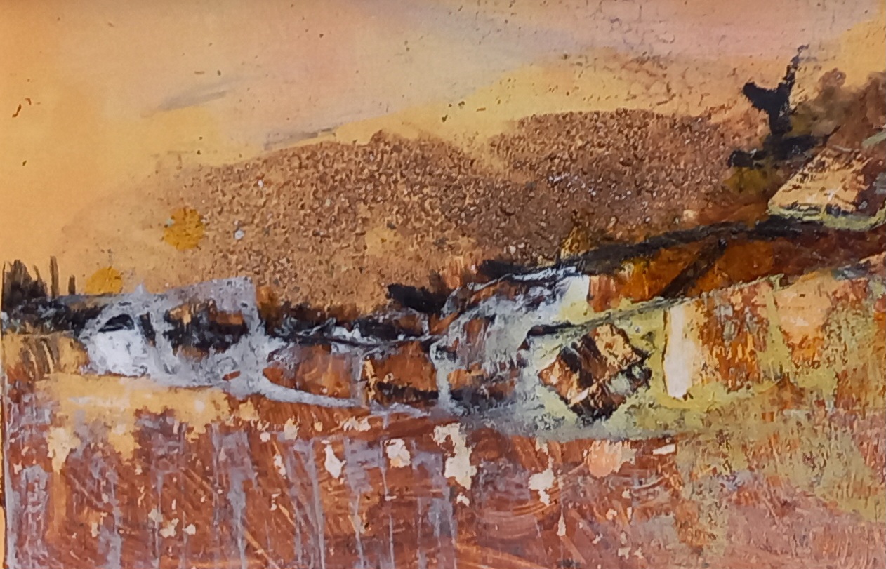
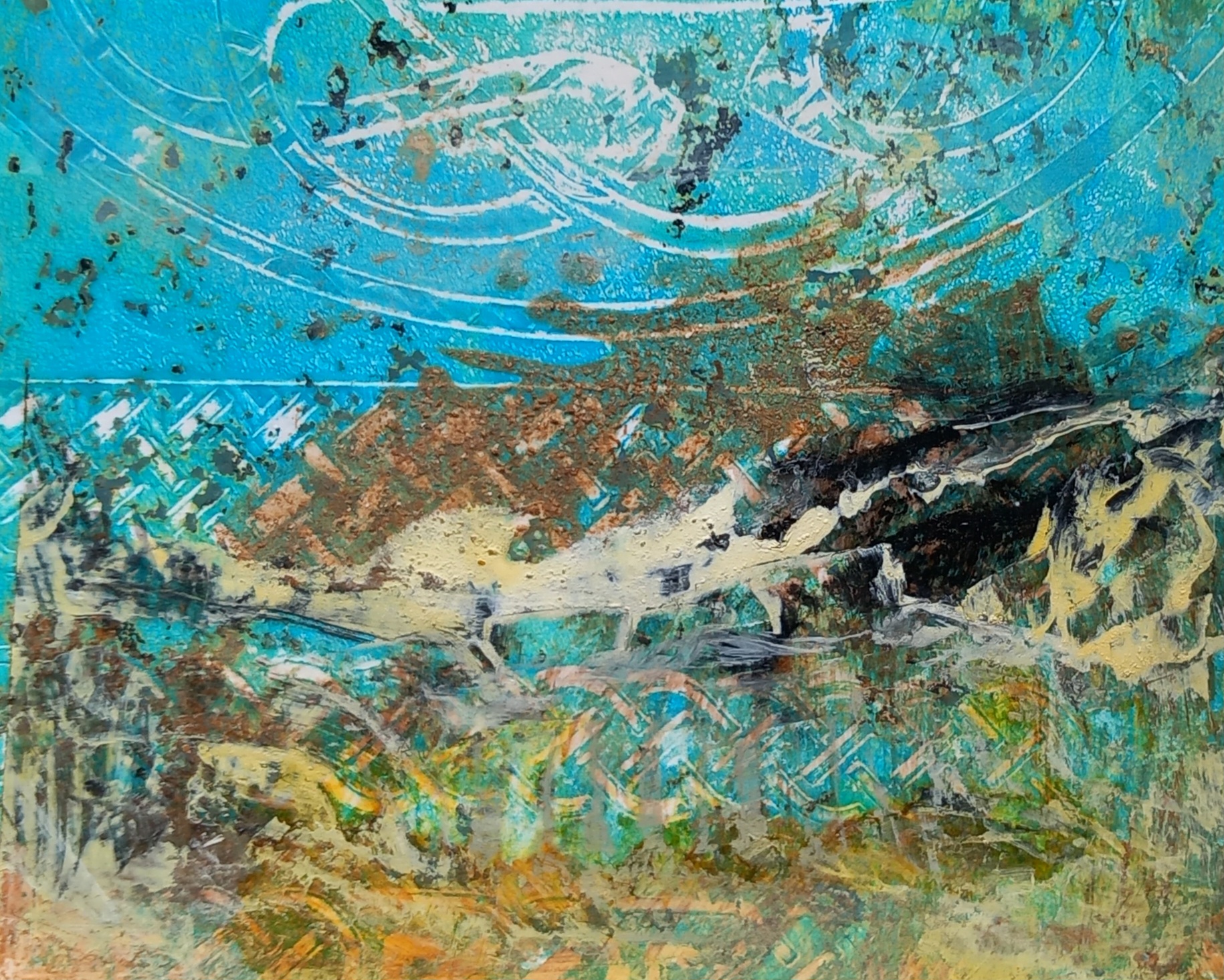
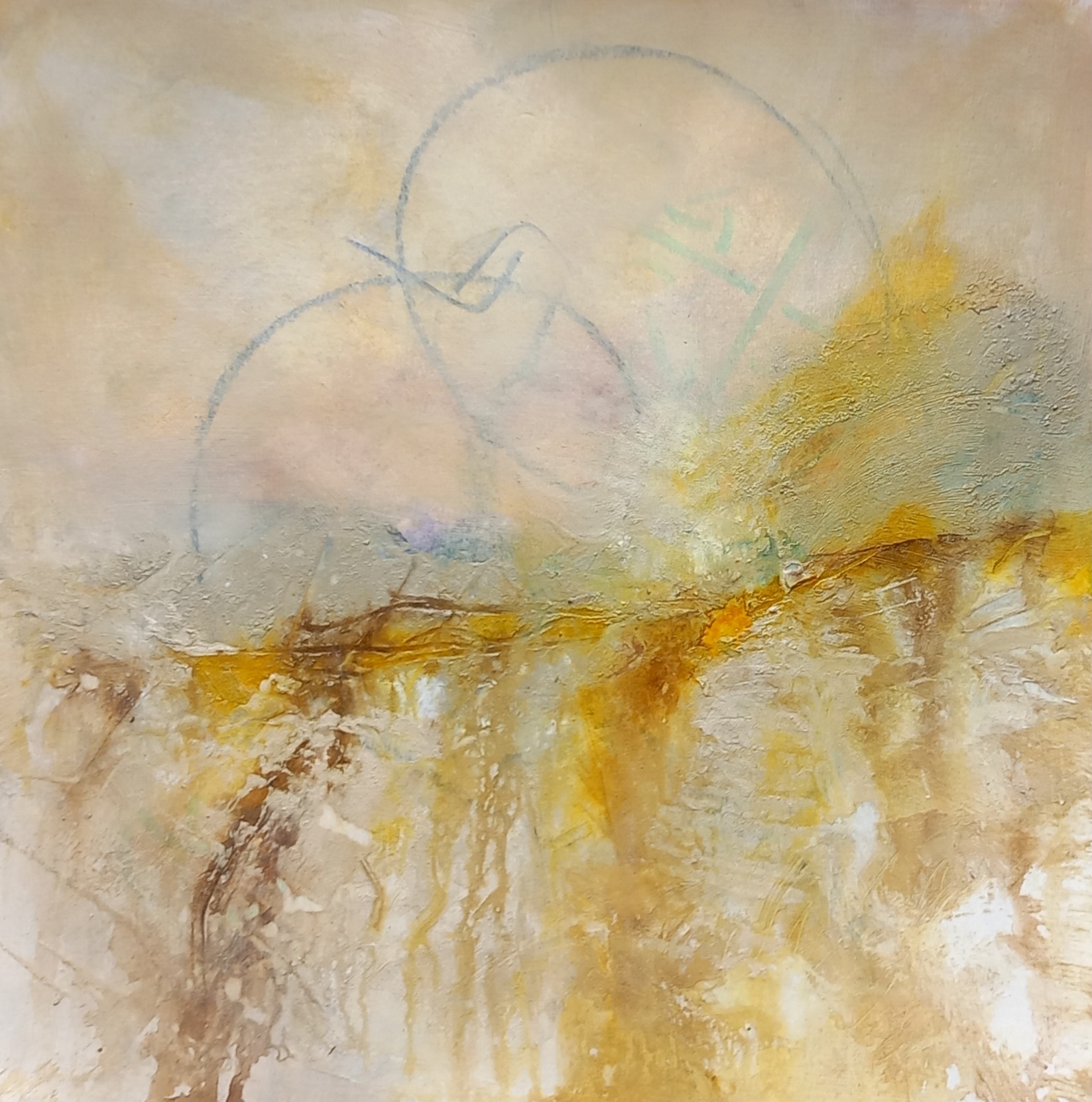
It almost ended up kinda how I wanted it but something was bothering me, so after a while of staring at it with contempt, it got painted over. I looked at the surface for a long time and then got out the earth pigments – a LOT of earth pigments. I used nearly my entire stash of earth pigments and the surface is very heavily textured. Nice.
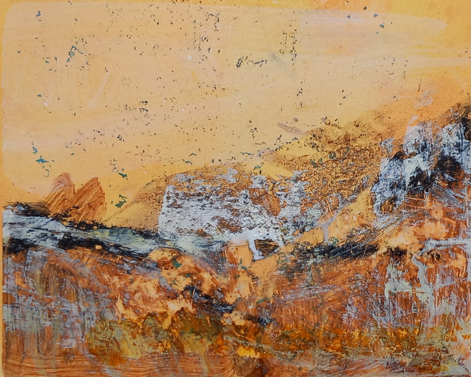
It stayed in the earth pigment state for a long time. I received very good comments on Instagram and elsewhere but I hated it. I felt it was boring, didn’t have any structure or point and was dull and lifeless. However, something in it kept calling out to me. So today, I ‘had a go’ and managed to coax that ‘something’ out … I am now happy with it.T

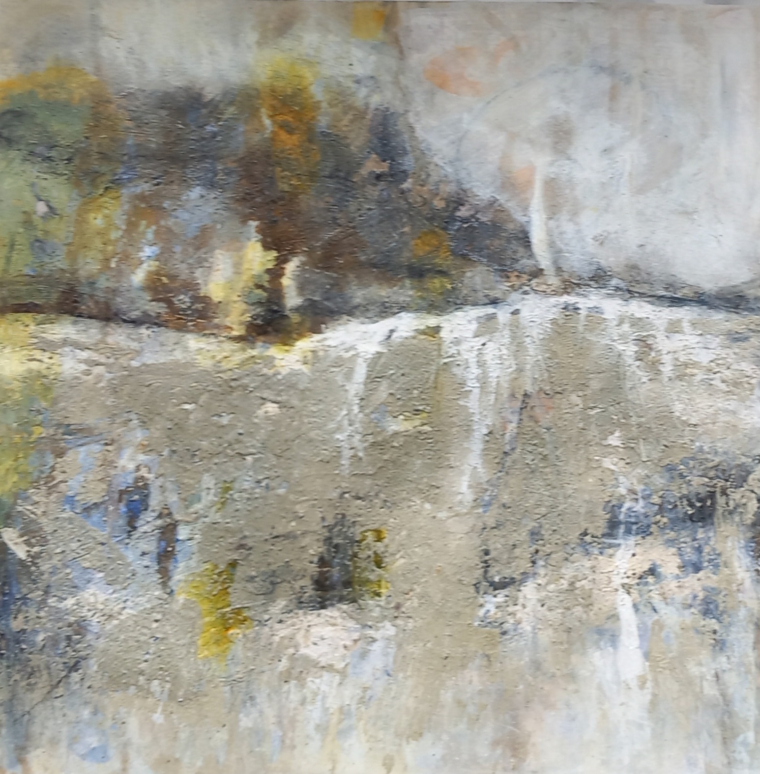
This is the final rendering:

This has gone through many stages of redaction, as well as most of the techniques mentioned in the course notes (scraping back, spraying etc. etc.). I have used earth pigments, inks, high-flow acrylics, isopropyl alcohol and water. The texture created when I used various pastes (including crackle paste) as still clearly visible in the sky area and further down the picture plane. I have not sealed it yet.
What does it mean for me?
Artists are supposed to articulate what drives them to create a specific painting – what resonates with them? I am always nervous of putting forth how I feel about my work, in case this clashes with how other people see it and somehow changes its meaning. There are a lot of factors at play in my mind when I create something large like this painting.
- It is me screaming out to the world that I ‘have’ to work large and that when I do, I can create stuff that is appealing. I suppose it is a big of a desperate cry, because i do not have a studio space that in any way supports the creation of large pieces of work. It’s my way of trying to make ‘universe’ listen and send some kindly soul along who will gift (or lend) me a barn!
- I do not do ‘representational’ work, I am process driven. However, I DO want to create images of places that I half remember or have stayed buried somewhere in my soul.
- Wilderness areas most affect me and the more I look at my work, I can see these places coming out all the time – from the Highlands of Scotland, to Iceland and Norway and other places that are wild and expansive. I also have a great love for forests and woodland, there’s nearly always some sort of tree symbol somewhere in my work.
- Working with earth pigments and other things like inks, enables me to coax out abstract landscapes that I feel a connection with. I know that they have also influenced other people and this is really inspirational for me.