Following are a few pieces that I’ve done recently in preparation for various exhibitions that I’m supposed to be involved with before the end of this year … more on that in next post.
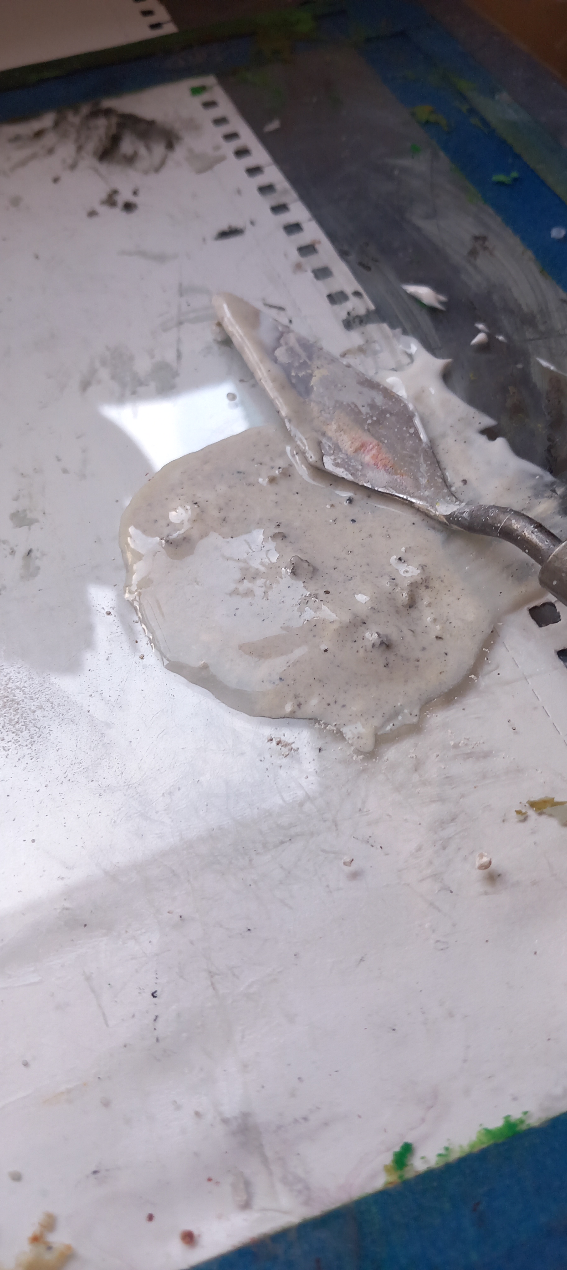
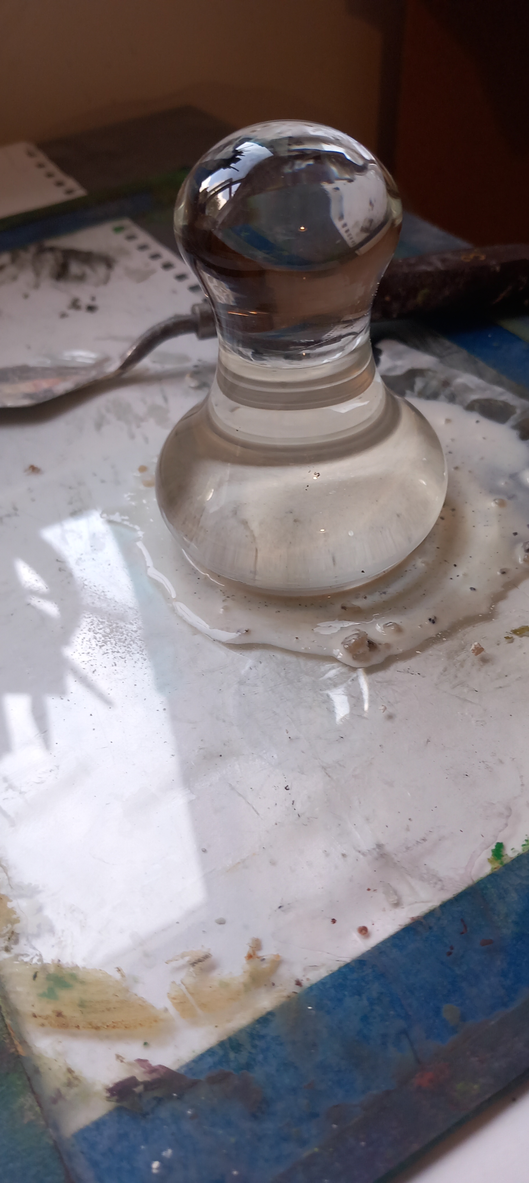
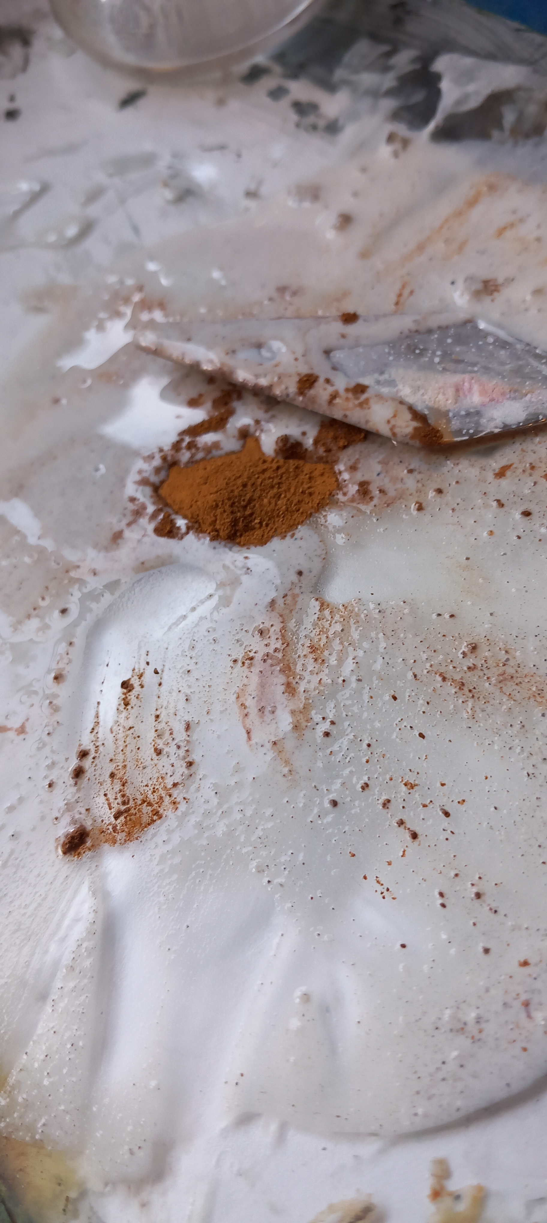
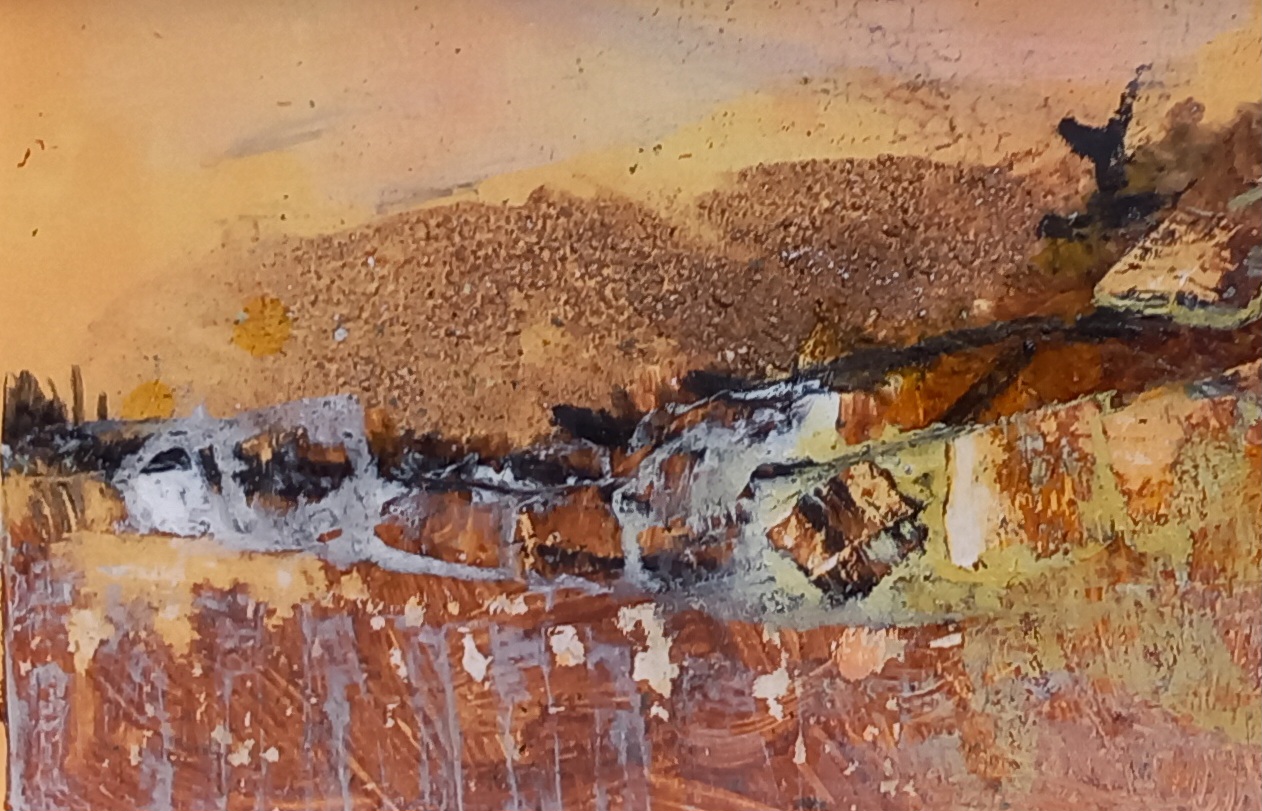
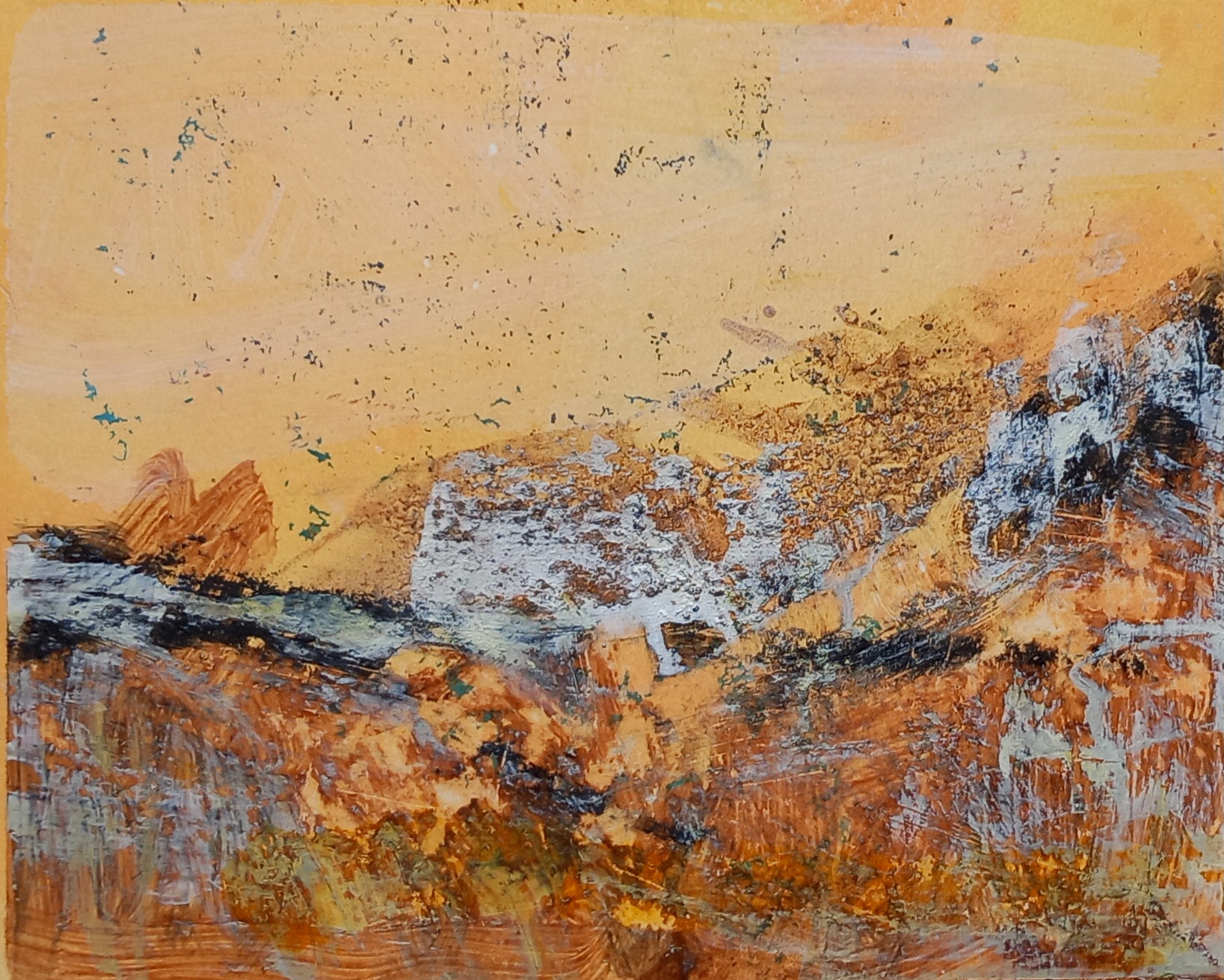
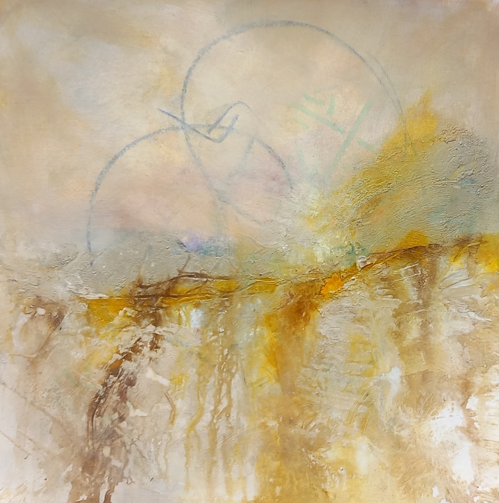
Places’ Set of 4 x 13x11cm abstract landscapes on Fabriano paper using raw earth pigments and mixed media (acrylics and inks).
For this series I used pigments sourced from the incomparable @peteward.artist Fremington Grey, Gunwalloe Gold, Perranuthnoe Ochre, White Meeth, Leswidden White, Peppercombe Red, Trevellas Green.’
These are small ones, photos show the studio set up while I work and then the finished pieces.
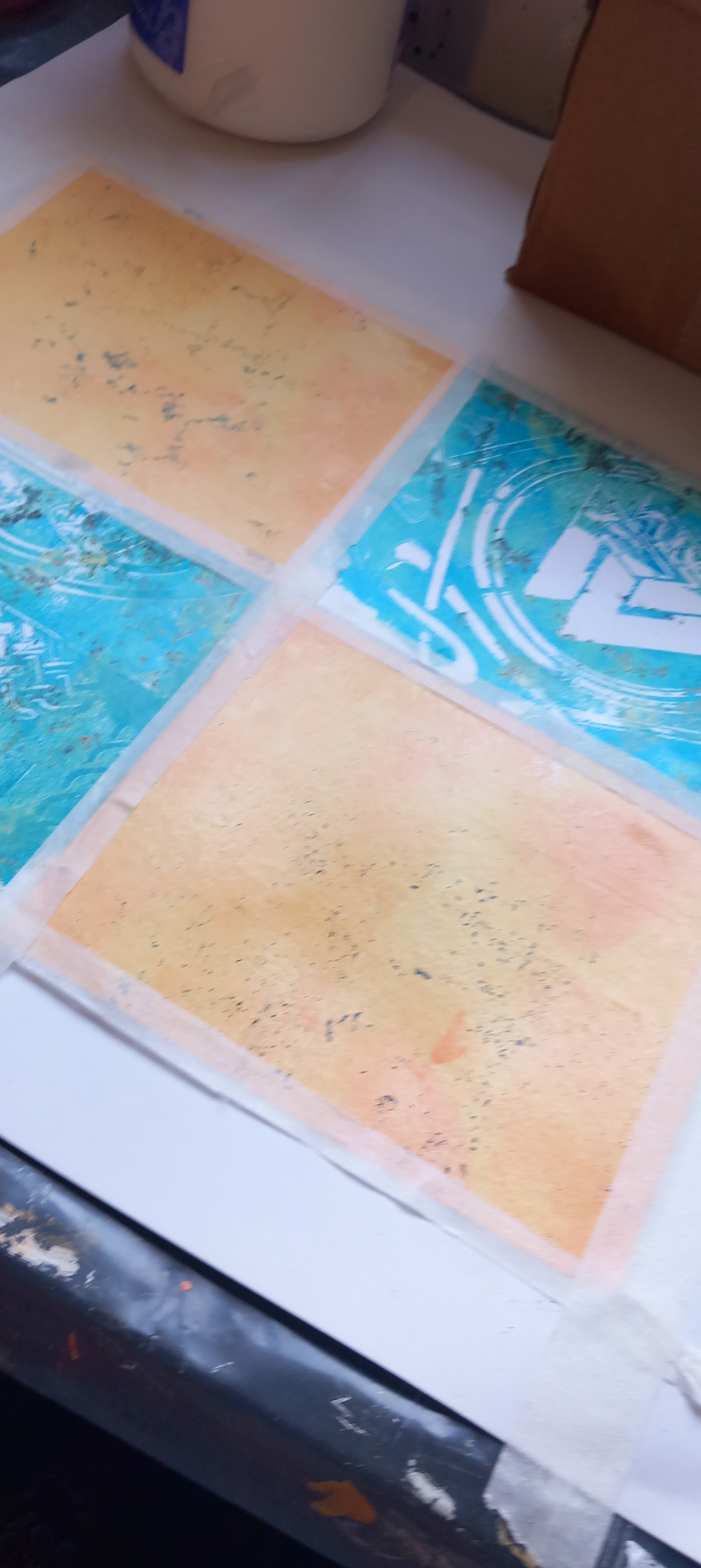
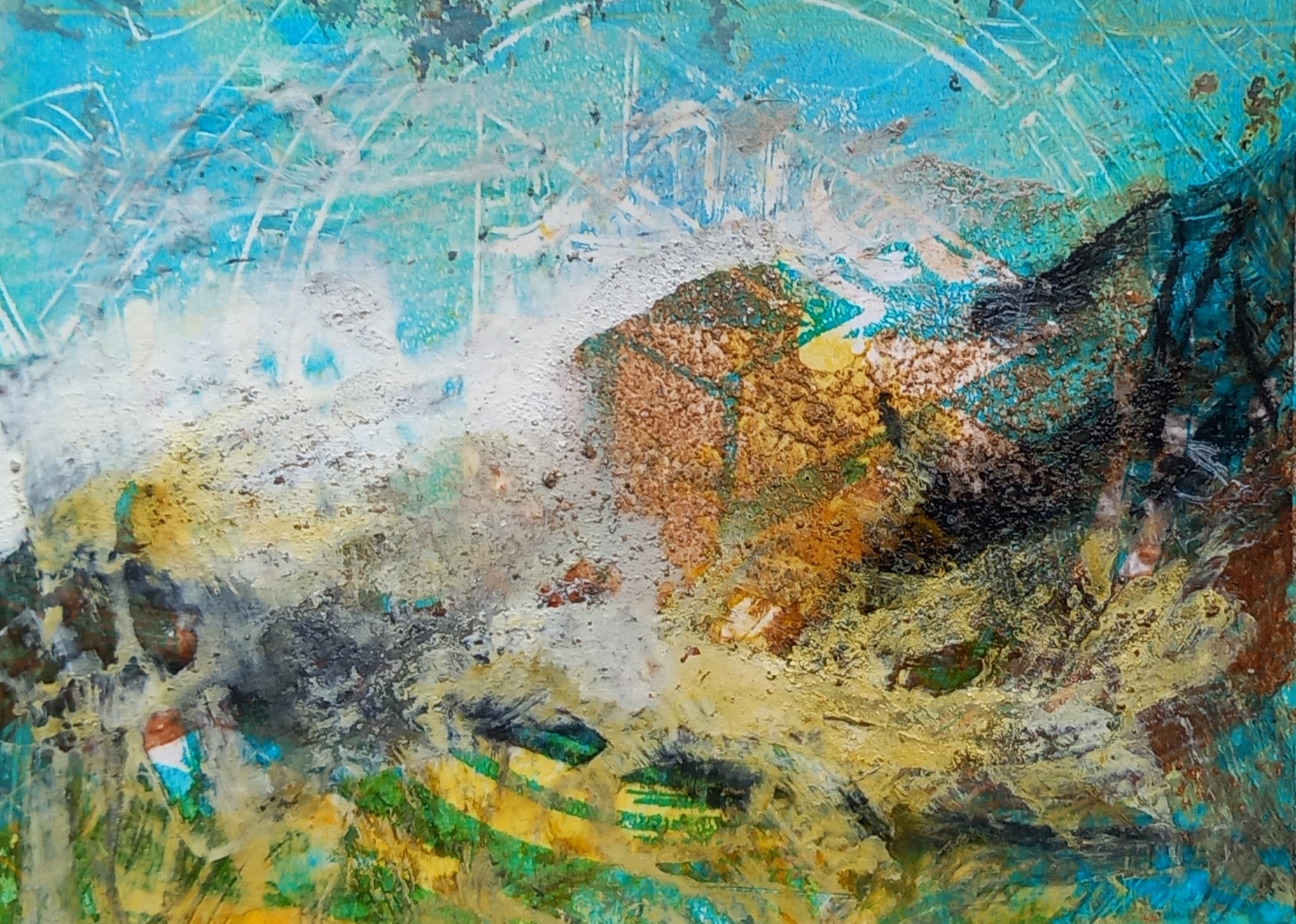
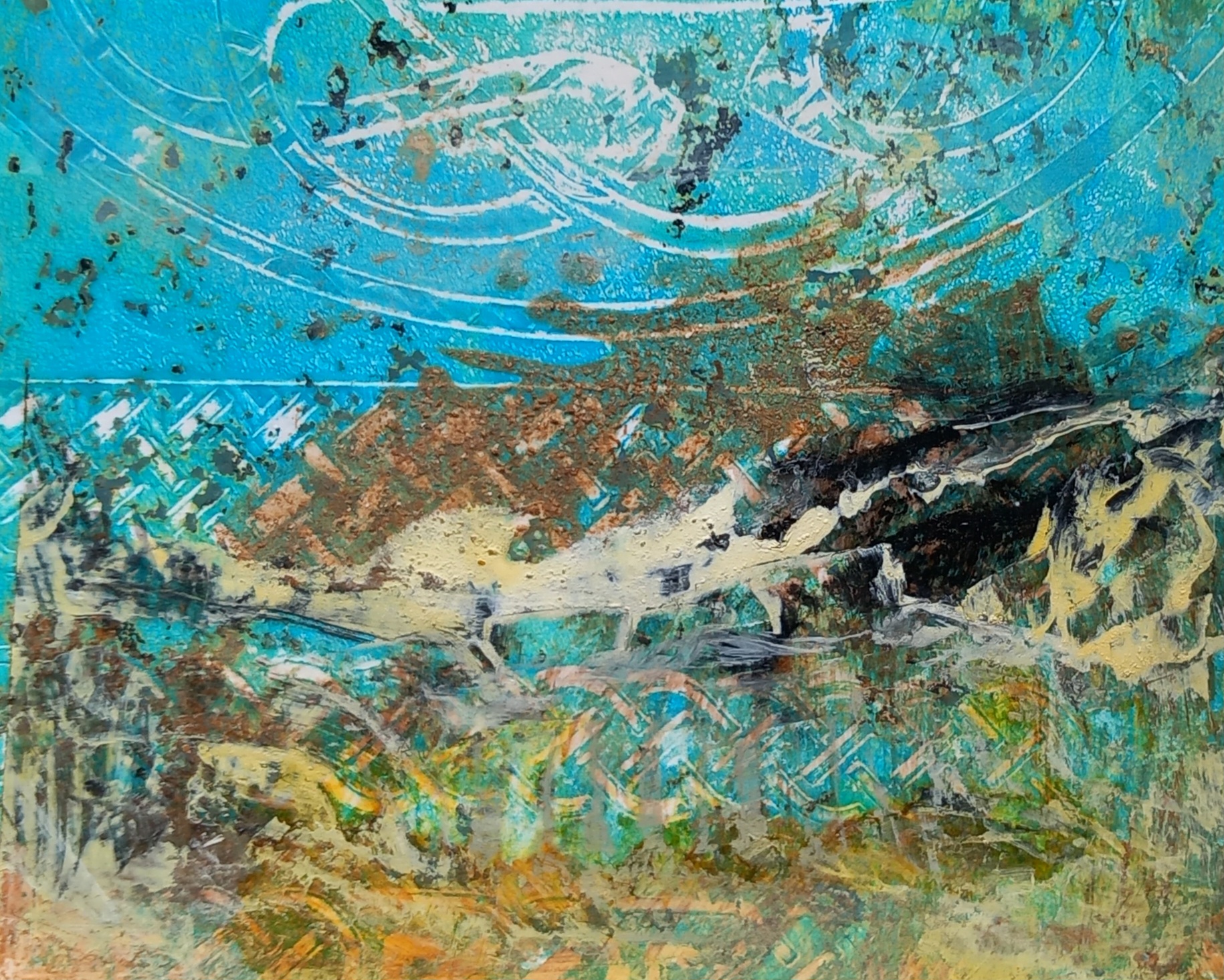
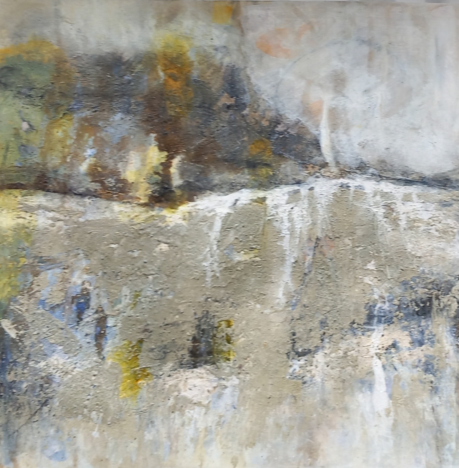
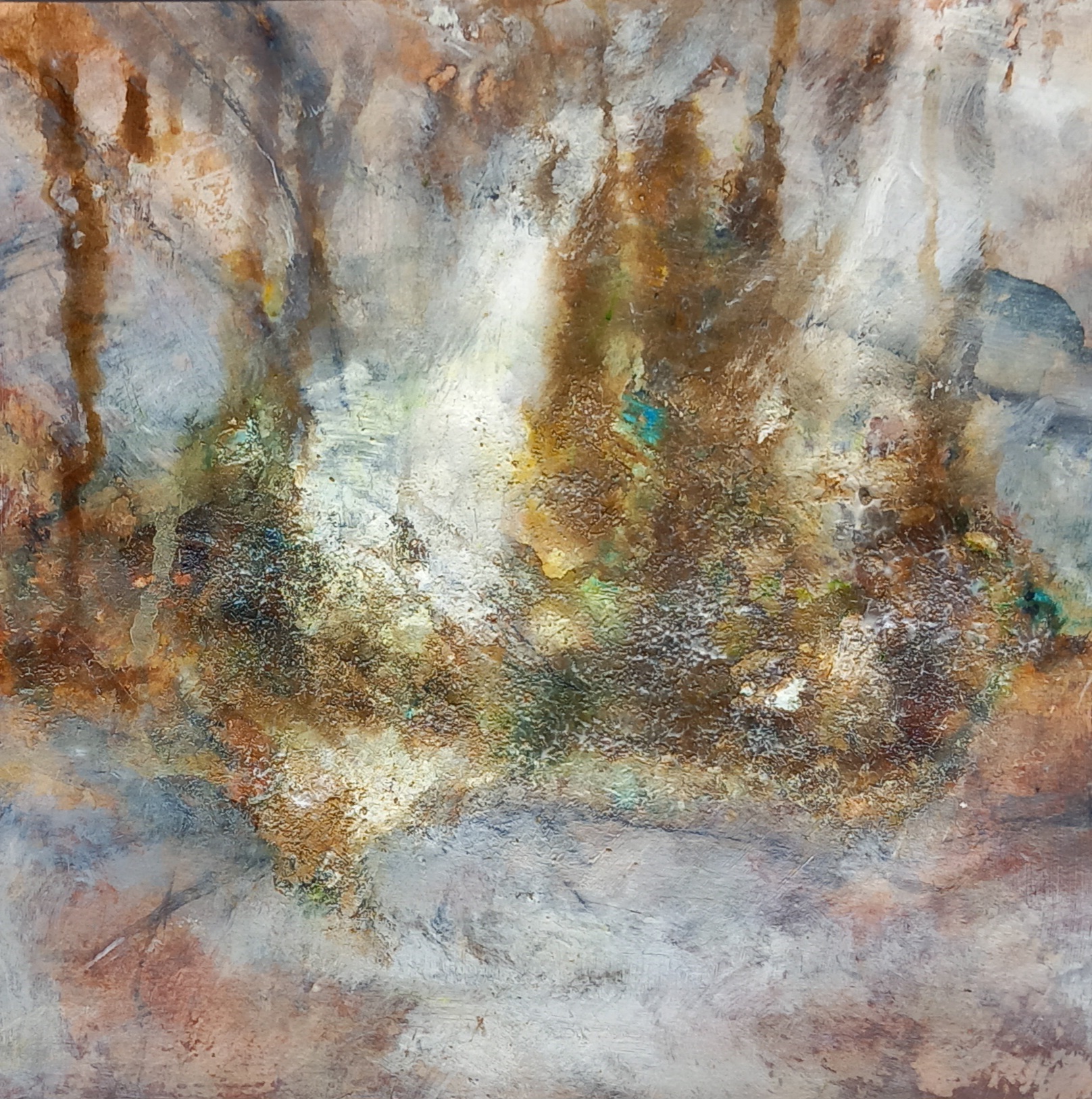
Then I produced these larger ones:
‘Places2’ Set of 3 x 30X30cm abstract landscapes on Fabriano paper using raw earth pigments and mixed media (acrylics and inks).
‘Places – Gold’ – Janice Scott – Raw Earth pigments and mixed media on Fabriano paper
‘Places – Sail’ – Janice Scott – Raw Earth pigments and mixed media on Fabriano paper
‘Places – Trees’ – Janice Scott – Raw Earth pigments and mixed media on Fabriano paper
I’m having a bit of a directional crisis at the moment and would appreciate some feedback. I recently approached a local gallery for representation and whilst they absolutely love my soft pastel work, they are reticent to take my work on – basically because they battle to actually sell soft pastel landscapes. Whilst the bulk of their comments were really inspirational, I was left wondering whether I’m going in completely the wrong direction.
I also know, from experience, that pastel works do not sell – no matter how much everyone raves about them, that applause doesn’t often translate into hard cash. So, should I stop working with this medium and concentrate on developing my style with acrylics or oils?
Anyone who knows me, understands that I do not enjoy working with oils but I decided to have a go with a scene from outside my window yesterday. This is the source image (quite heavily pixelated):
I toned the paper with an acrylic wash first – I used Arches for Oil paper, which is just about the best you can get and cracked on.
I use water-soluble oils – mainly Cobra. After waiting for it to dry up a bit overnight, I fiddled about with it some more today and this is where I am now:
Looking out across the winter fields
I frigging hate it! It needs so much more ‘honey’ – it’s not glowing. I know that if I did this in soft pastels, it would definitely glow and have a bit of spark. The way it looks now (to me) seems dull and lifeless. I will probably fiddle about with it more, perhaps with a honey glaze, not sure yet.
I then decided to re-do a soft pastel work that I did last week – this one:
And for this attempt, I used acrylics. This is the result:
‘Sunlit autumn stream – acrylics’
How I test myself with this is to try and take almost the same amount of time that I would have done when making the soft pastel painting. So I forced myself not to fiddle about too much (with the acrylic). I did not use the best quality acrylics, they are student grade. I toned the paper a burnt ochre but now when I remember, I actually used a green toned paper for the pastel one, so maybe that’s why the acrylic version isn’t sparking as much.
Here they are side by side:
Aargh! Come on, give it to me on the nose (I can take it) – should I pack it in with the soft pastels or what?
Underpainting of alcohol inks, added area of gold metal effect medium, then overpainted with oils (not artist quality) on canvas board.
I didn’t have any linseed oil or other mediums, as well as cleaning solvents, so was hesitant to try out these oils but then discovered that I could use Baby oil to dilute the paint and to clean the brushes, also much better on the skin! So far the baby oil doesn’t appear to have created any dull patches – the paint is still wet, I expect it will only be dry and fully cured in a month’s time. The oils and canvas board came with the set I describe below.
Soft pastel studies – my first attempts using this medium:
‘Dartmoor landscape’ from reference photo in a book.
Approx. 11″ x 7″
Soft pastels (not artist quality) on cheap scrapbooking type project paper (blue).
‘Orange landscape’
Approx. 5½” x 7″
Soft pastels (not artist quality) on cheap scrapbooking type project paper (blue).
Footnote:
I was given a compact artist’s kit comprising oils, acrylics and watercolour materials, plus palette and sample canvas boards, sketching pads, brushes, painting knives etc. etc. for a Christmas present. These sample paintings are the results of playing about with the stuff in the kit.
I have never used soft pastels (chalk pastels) before and am finding them really fun to work with. I enjoy the way I can layer over the colours and blend to get quite interesting effects. This has inspired me to try and purchase better quality soft pastels as soon as I can, as well as some good quality paper – I’d like to turn out more impressive work in the future – so watch this space!
I hope everyone who visits this page had a lovely Christmas and everything of the very best fo 2017 – let’s hope it’s a positive year for all of us!
Acrylics, Inks, collage, gels, gold foil on acrylic canvas board/panel.
Close ups of texture:
I’ve been in a bit of the creative doldrums since I returned from South Africa, artistically speaking. Pottering about with clay hasn’t really helped, it’s just made me work small and that’s not what I’m about. I decided yesterday that I needed to put all the clay away and get back to er ‘making art’ … lest I forget how.
Again, I’m working small, so I wasn’t feeling very confident. I started working with tissue and forming the texture, the ground … I wasn’t really sure where I was going other than I wanted the little panel to express a feeling of wide open space and emotional depth. Then I got to thinking about the other evening when my daughter and I were travelling home from doing our shopping. It’s almost harvest time here and the wheat and barley in the fields is very high, golden brown and thick. In this vast expanse of golden beige, there he was just popping his head out of the grasses to have a look around. So he became the inspiration for this final bit of rather naive collage.
I hope to be able to get going with a very large canvas I have sitting around downstairs next week, it’s calling to me.
Acrylics, inks, found objects (threads), aluminium foil and gels on acrylic paper.
Close ups of texture:
The rape seed fields are now turning a glorious golden / electric yellow – I took this picture whilst out on my own last week, when I went to go and find some bluebells in our local woods.
Acrylic paints, Daler Rowney inks, Pebeo Fantasy Prisme paint (still settling and drying, so there will be changes in the final effects once it’s dried and cured overnight).
Texture detail:
Driving home the other evening, I took a quick photo out of the side of the car of the rape seed fields … I love this time of year. I was inspired by this scene but didn’t want to create just another yellow, blue and green picture … so got fiddling about with the Pebeo paint, which takes an absolute age to dry completely but the results are always interesting. I will also press this when completely dry so that it lies nice and flat.
UPDATE: After weighting the painting last night, it’s not as rippled as in the previous photograph – so I’ve updated this post with new photos.
Another reason why working on acrylic paper is not always the best thing for me to choose but I didn’t have any canvasses lying around that were ready and as I’ve got kids home for the Easter holidays, time is limited. The paper (even though it’s like linen and thick) wrinkles something horrid – despite the gesso, binders and what not … anyway, this is a ‘sketch’ really. I want to work on a very large canvas that I applied texture to several years ago in the form of waves and spray. With this mock up, I wanted to see if I could get the colours I need for the ‘sea’ with inks.
I only used white acrylic paint, the rest is ink and pencils and globules of texture paste (actually grout). The finished thingie is about 11 1/2″ x 7 1/2′ and needs to be weighted, which I’ll do in the next couple of days (to flatten it out). The colours are much richer in natural light, it looks dull in the photo.
Acrylics, inks, gel, metallic effect medium on mixed-media paper.
10 ¾ “ x 7 ½ “
Close ups of texture:
About the title:
I was going through old dvd’s I have of stored family photos and came across a picture I’d taken when on holiday in the Southern Drakensberg with my family for a long weekend over Easter back in 2008. We made a fire outside whilst we were braaing (you guys in the UK call it a barbeque). My son placed a few twigs in the red embers, waited until they were glowing and then began making circular patterns, zigzags and drawing words in the darkness (as we would do with sparklers on Guy Fawkes night back in the day when people were responsible and there was no need for stupid draconian health & safety regulations for everything). I digress. Anyway, that moment inspired this painting. (even though I promised I’d lay off the gilt paper for a bit, couldn’t help myself) 🙂
Acrylics, gels, inks and metallic effect Pebeo paper on mixed media paper.
Detail of foil work
I did a large canvas a few years ago that I’ve never been entirely satisfied with. I used bronze metallic paint to highlight the texture but it isn’t working properly. So I now want to bring it up to speed. The smal piece on paper that I did today is a kind of mock-up for the work I want to do soon on the older large canvas – which looks like this at the moment:
This canvas is 47″ x 39″ and about 2″ deep – I haven’t really had anywhere to work on it because of its size but I’m determined next week to take it downstairs and get started. Wish me luck!
These are experiments with resists (vaseline), inks, layering
“Hedgerow”
Mixed media paper – small
“Coral”
Acrylic paper – A3 size
This one was an experiment using printing technique – so the paint is applied on another surface, then lifted off with waxpaper or foil and then printed onto the paper that I’m using for the composition.
Acrylic, gels, paste, caulk, gilt metallic paper (Pebeo), inks on acrylic paper.
I bought me some Pebeo metallic effect papers yesterday ‘cos they were on sale at Hobbycraft! Of course I didn’t get the gilding paste to go with (duh) … so it’s a bit futile trying to do anything with the metallic paper without the paste. Necessity being the mother … and all that … I used other sticky stuffs that I have laying around and used that to get the metallic paper to bond to the surface of this little piece. It still didn’t work out the way I wanted it to … so looks like I’ll have to go and get me some gilding paste (dammit).
I didn’t gesso the acrylic paper before I applied the textural pastes (I used household grout/filler and glue), so the paper buckled somewhat – I did use a lot of paste though to be fair. I weighted the paper down after a few coats of bonder but it’s still a bit bumpy, which I like. It was supposed to have texture after all! Otherwise why bother hey?
I like the colours on this one, there is just the tiniest smidgeon of metallic powder blue (ink) splattered here and there. I would like to make this one into a much bigger piece with a more rigid substrate.
Thanks for looking at my work and commenting, I really appreciate it! 🙂 Have a lovely weekend.
Acrylic, gels, paste, grit, sand, inks on mixed-media paper.
I tried a few larger pieces this week on the A3 acrylic paper but I wasn’t happy with them, so then I fiddled about with this small piece. Also not really happy with it but thought I’d stick it up here for reference purposes.
Modelling gel, acrylics, metallics on mixed-media paper (250gm/169lb)
Approximately 12″ x 8″
Close up of texture detail.
One thing I learnt here is that you must use acrylic medium between layers – I don’t have any at the moment, hence my new found knowledge! Otherwise, the underlying layers become muddy and hard to work on. So I’m off to get me some new medium just as soon as I can – cos all my other stuff is finished!
Acrylics, gel medium, metallics on mixed-media paper (250gm/169lb)
Approximately 12″ x 8″
Close up of texture detail.
I have been watching a lot of videos by the German artist, Gerda Lipski and was inspired by her to try layering with acrylics on paper today. This is not something I normally do – because I don’t trust the nature of paper to stay strong during the layering process! Anyway, thanks to some of the tips that Gerda gives on her YouTube channel, I figured it out and now I’m having fun layering on paper for a change! Need to get some more acrylic medium though, as I’ve run out – so had to use heavy gel medium on this piece, which explains why I ended up with a bit more texture in the middle than I thought I would. 🙂


 This is sold


