I have been digging about in my portfolios sorting paintings into themes – as I am considering producing a series of 10 notecards.. I am surprised because I thought I’d done a lot more with this subject!


ART from Norfolk
I have been digging about in my portfolios sorting paintings into themes – as I am considering producing a series of 10 notecards.. I am surprised because I thought I’d done a lot more with this subject!
I’ve been a bit pre-occupied this past couple of months trying to get things ready for the formal assessment of my work for the Summer assessment event. I’ve submitted the following pieces in my portfolio for adjudication:


Wish me luck!
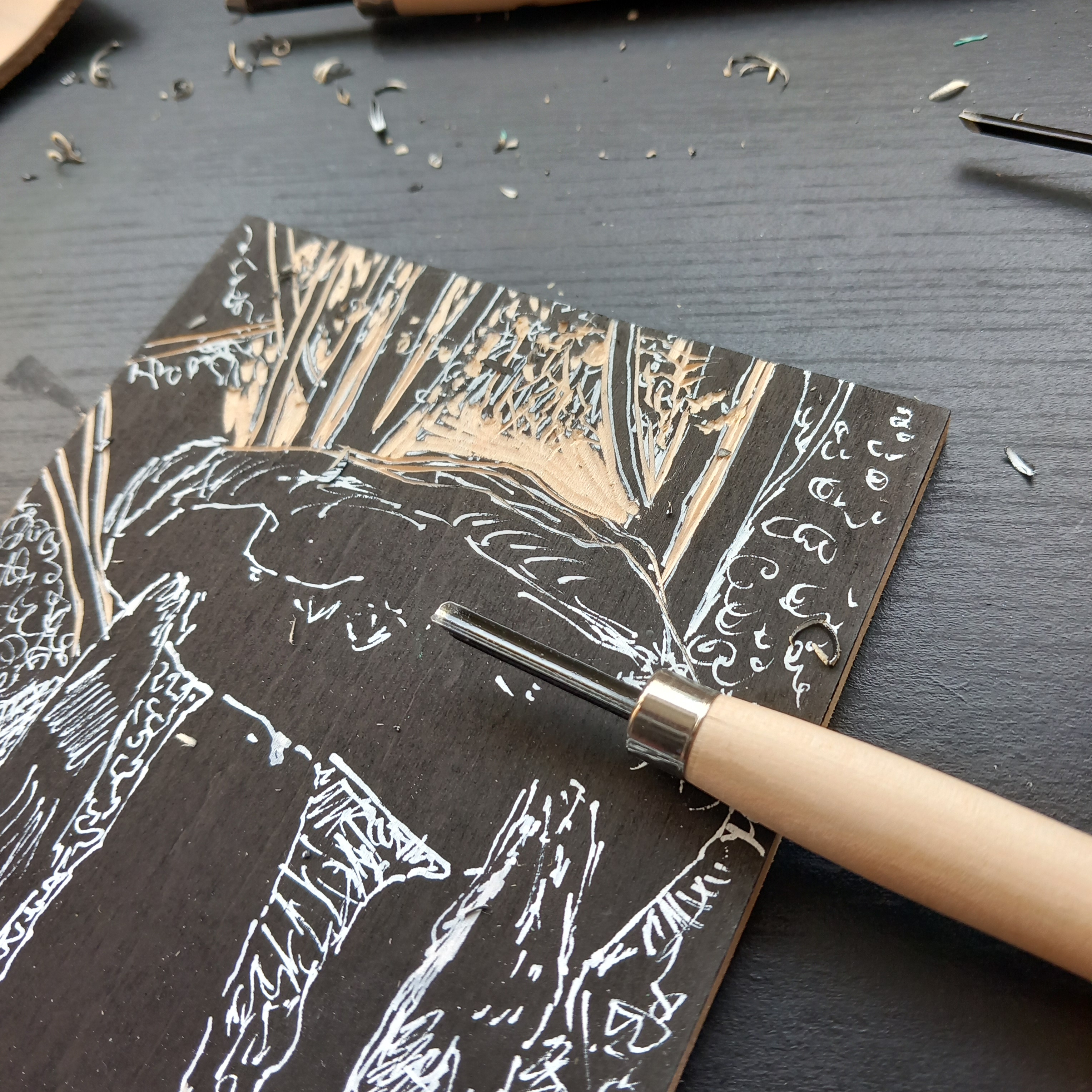
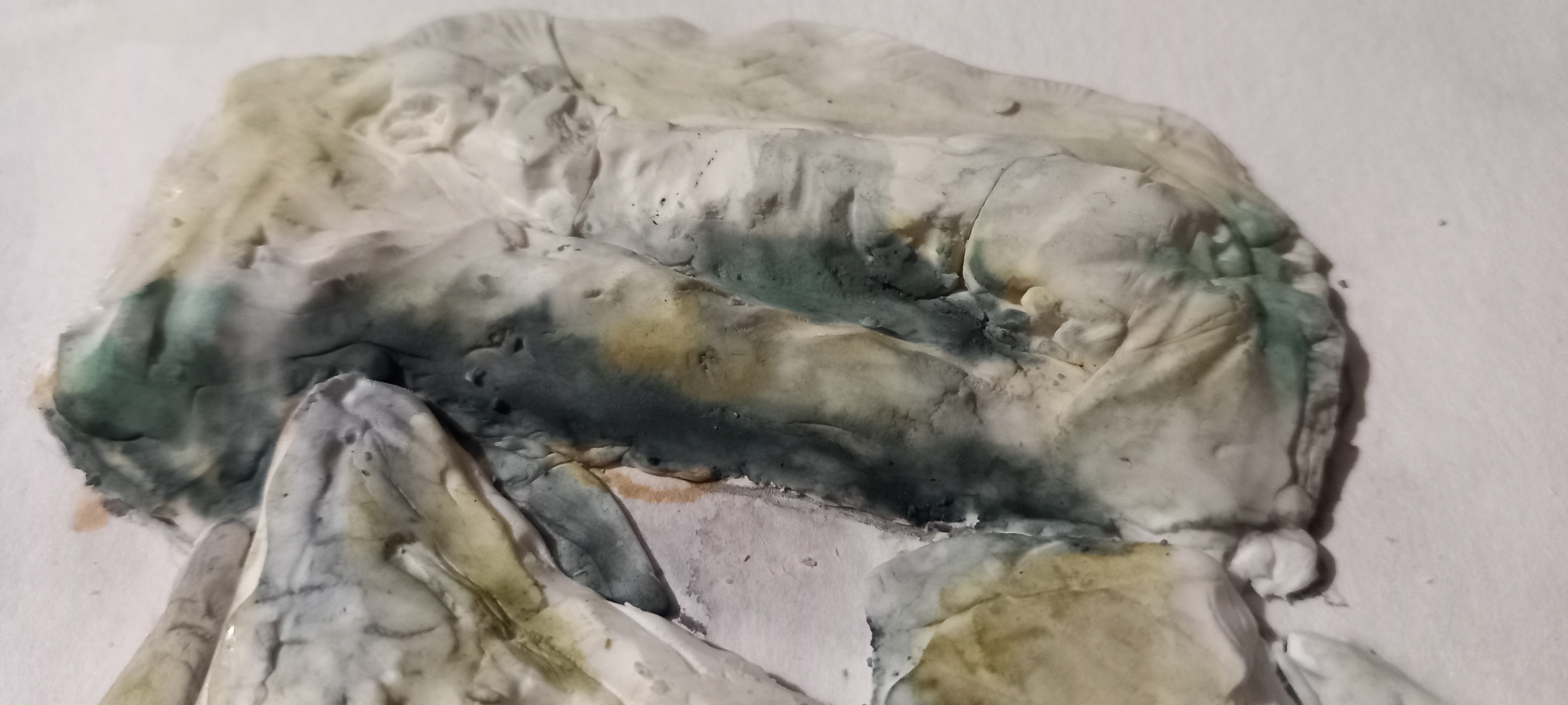
Today I’ve been having another ‘go’ with the piece of Japanese plywood – my first attempt was somewhat feeble.
https://www.instagram.com/p/C5Q2kkUMZHkJEUtJZHJ3AvlIej1kun08LWa0hE0/?img_index=1
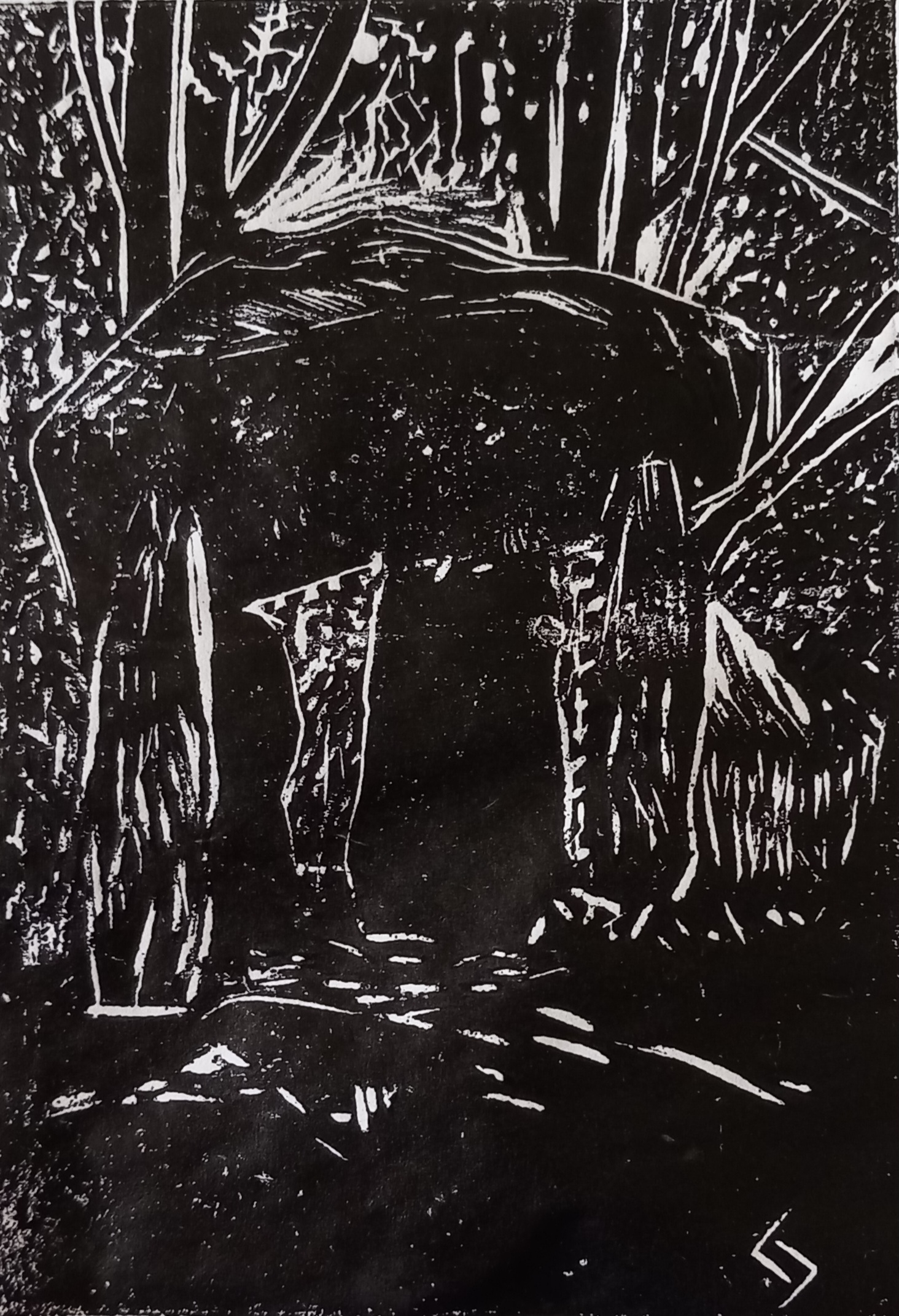
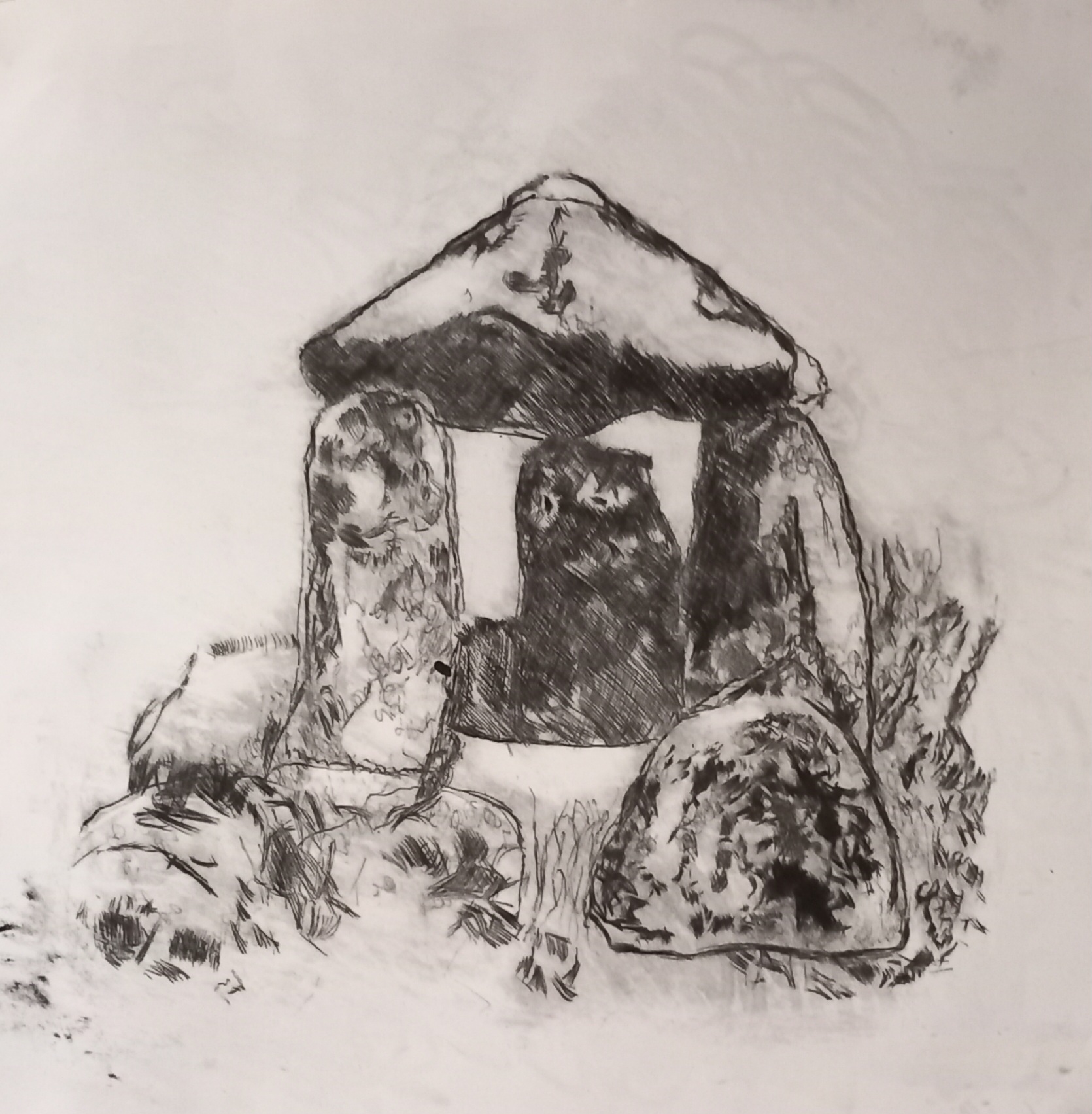
I had much better luck with the carving today (on the back of the piece that I did before) and got a halfway decent image out of the wood (a dolmen in amongst trees). I am still finding it hard to do circular marks (like dots and squiggly lines) – this is a slow learning process!
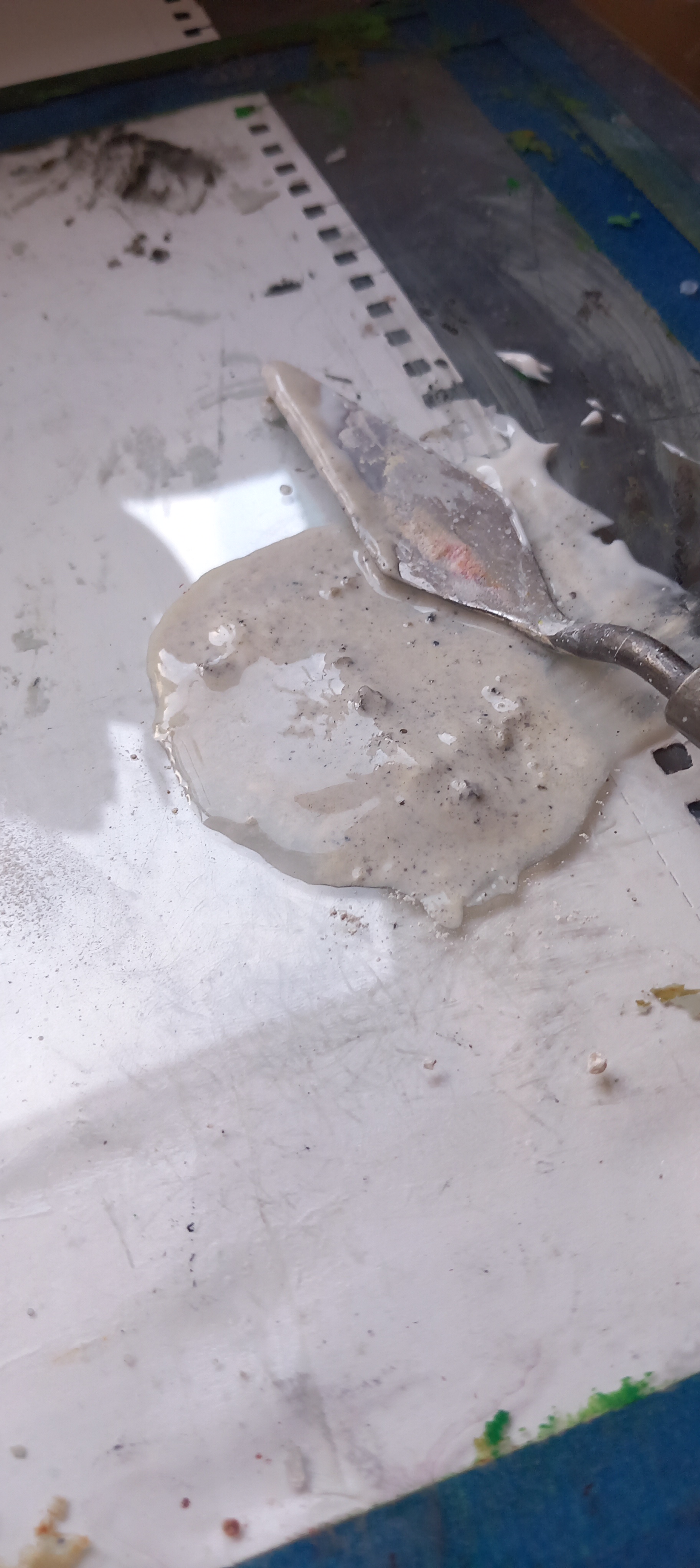
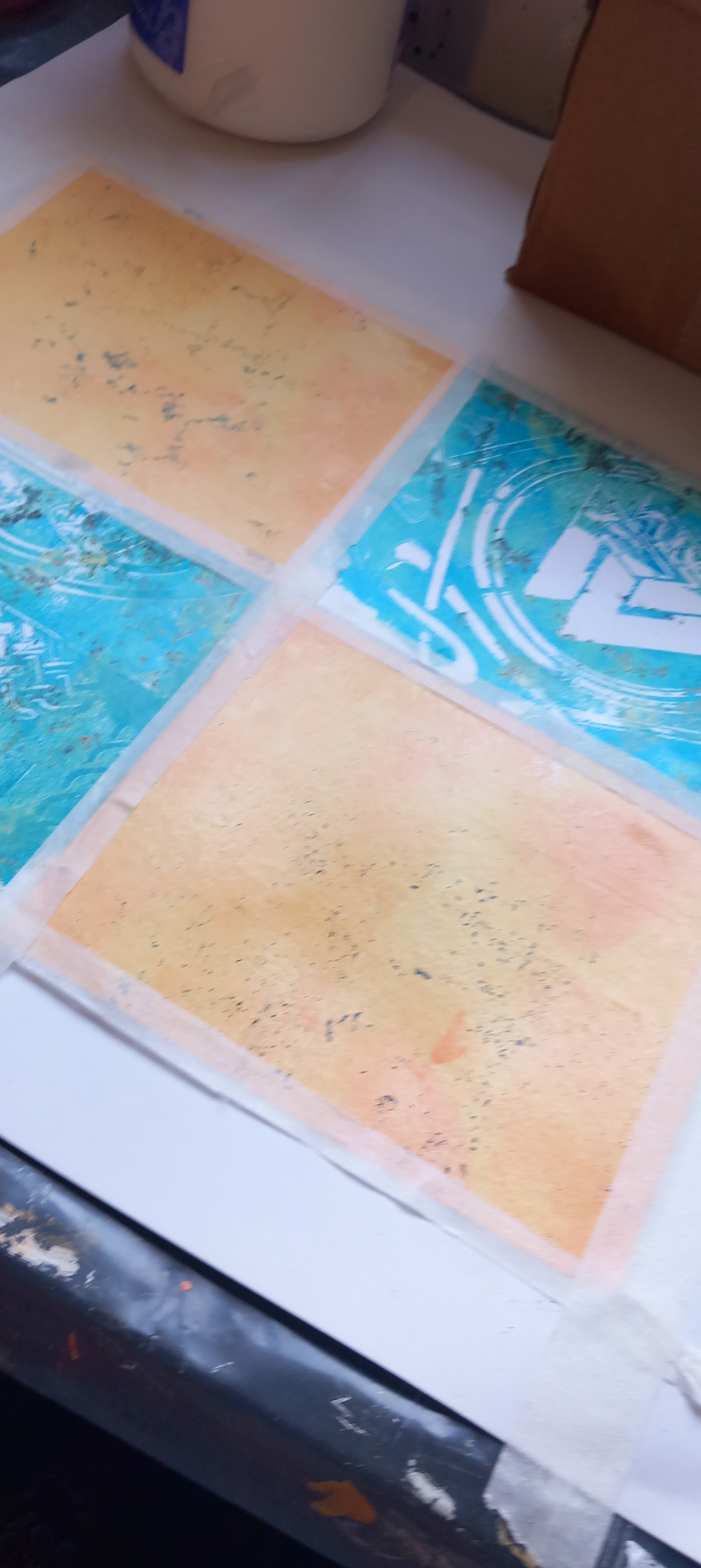
I printed on really cheap paper. I forgot to dampen it for the first couple of prints but then ended up soaking the paper and layering it between sheets of kitchen towel, that seems to work really well. Paper must be as damp as you can get it for this process (I’m not using a press). The biggest mistake I made today (along with all the others) was using Linocut ink (trying to save money – duh) … it doesn’t provide a strong print, no matter how many times you ink up the block and it also doesn’t make any difference if you apply the ink directly to the block with a rag or roll it on. I tried a few monoprinted (colour) background papers (that I made using the gelli plate) and this worked well – but again I was using linocut ink and the black image of the block wasn’t strongly defined at all.
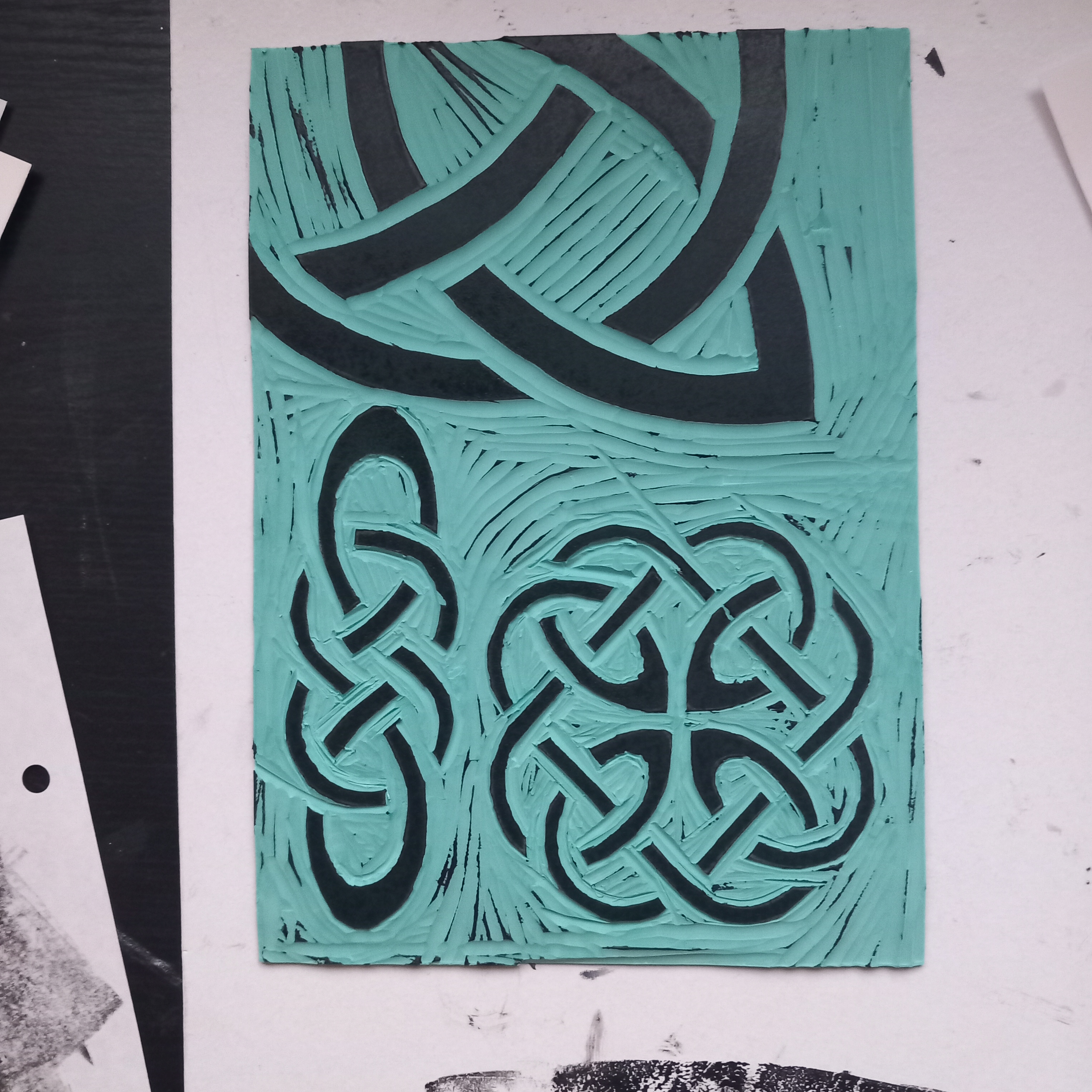
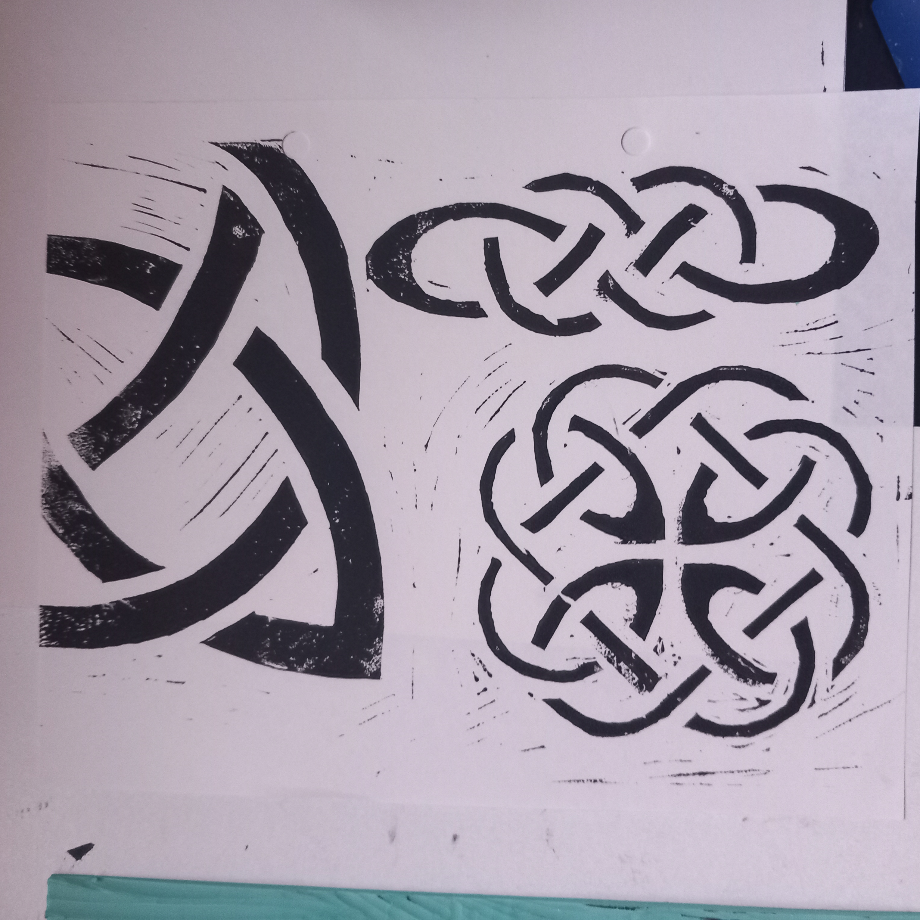
Images below show some work done on new Lino yesterday and the resultant print (Celtic designs) and then the work today using the Japanese plywood and various inks/papers
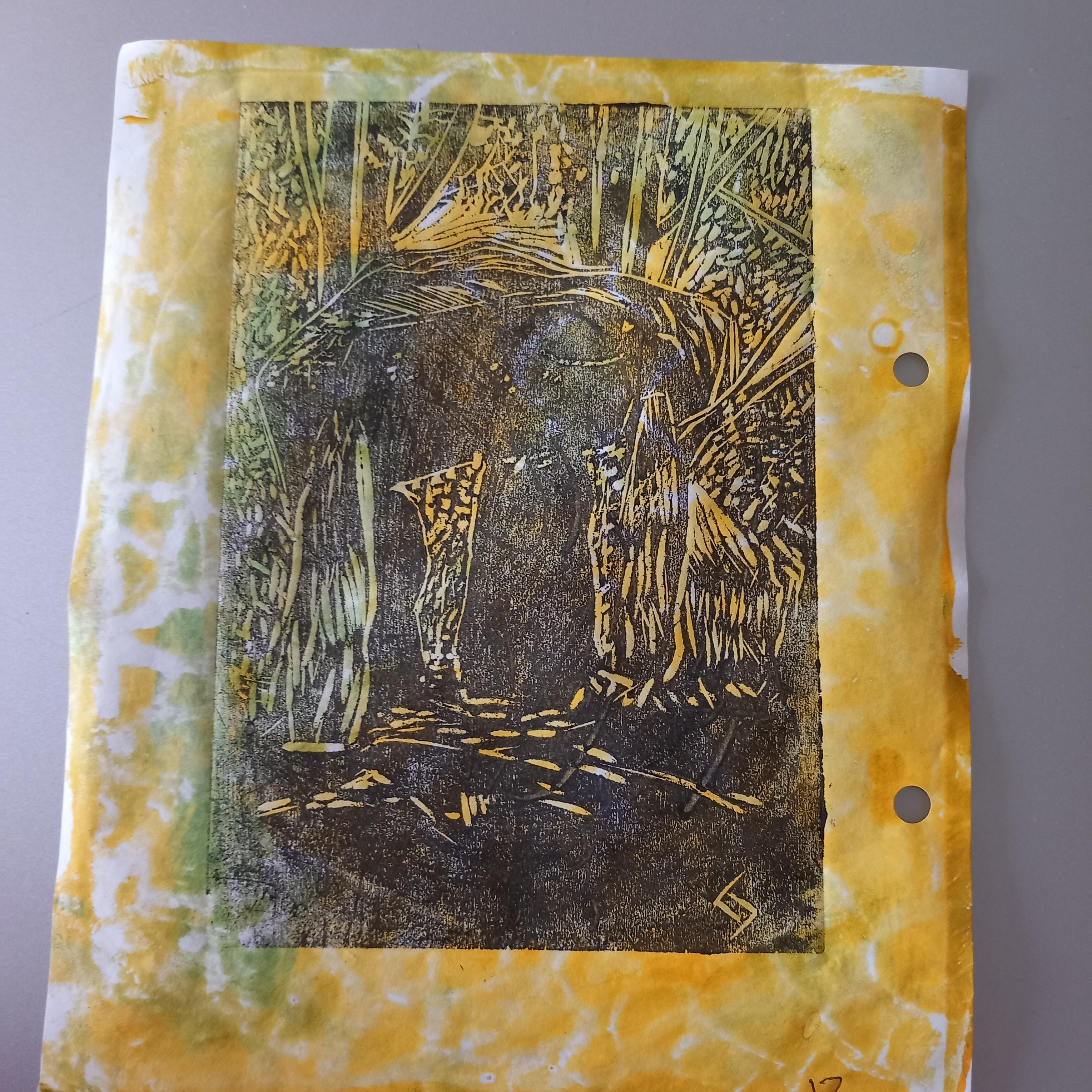
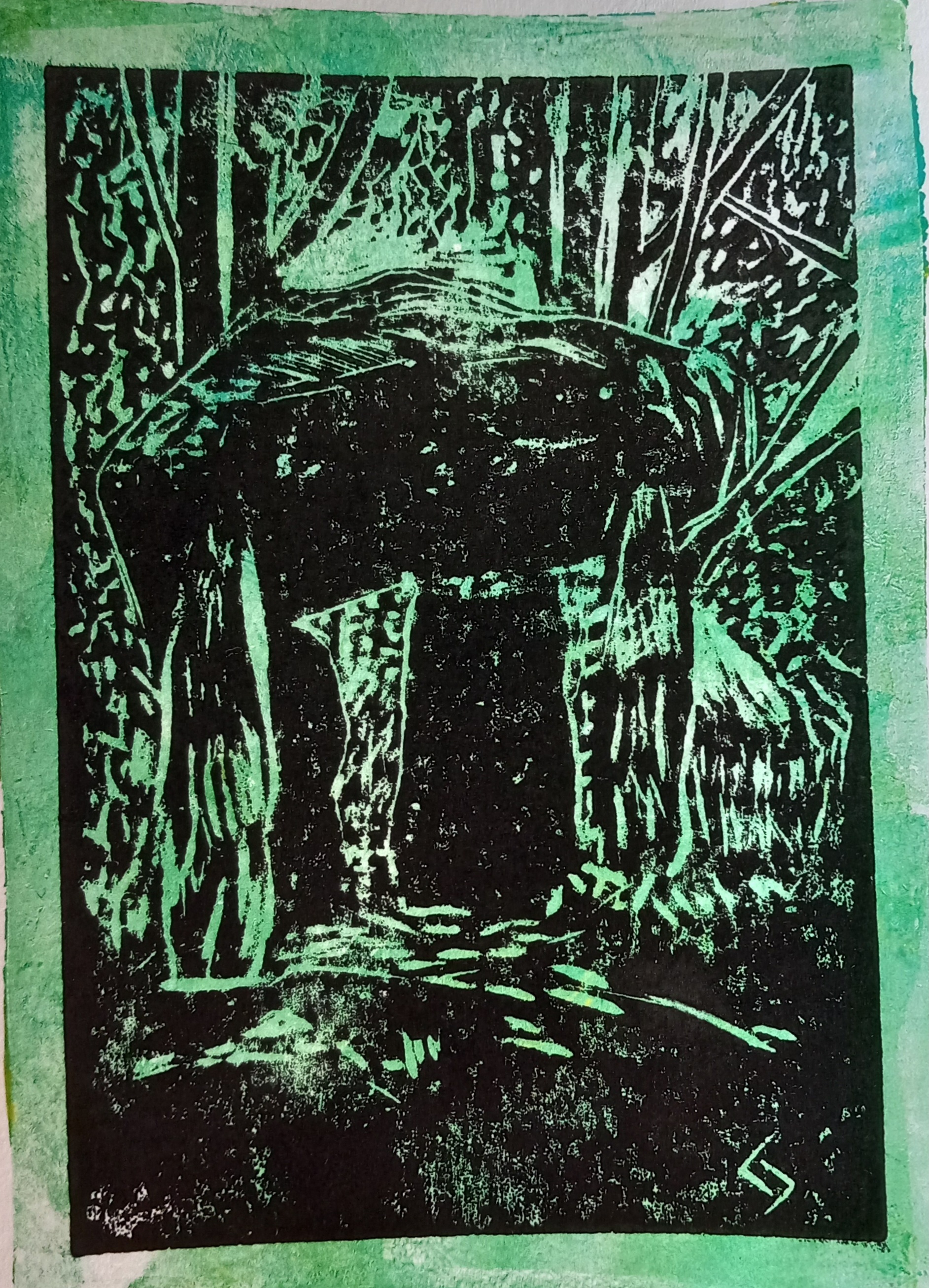
Eventually I changed to Caligo safewash ink and the results were instantly ‘true’. I made more coloured backgrounds on the gelli plate using Fabriano paper (which is really thick) and again tried to make sure this paper was very wet. I had mixed results with the Fabriano paper but I like the archival quality of this paper. I did about 20 print experiments in all, working on one with soft pastels after it had partially dried – not very successful result though. I carved into the block again and will do some more prints, to see how the block takes to being abused. Wood makes a much more durable printing block than lino but it is harder to cut into. I have bought more plywood sheets, some ShujiGami (Japanese) paper, which I have used before to do dual-sided monoprints on- it is wonderful paper and very cheap for how much you get in a roll. Once this arrives, I will try and produce something that is good enough to sell. I have the best intentions …
I collected my prints yesterday and have mounted them temporarily to keep them protected. We could end up doing more experimentation with coloured papers but for now I’m just so pleased to have them home!!
I am part of a group of fellow second-year Open College of the Arts/Open University students. We decided in 2023 that we should collaborate and create an online virtual gallery exhibition. Due to pressures of family life and what not, we pushed the dates forward and we are now looking to have this project completed by the end of February – there are eight of us involved at the moment. I have created a separate blog where the artworks that are completed thus far are detailed. Eventually these will be included in the virtual exhibition, which is a work-in-progress at the moment.
The theme for our exhibition is ‘Man-Made‘ and we have allowed ourselves the freedom to interpret that brief as best we see fit. I am commenting on this learning log on my own piece – however, the link to the blog for ‘Man-Made’ is here: https://manmadecollaboration.wordpress.com/
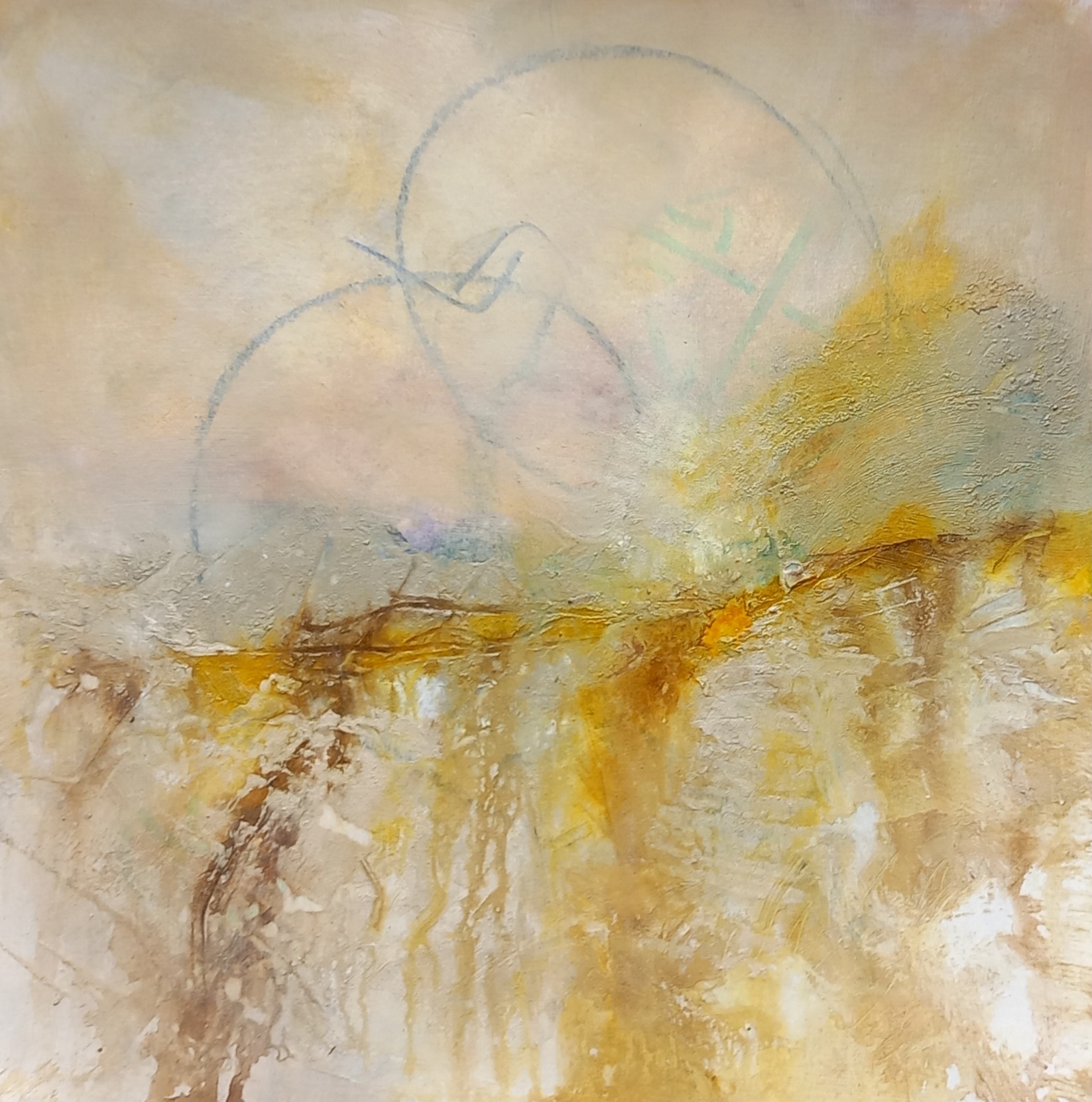
‘Genesis’ – Man-made (soft pastels on 60x60cm stretched deep edge canvas)
I am particularly fascinated with neolithic structures that were around thousands of years before the Pyramids – these monuments are the precursors of modern-day architecture. I chose to use an internet sourced photograph for this piece, as I felt the dramatic almost primordial sky lent an air of pre-history to the scene.

This is an overview of the process:
For this piece, I initially drew a rough sketch with charcoal onto the primed canvas. I then used acrylics to block in an orange underpainting of the sky area. I was going to use water-soluble oils for this project and started laying in the sky. After a while though, I could see that this medium was not behaving the way I wanted it to, so I scrubbed off the oils (easy to do with Cobra water-soluble paint). I then applied about 8 layers of Golden pastel ground to the surface of the canvas (including sides) – using first a brush and then a foam applicator, so that there were no streaks and the surface was level. Once this was all dried, I used a variety of soft pastels to complete the piece.


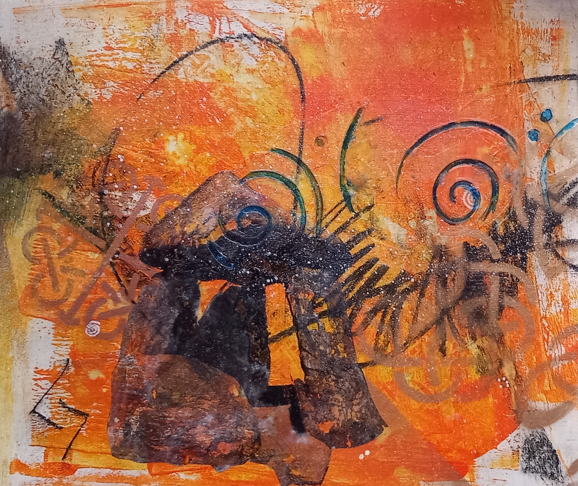
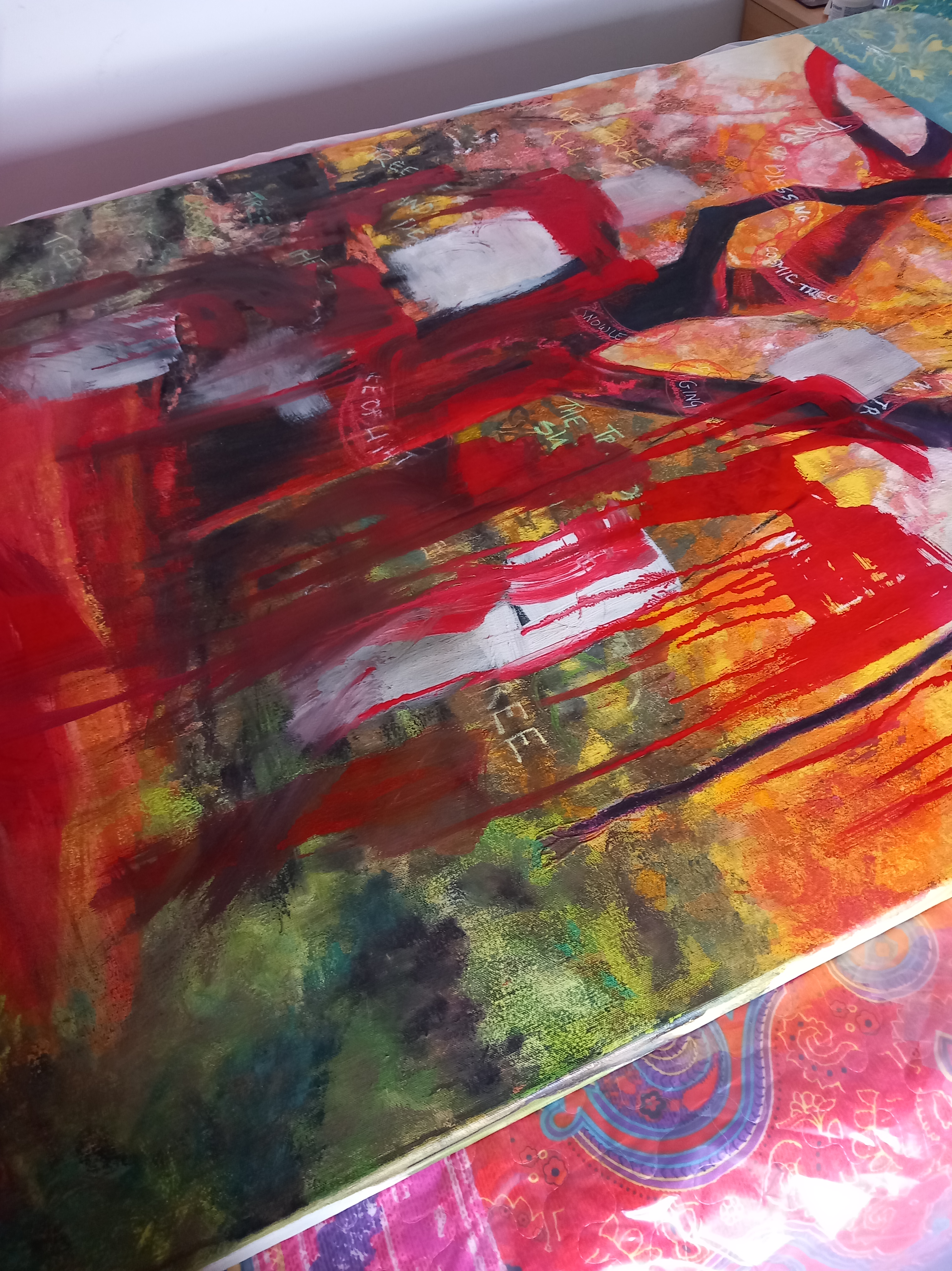
During the course of a year (or almost), I have worked on a large canvas, which as far as I’m concerned, is now finished. It started out as something entirely different, this is it’s story:

I used stencils, collaged symbols that had been monotyped onto tissue paper, old Rune words, celtic designs, charcoal. It was worked in inks, acrylics and soft pastels (I used Golden pastel ground over most of the surface). I based it on a false colour image of one of my own photos that I took of a tree in a local wood. It stayed in its ‘tree’ form for a long time, driving me nuts.

In a fit of desperation, I painted over the entire thing one night using red paint and white gesso and left it for a few weeks before starting on it again.

For its second ‘outing’, I decided to try and recreate a similar scene to another painting of mine, this time using acrylics and watercolours (I eventually also ended up using soft pastels).

I used structure gel, modelling paste, crackle paste on the surface for the tree trunk and this is still visible in the final painting (at bottom of this post).
It was taking shape and full of colour …


It almost ended up kinda how I wanted it but something was bothering me, so after a while of staring at it with contempt, it got painted over. I looked at the surface for a long time and then got out the earth pigments – a LOT of earth pigments. I used nearly my entire stash of earth pigments and the surface is very heavily textured. Nice.
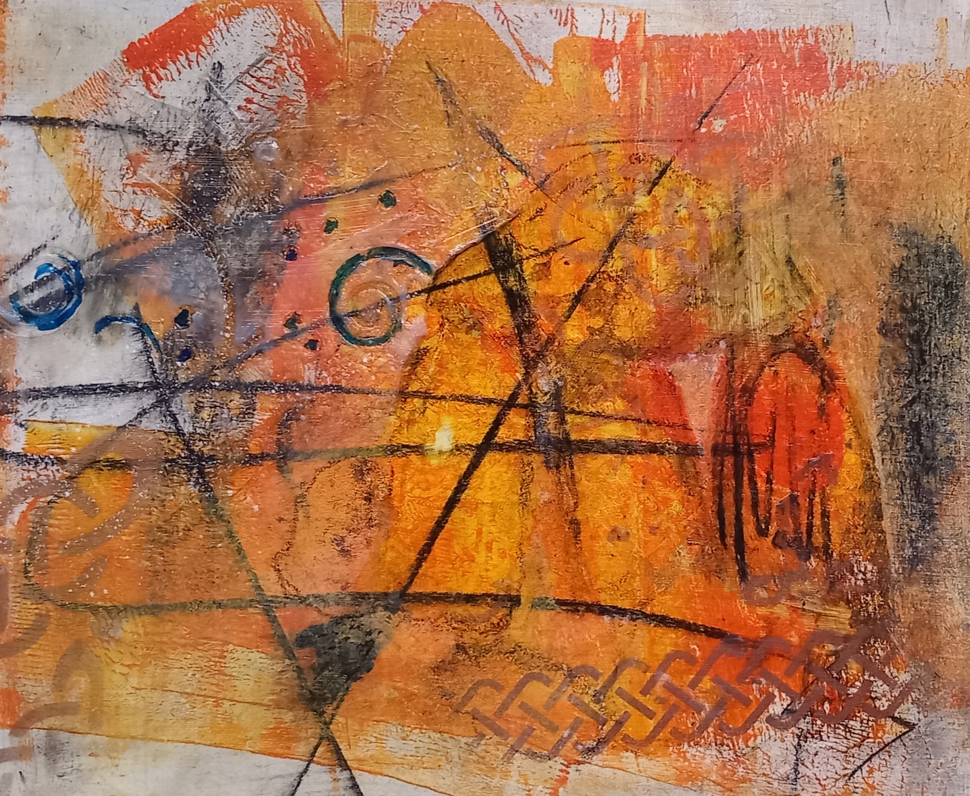
It stayed in the earth pigment state for a long time. I received very good comments on Instagram and elsewhere but I hated it. I felt it was boring, didn’t have any structure or point and was dull and lifeless. However, something in it kept calling out to me. So today, I ‘had a go’ and managed to coax that ‘something’ out … I am now happy with it.T

This is the final rendering:

This has gone through many stages of redaction, as well as most of the techniques mentioned in the course notes (scraping back, spraying etc. etc.). I have used earth pigments, inks, high-flow acrylics, isopropyl alcohol and water. The texture created when I used various pastes (including crackle paste) as still clearly visible in the sky area and further down the picture plane. I have not sealed it yet.
What does it mean for me?
Artists are supposed to articulate what drives them to create a specific painting – what resonates with them? I am always nervous of putting forth how I feel about my work, in case this clashes with how other people see it and somehow changes its meaning. There are a lot of factors at play in my mind when I create something large like this painting.
To all my patrons, thank you for your continued support this year, which has been eventful for me – not just with regards to the artistic side of my life. I have learnt many new skills; stretched myself emotionally, spiritually, physically and mentally. Some things I attempted were more than a massive challenge (ArtFairEast) other projects (local art shows) were a breeze. I cannot control my nerves and insecurities sometimes and have a battle believing in myself … I will try to be more patient and let things flow in 2024.
I have met so many new, wonderful, wise, kind and generous people this year and consider myself really lucky.
I am looking into upgrading my professional website (this blog you are reading!) next year … it seriously needs an overhaul.
I have some new ideas for work that will commemce as soon as Christmas has flown past. AND I absolutely cannot wait to complete my stone lithographic print.
On a more serious note, I am behind with the degree studies, so will not be posting much more on this platform (or Facebook) for a long time. I am more active on Instagram @janiceheatherscott and this is where I post most at the moment..
Have a truly magical Christmas, be happy and stay safe … see you in 2024!!🎆
I was interviewed by the local Diss Express recently relating to my participation in ArtFairEast – the full page feature was printed in this week’s edition. Below is a photo of the article. Something else, I can include on my CV, so quite chuffed to get this exposure.

I was very pleased to be accepted into the Art Fair East exhibition, which was held at the gorgeous St. Andrew’s Hall, Norwich – between 1st and 3rd December – with a VIP night on the 30th November.

It was an expensive exercise for me but I am really pleased that I took the plunge and decided to go ahead with it. I have to admit that I was physically sick with nerves for almost two weeks leading up to the show but I didn’t need to be because I met up with some truly wonderful fellow artists at the show, who I hope to keep in contact with going forward. So, what did I learn?

Hidden costs:
Besides the cost of the panels (and light) used to display my work, there were a load of other costs that I hadn’t accounted for when I signed up to do the exhibition, such as:
Some comments I received about my work:
Here are a few photos from the weekend:

Setting up with the help of my son.

This was a very well attended show – hundreds and hundreds of people coming through each day – I don’t have the exact numbers of people but there were plenty!
I am really pleased to let my WordPress friends (and others on the whack-whack-whack) know that i managed to sell this painting at the weekend via the little village art festival in Tasburgh:
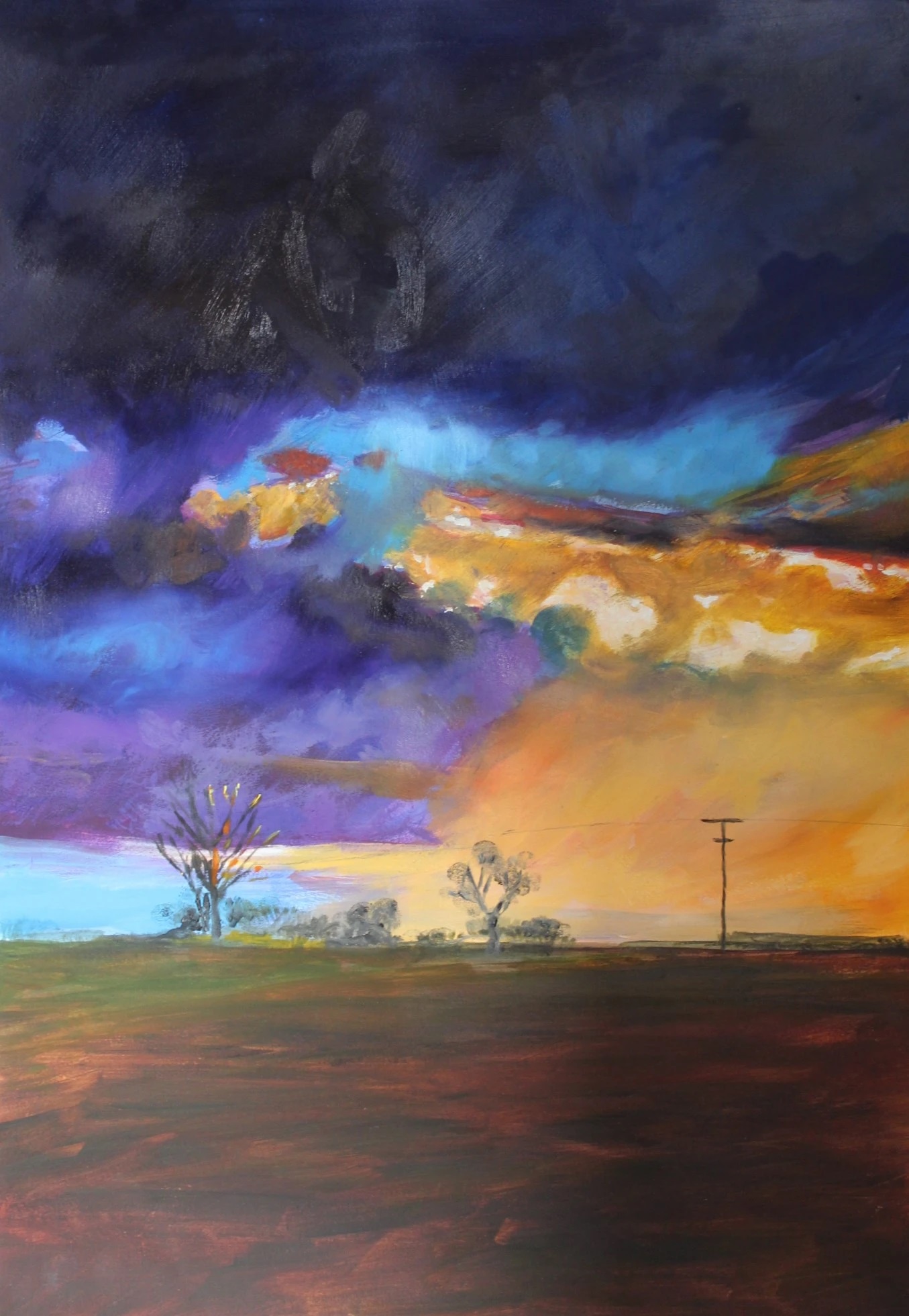
(‘Storm clouds over the fields’ – oils on paper, framed)
It was also really nice to hear that the organiser of this event purchased the soft pastel version of this landscape at my last show! I am quite pleased because I have based both paintings on my own reference photo – a moody atmospheric shot I took when we were living at the converted barn just outside Long Stratton (totally loved living there).
I apologise for the multiple posts but I am having to get a lot of work completed before the end of this week. It’s all go here in the factory.
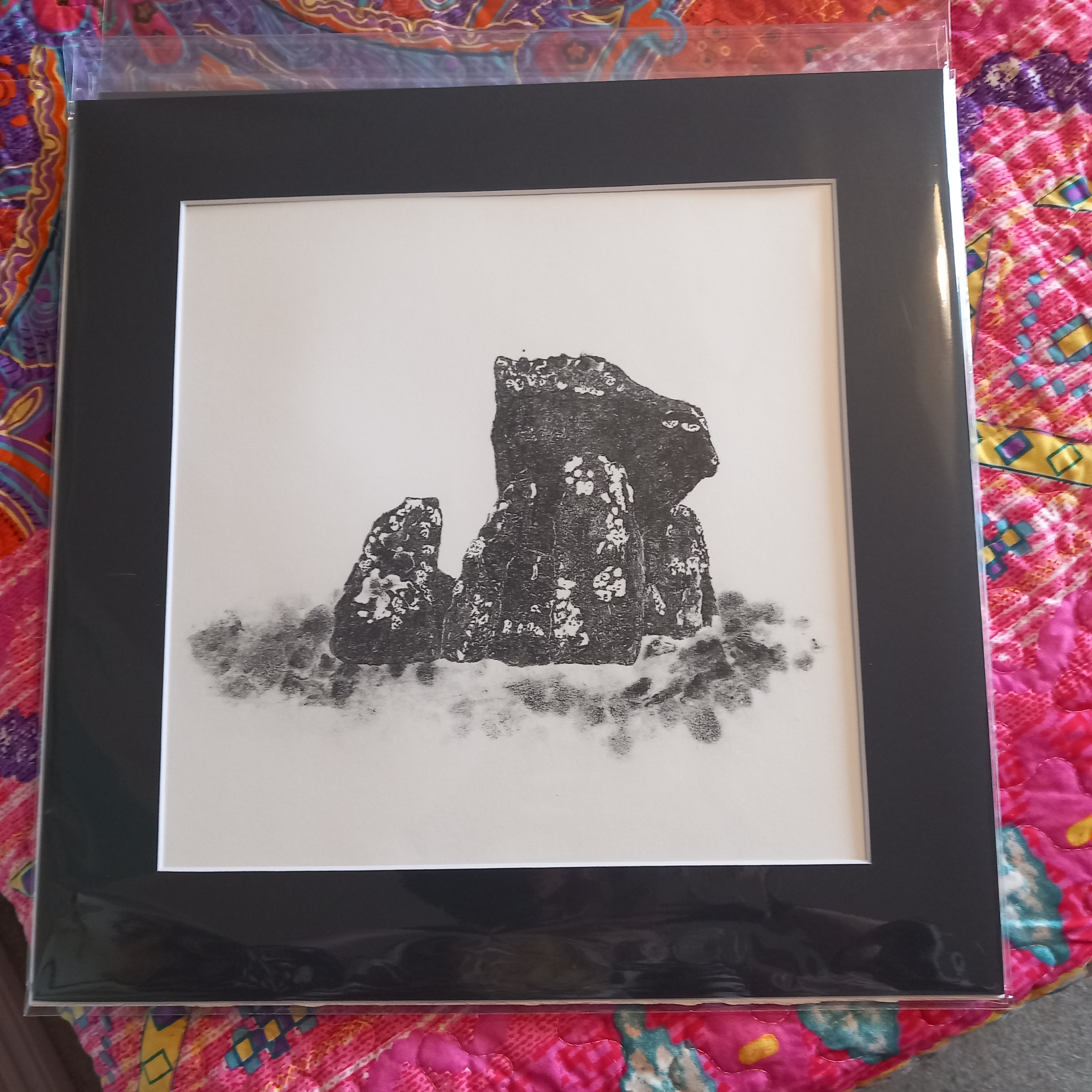
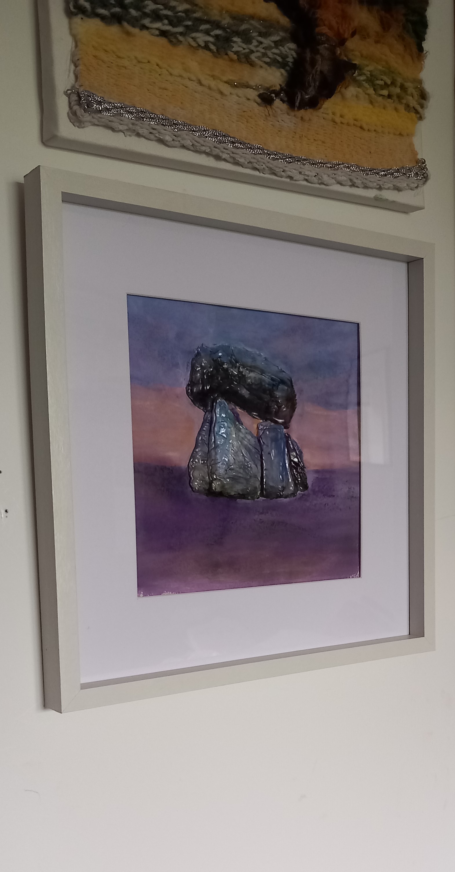
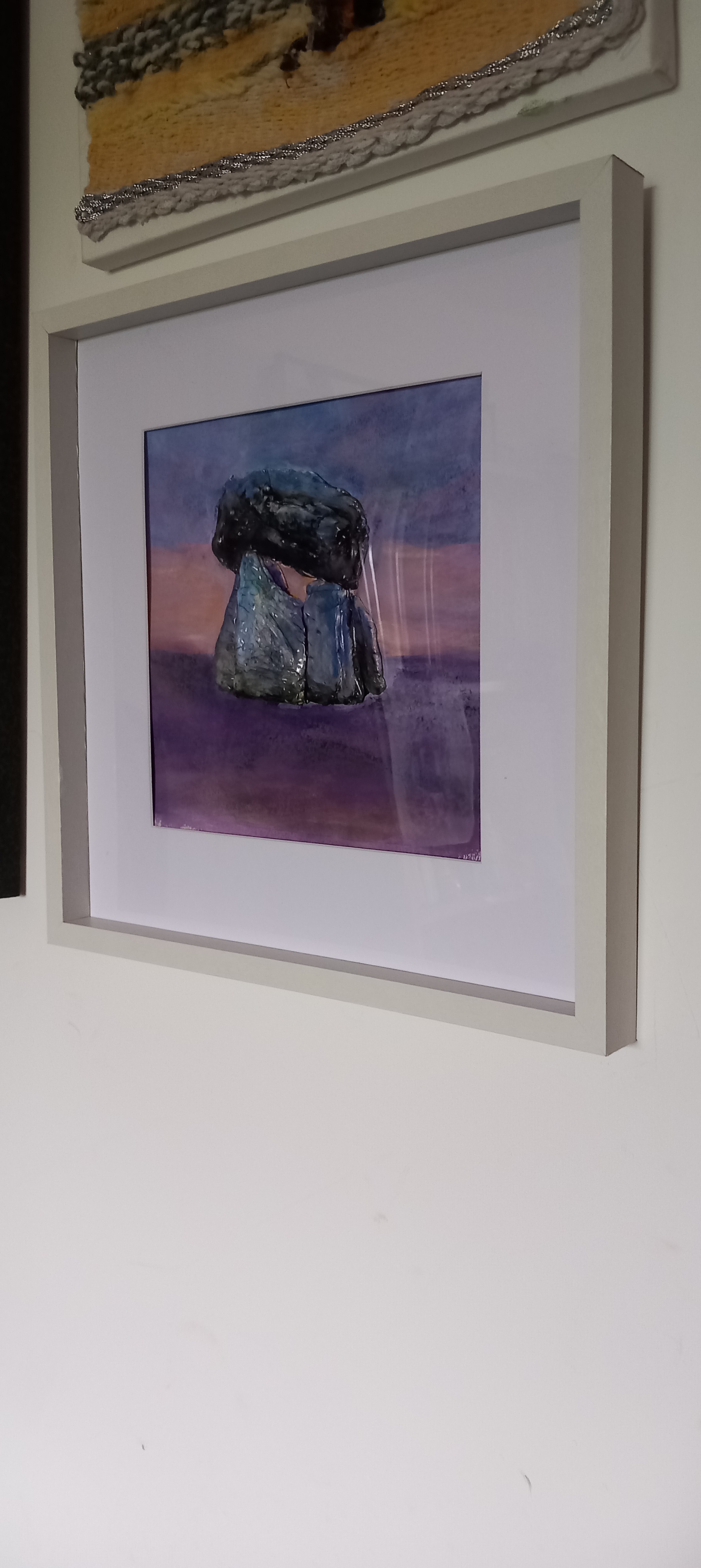
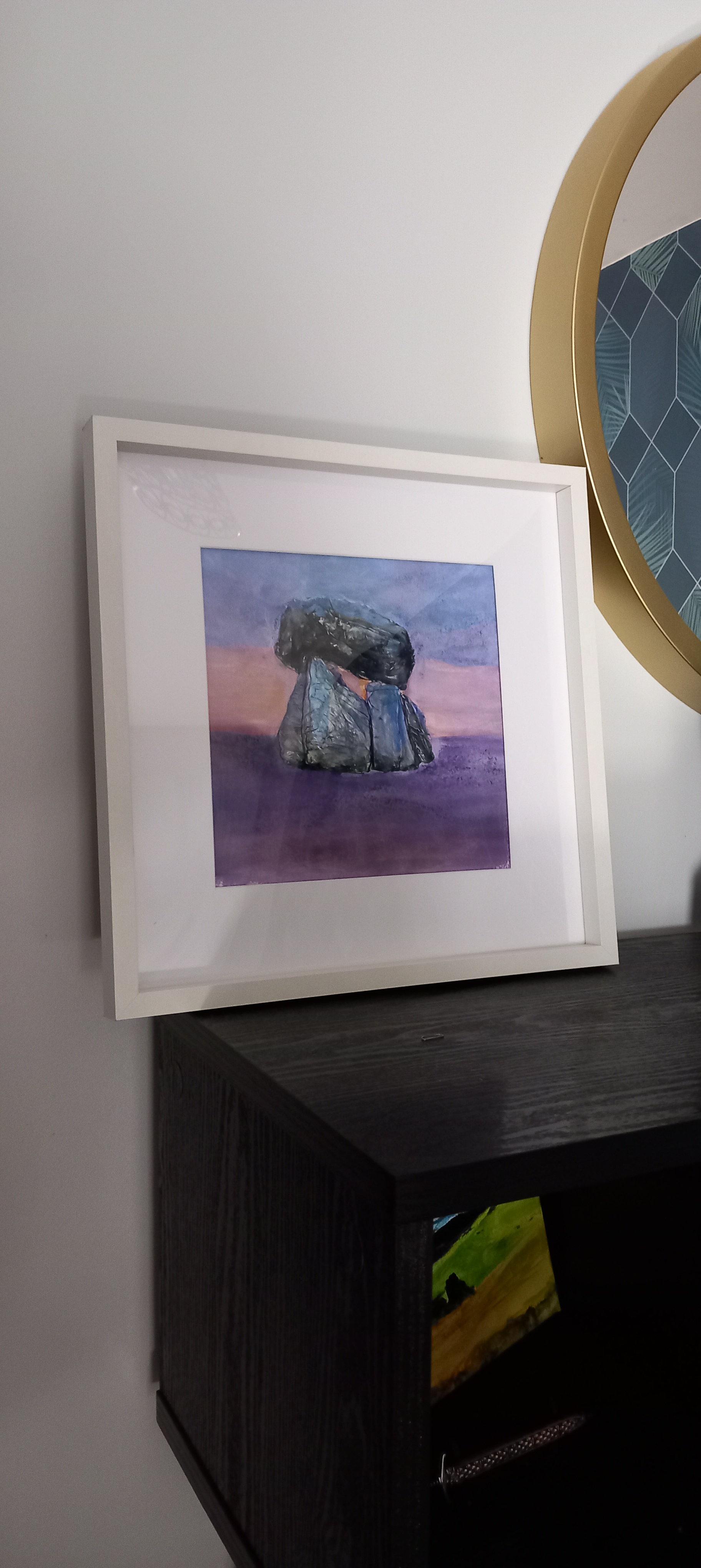
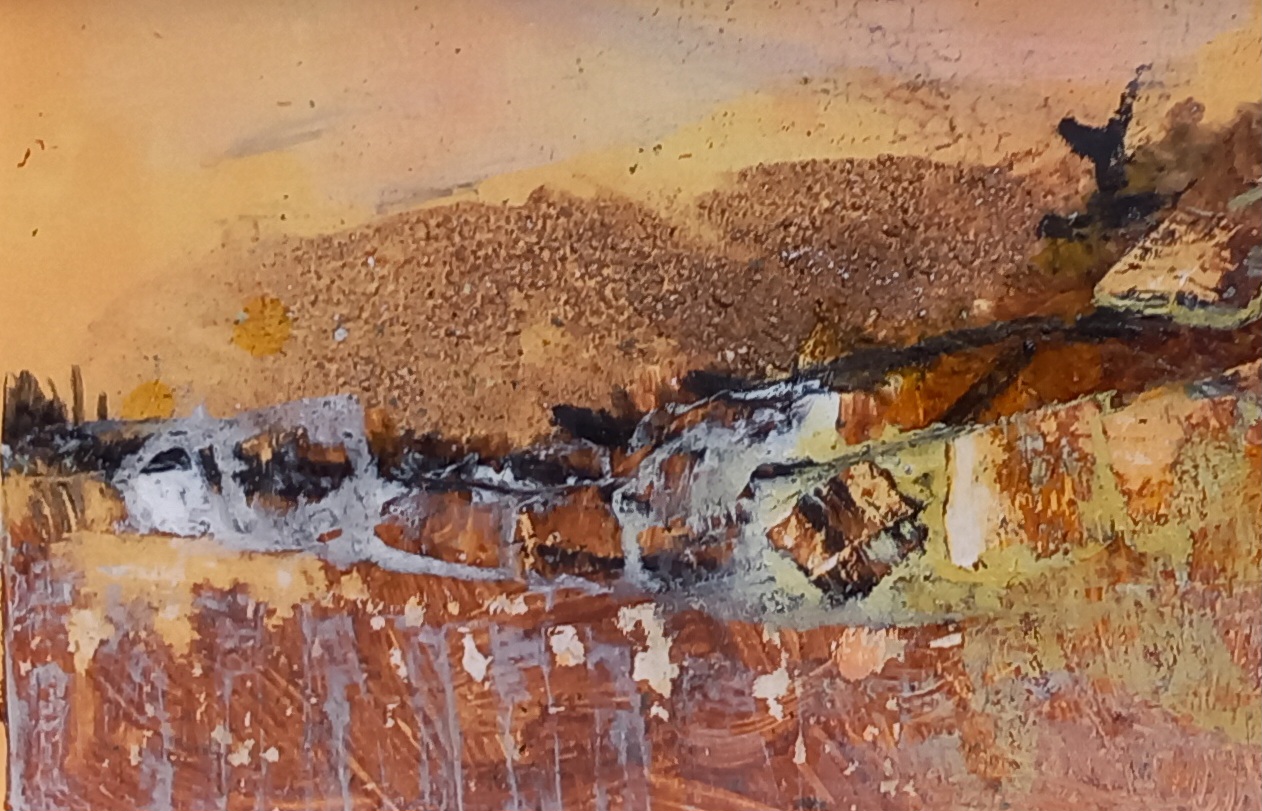
I used a photo of Carreg Samson, which is a +- 5000 year old dolmen located in Pembrokeshire, Wales, as inspiration for this piece.
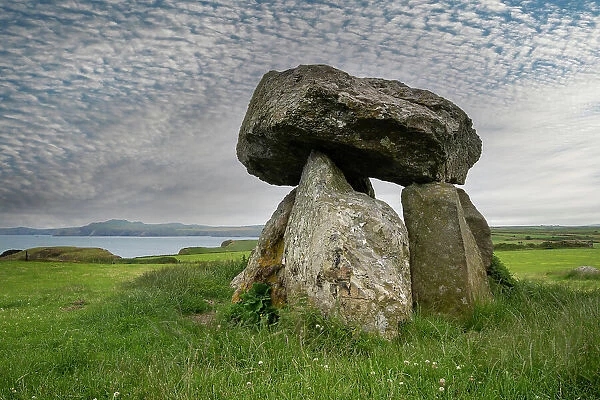
No, I haven’t been to see this dolmen in person yet but it’s on my list. I wanted to try something different in the interpretation – so out from hiding came the Fimo clay …
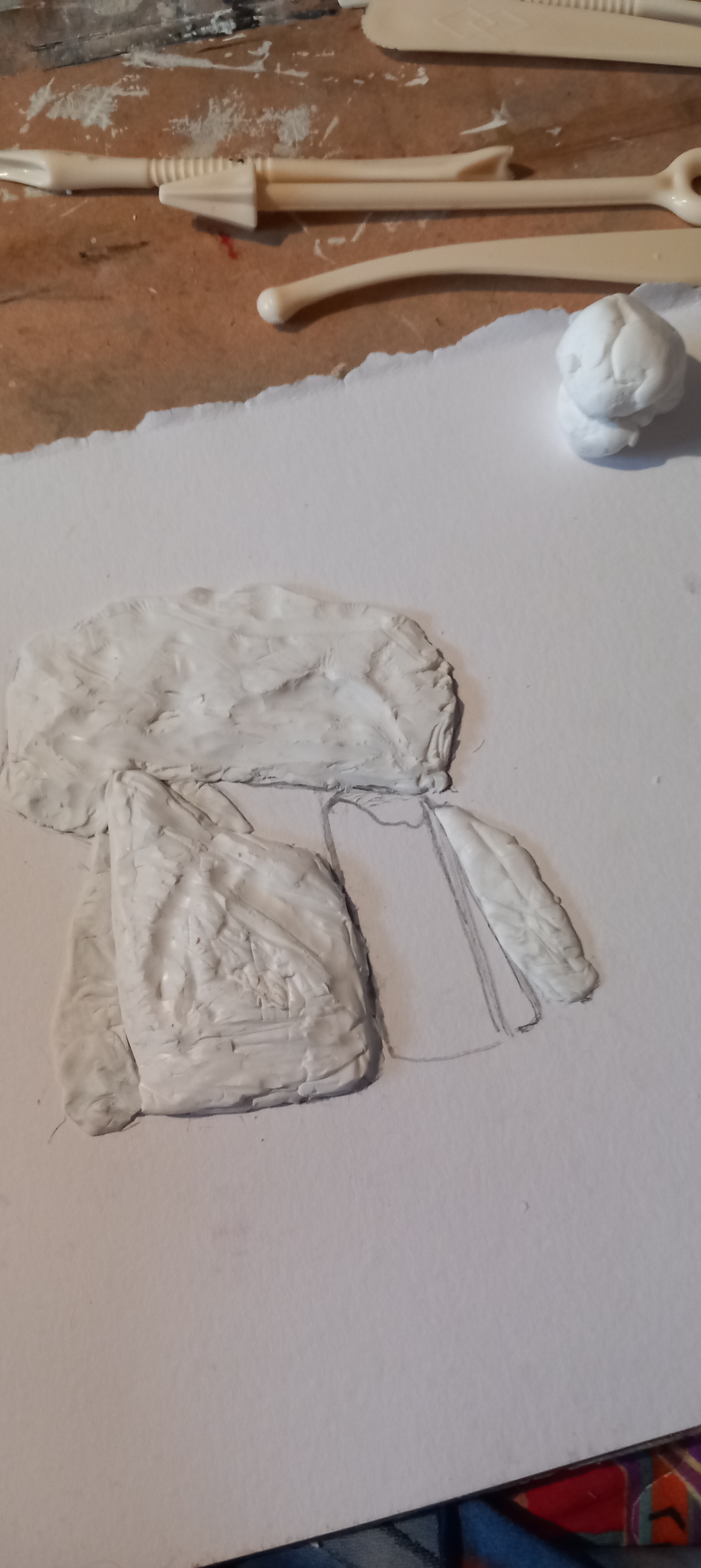
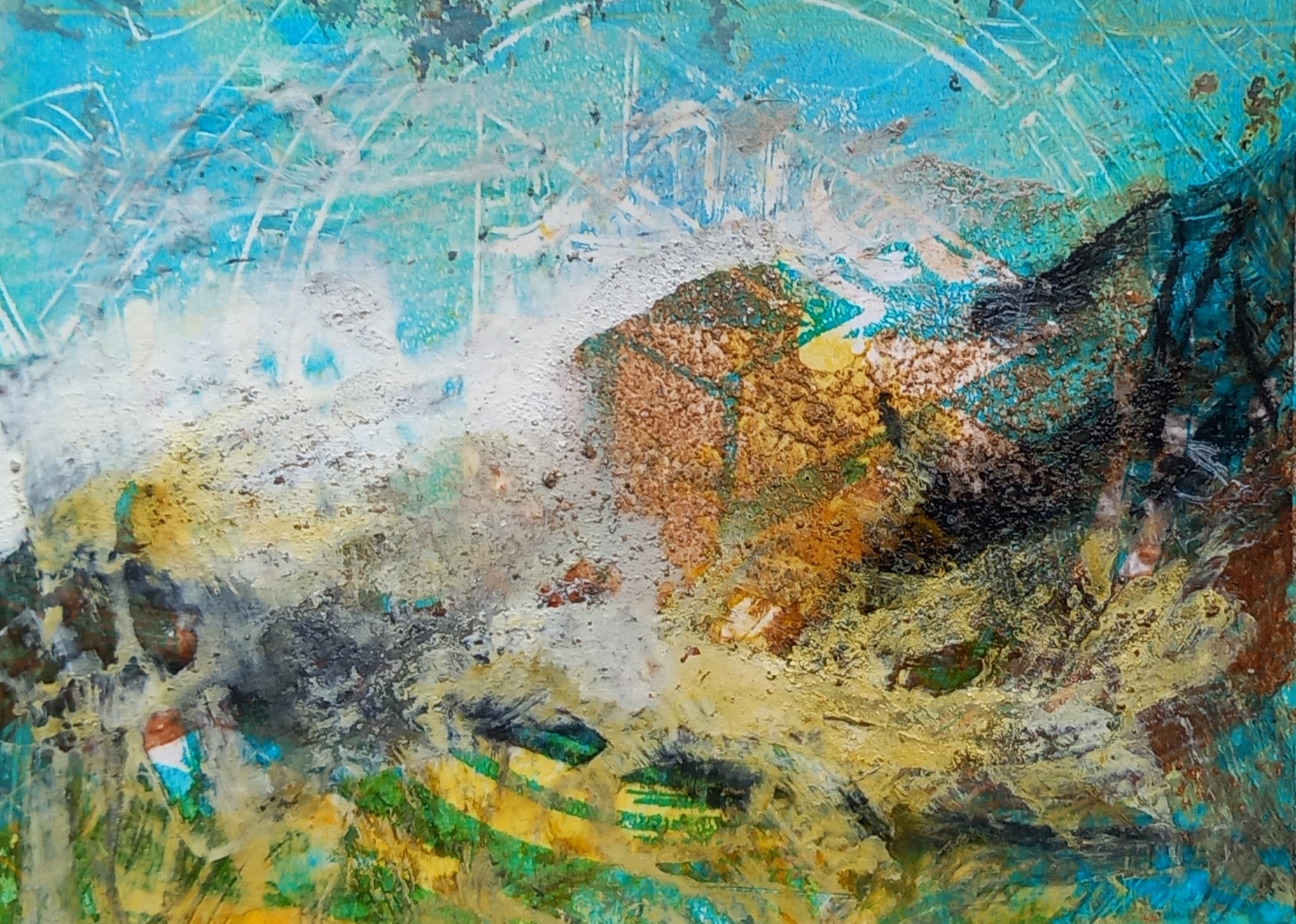
Then after more fiddling, I played around with watercolours on the surface
Today,I decided to work more colour into it and went a bit crazy, in the process knocking all my soft pastels all over the floor dammit.
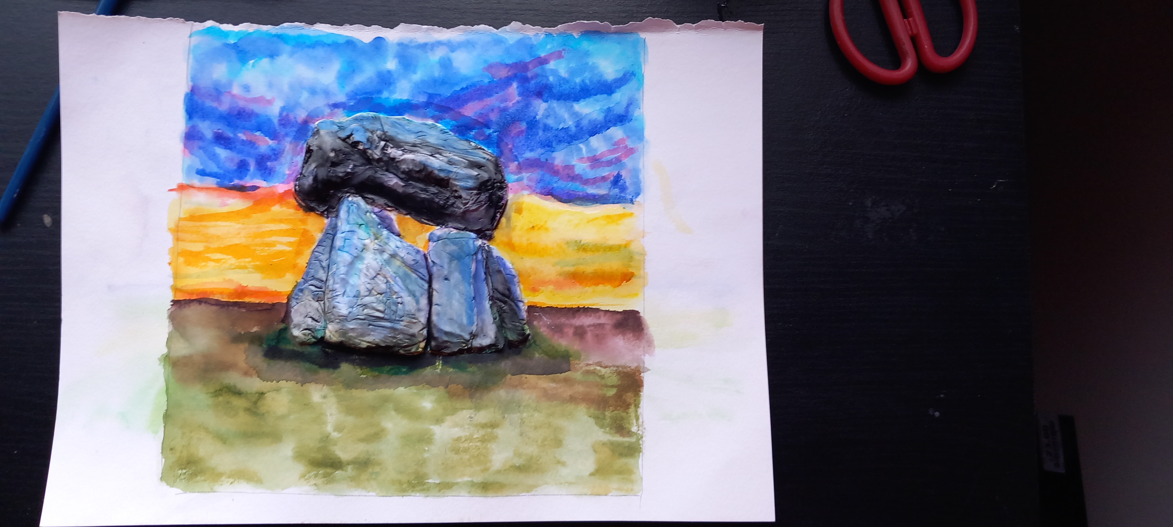
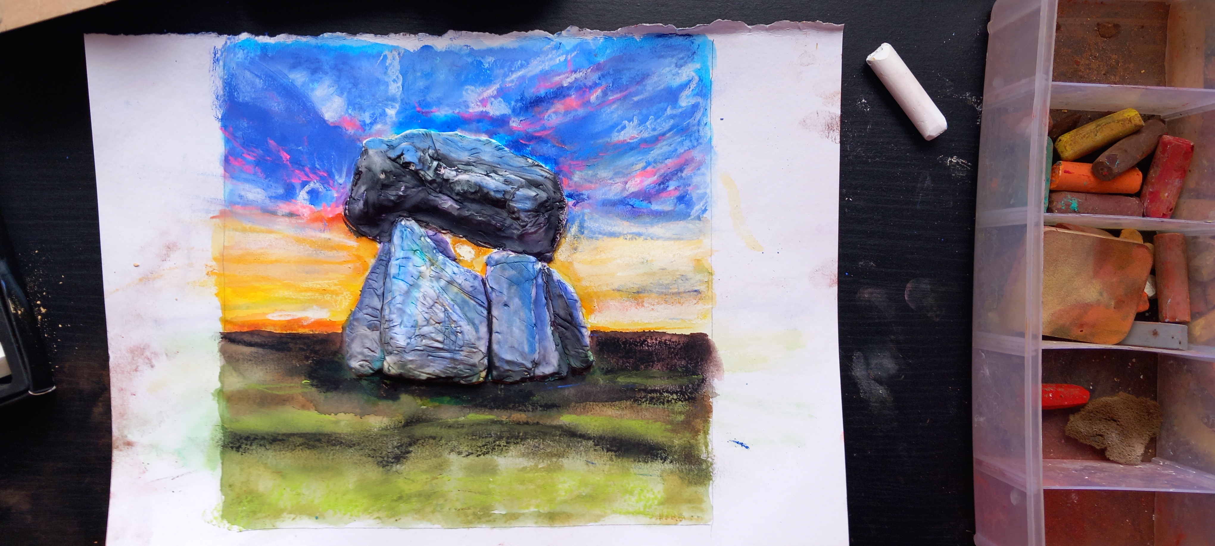
Eventually I decided to tone it all down a tad, layering some white and purple acrylic all over the surface, then spraying with iso-alcohol and water, manipulating the surface with a kitchen towel. I then sprayed it all with Winsor & Newton varnish sealant … so it kinda sparklies!
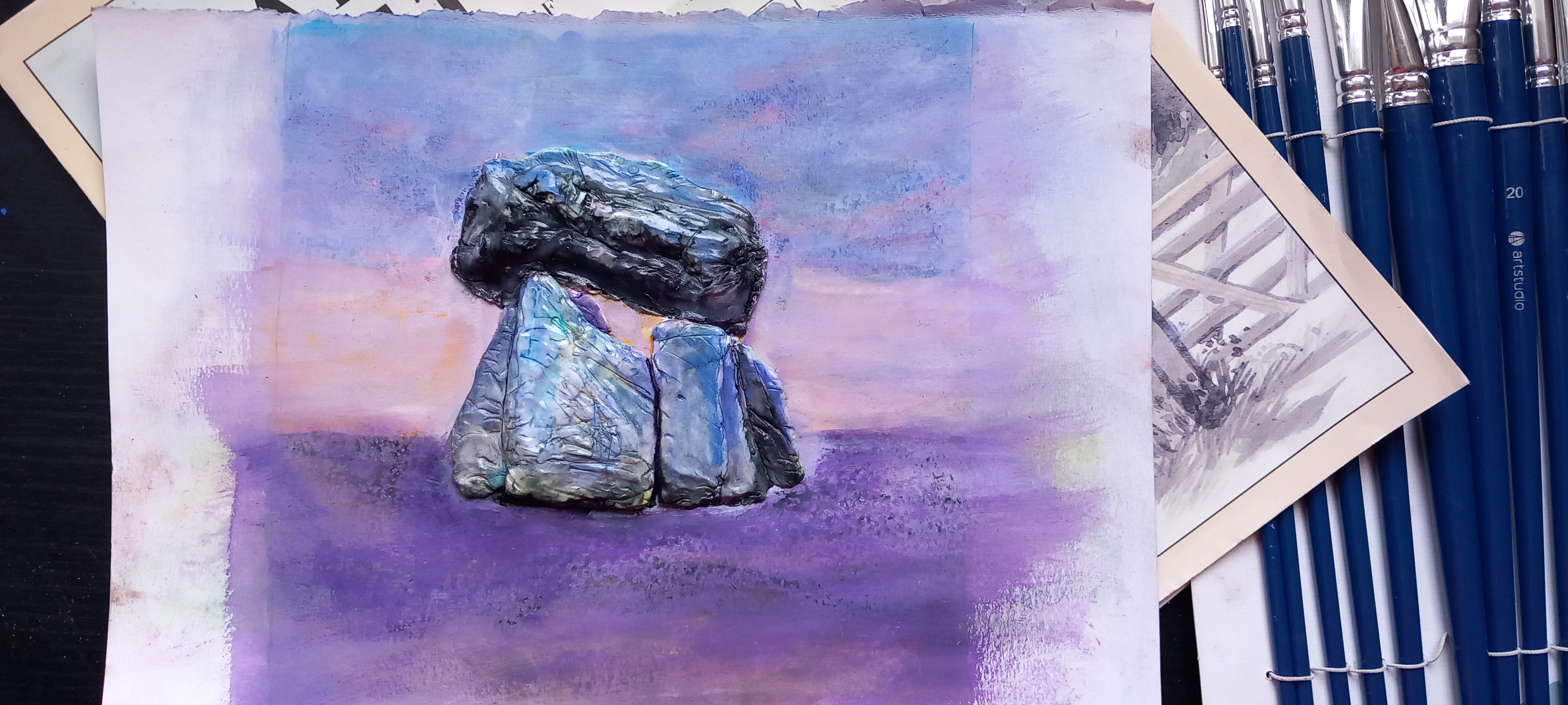
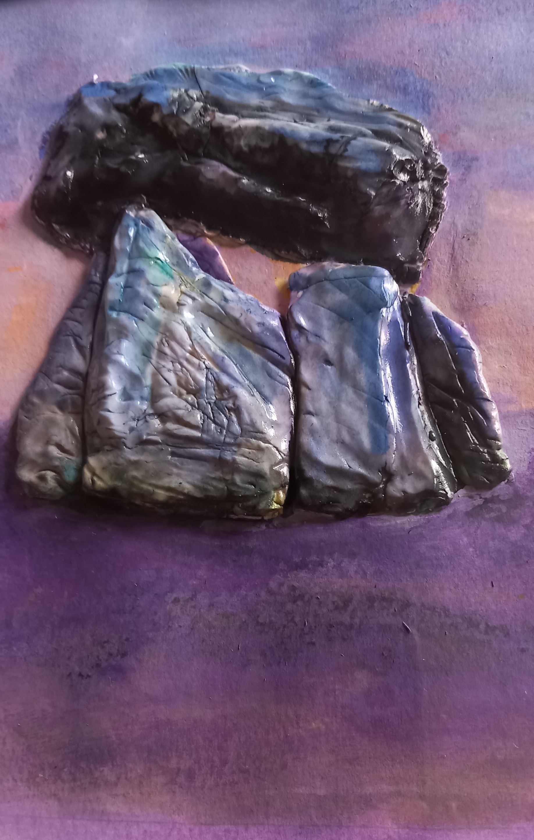
Dumbass that I am, I didn’t take enough photos of the finished thing before I put it in the frame and of course, there is a fair bit of reflection at the moment – hence taking photos from the side but you get the general idea. I kinda love this thing now.
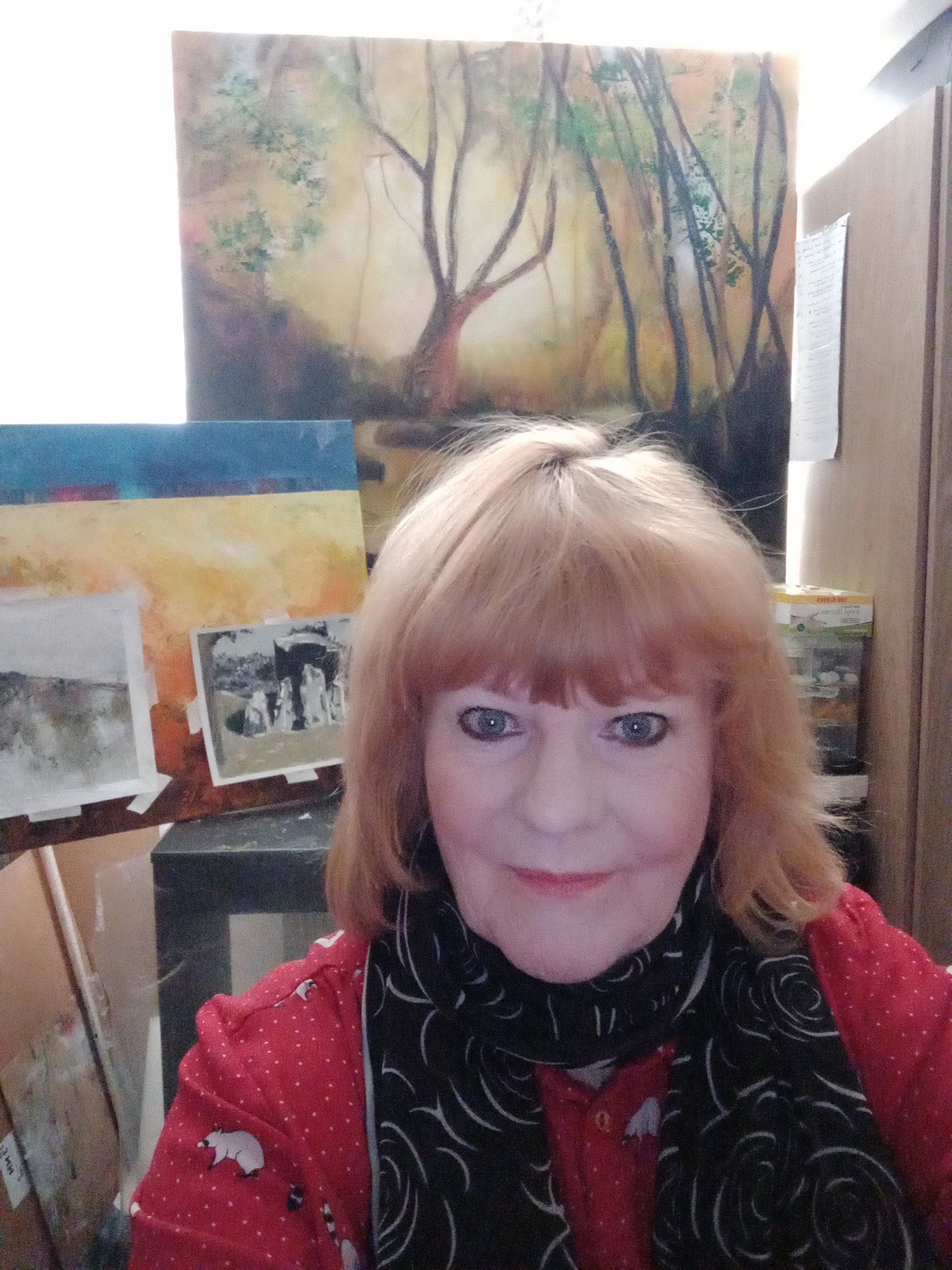
This is the press release that is generated by ArtFairEast for me to ‘send out to my contacts’ … apologies in advance for the mugshot, that’s the only one they wanted to use because it shows me ‘in the studio with my work’ (oi vey).
South Norfolk -Based Artist Janice Scott Selected for Prestigious Art Fair
A South Norfolk based Artist has been selected from international submissions to exhibit at one the UK’s major regional art fairs.
Janice Scott will be taking her artworks to Art Fair East in Norfolk. The fair is held in the medieval splendour of St Andrews Hall, Norwich from 1st-3rd December 2023.
Janice Scott said: ‘I am thrilled to have been selected for Art Fair East 2023. This will be a chance to reach new audiences with my work and I am excited to be showing in a fair that has already exhibited international names like Banksy and Nando Kallweit. I plan on displaying artworks themed around my work with mixed media and especially raw earth pigments.’
Art Fair East’s co-founder Will Teather said: “We are delighted to have Janice Scott taking part in our 2023 event. We always have more submissions than we can accommodate which ensures that the quality remains high.”
Founded, and curated by established artists Will Teather and Brian Korteling, Art Fair East has become acknowledged as one of the leading regional fairs in the country. Now in its ninth year it showcases contemporary art from around the UK and overseas. As artists themselves, Will and Brian are passionate about getting more people interested in original contemporary art and helping artists to make a living from their work. The 2022 fair attracted thousands of visitors from around the country.
Janice Scott has been producing art on a professional level for several decades. Here is a snippet from her blog:
‘I am inspired by and seem to concentrate on depicting natural forms or elements of nature into my paintings. I was born in Yorkshire, England but spent the larger part of my life in South Africa, where I experienced vast wilderness areas, such as the Karoo and Southern Drakensberg mountains. I am now back in the UK, living in South Norfolk. I work with many different materials and techniques, including printing. I use soft pastels (a lot), acrylics, oils and other liquid medium. I am currently exploring earth pigments and have found an almost visceral connection with these materials.’
More details of the event can be found at www.artfaireast.com
The event in sponsored by Musker McIntyre & Chadwicks.
Press release ENDS
Notes for Editors:
Janice Scott is available for interview,
Email: janiceheatherscott@gmail.com / Telephone: 07543 572364
Art Fair East media contact:
Kate Royall: hello@kateroyall.com
About Art Fair East
ART FAIR EAST is an annual event and aims to be an important art fair for the East of England. Our mission is to showcase quality galleries, dealers and artists to an Eastern region audience of art collectors and businesses. The 2023 fair takes place in the spectacular setting of St Andrews Hall, a well-known events venue at the heart of Norwich city centre.
Event information
Art Fair East 2023, St Andrews Hall, Norwich
PRIVATE VIEW Thursday 30th November 6pm to 9pm
OPEN TO PUBLIC Friday 1st December 10.30am to 5.30pm
OPEN TO PUBLIC Saturday 2nd December 10.30am to 6.00pm
OPEN TO PUBLIC Sunday 3rd December 10.30am to 5pm
Social media:
I have been reworking an older plexiglass drypoint study I did a while back of a dolmen (duh, what else). I received an electric engraving tool set for my birthday from one of my good friends (and art patron 🙂 ) … so thought I’d see how it performed on the plastic. I really enjoy doing dry point printing, as it’s quite tactile and relatively easy to do. You don’t need to roll out ink onto a surface and then apply with a roller or brayer – you can just squeeze the ink out directly onto the plate and rub in gently with paper towels and bits of rag. Then once you have wiped off the excess ink, you can print.
I used the back of a metal measuring spoon to do the printing this time – although when I go for my next printing workshop next week, I will be able to use the actual press – quite excited to see how the two processes will compare.
I made three prints in total – first one was using Fabriano all media paper. In all cases the paper is soaked in cold water first, allowed to dry so that it’s not shiny and then used for the print.
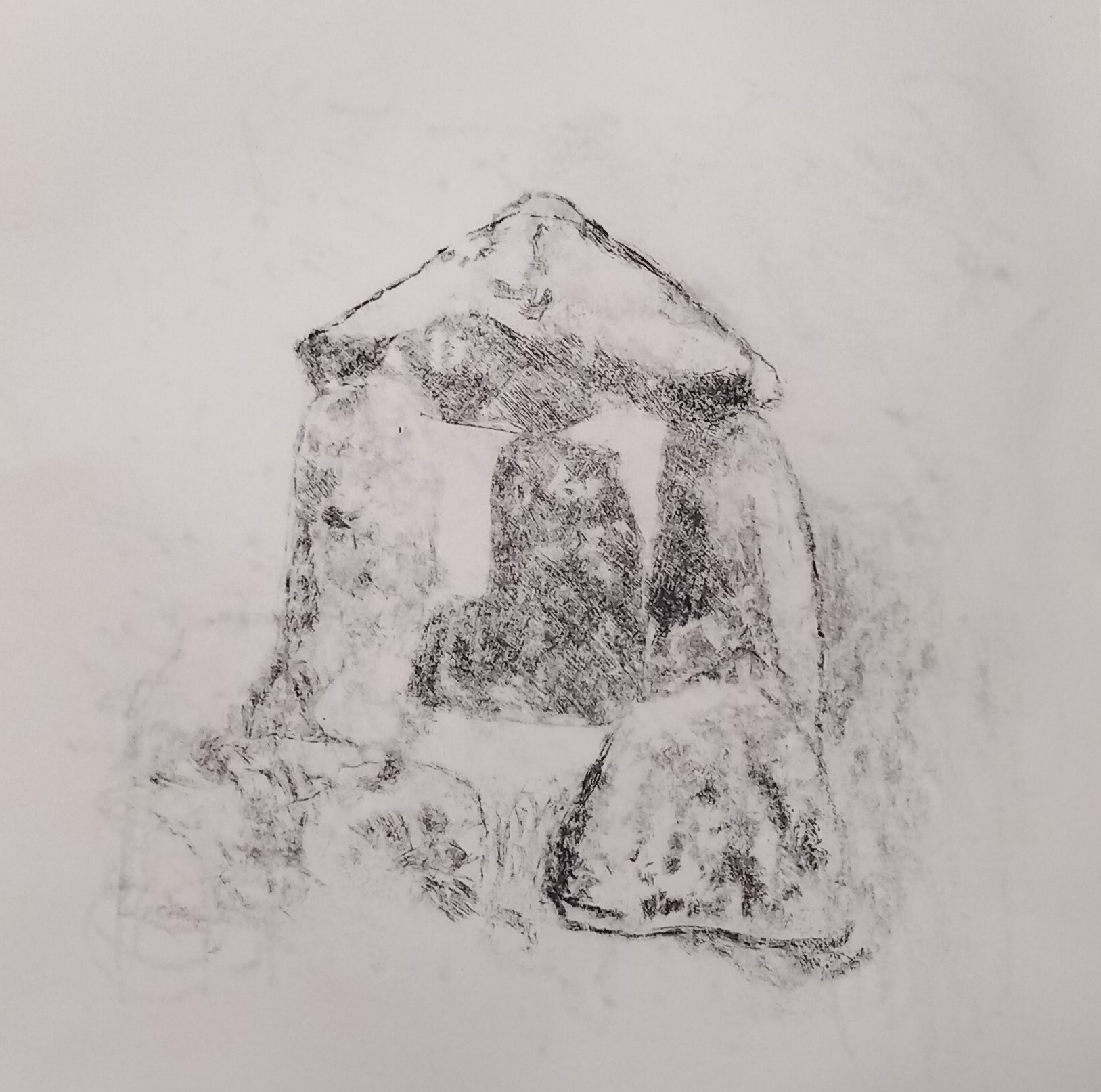
It is very indistinct, largely because of the thickness of the paper and me taking off just a bit too much ink. If this had gone through the press, it would have been far more successful. I still like it though.
Next, I tried plain old cartridge paper – from my A2 sketchpad – I cut two pieces to size.
The result of the lighter paper is obvious – far more detail from the marks has come through and it’s not gloopy or too dark. Drypoint typically creates a soft edge (almost furry), which is what I love about it. I was pleased with this but wondered if it is was a ‘one off’, could I do it again?
Well yes, I can repeat the process – this time I didn’t remove as much of the ink and it has created quite a strong print. Spot the gloop though. (Left hand orthostat – lol).
It’s fascinating (for me) to compare earlier attempts at this same subject. The first set done from the original etching, I made use of a dampened Japanese paper (which is furry to begin with) and the ink bled all over the place.
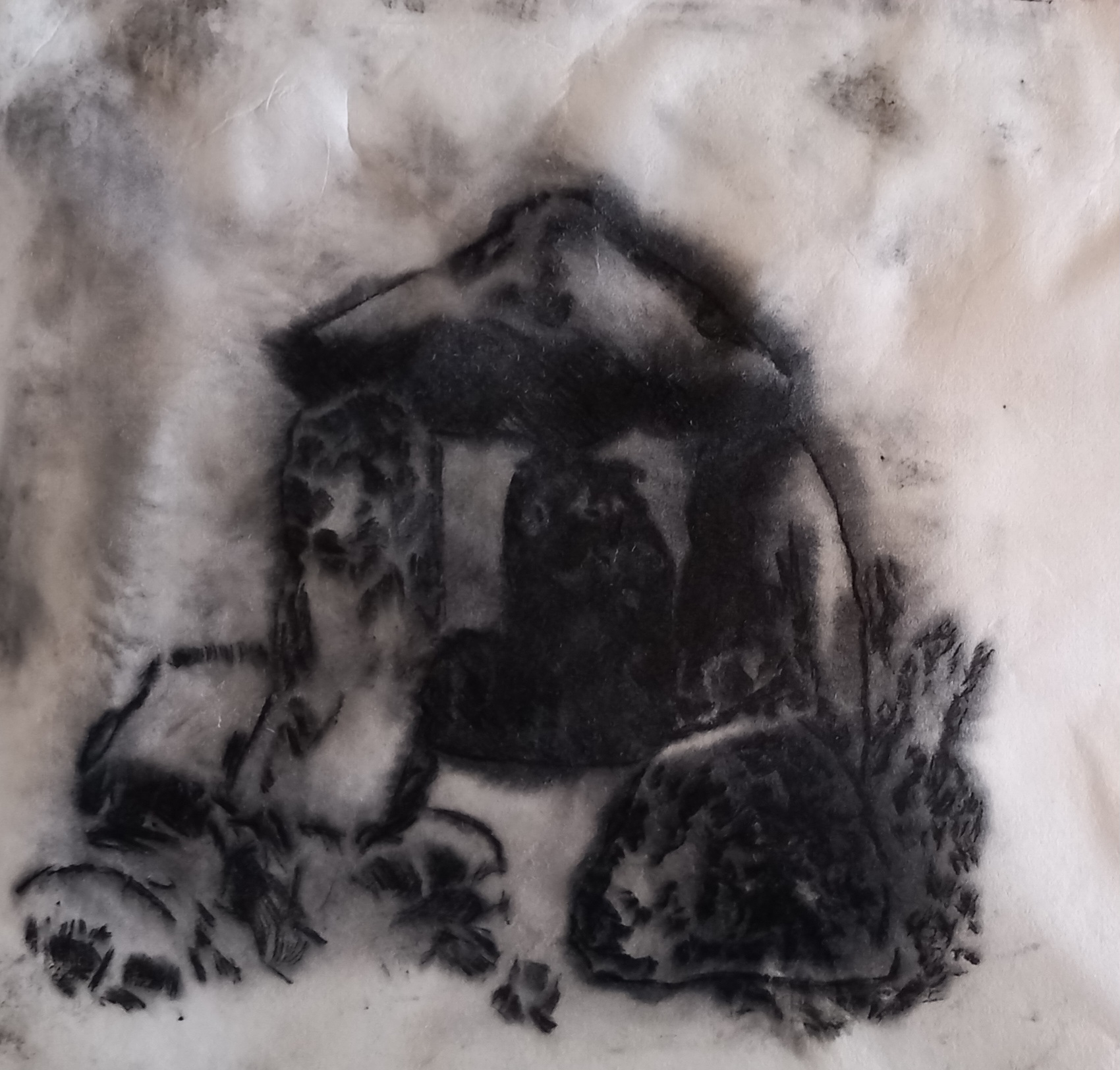
Despite it’s ‘furry’ appearance, I really like this one, it has a kind of mystery about it.
Anyway, I am pleased with all of these attempts and my printmaker friend is also interested to see how well the plate performs under an actual press – can’t wait to show the results of that experiment later on this month.
EDIT: I will be exhibiting the following five pieces at the Tasburgh Art Festival over the weekend – 4th to the 5th November. This event is an annual fundraiser and 20% of the proceeds of each painting go to the registered charity that it supports. All these pieces are framed in white frames, which measure 31.5 cm square.

At the moment, I am doing quite a bit of course work inbetween other projects, such as:
And then there’s ArtFairEast.
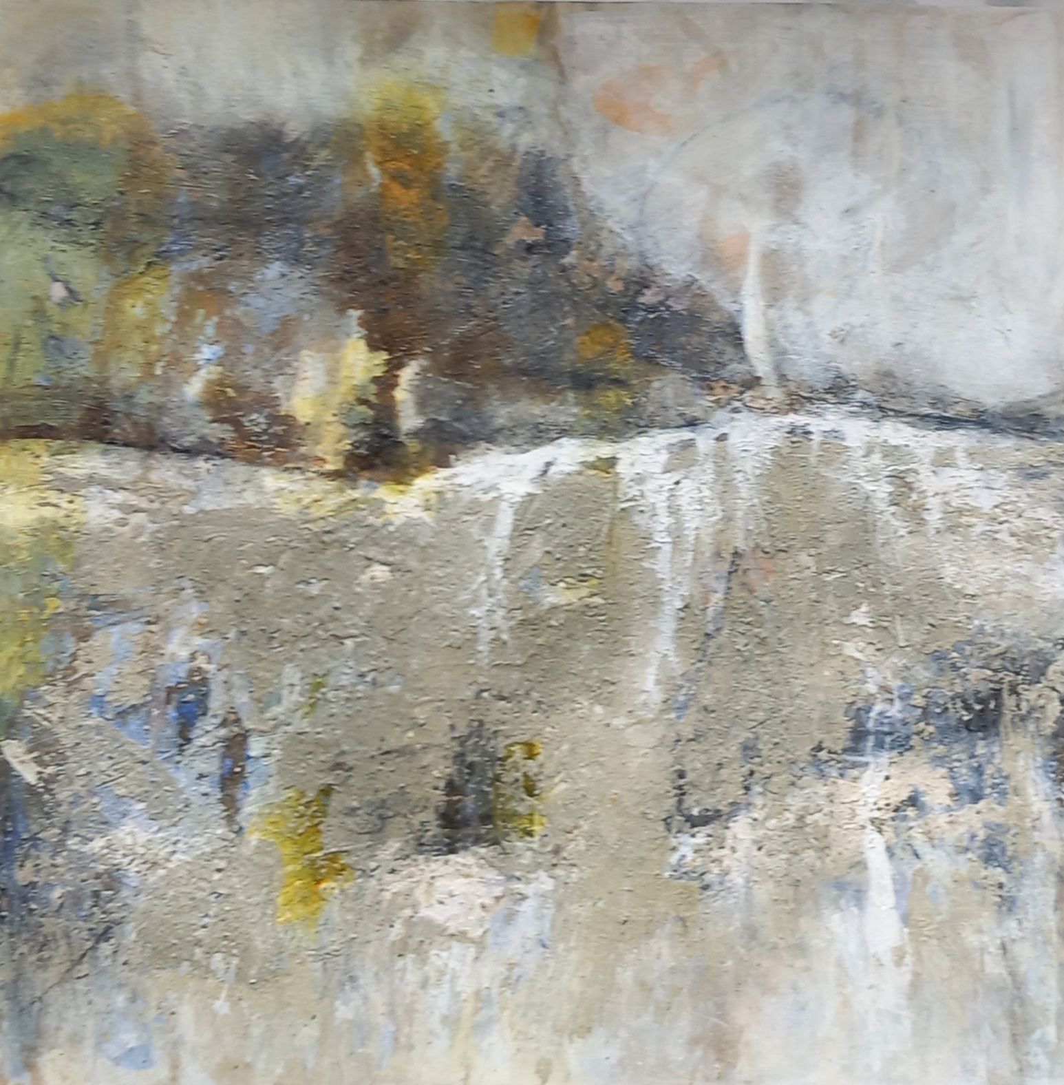
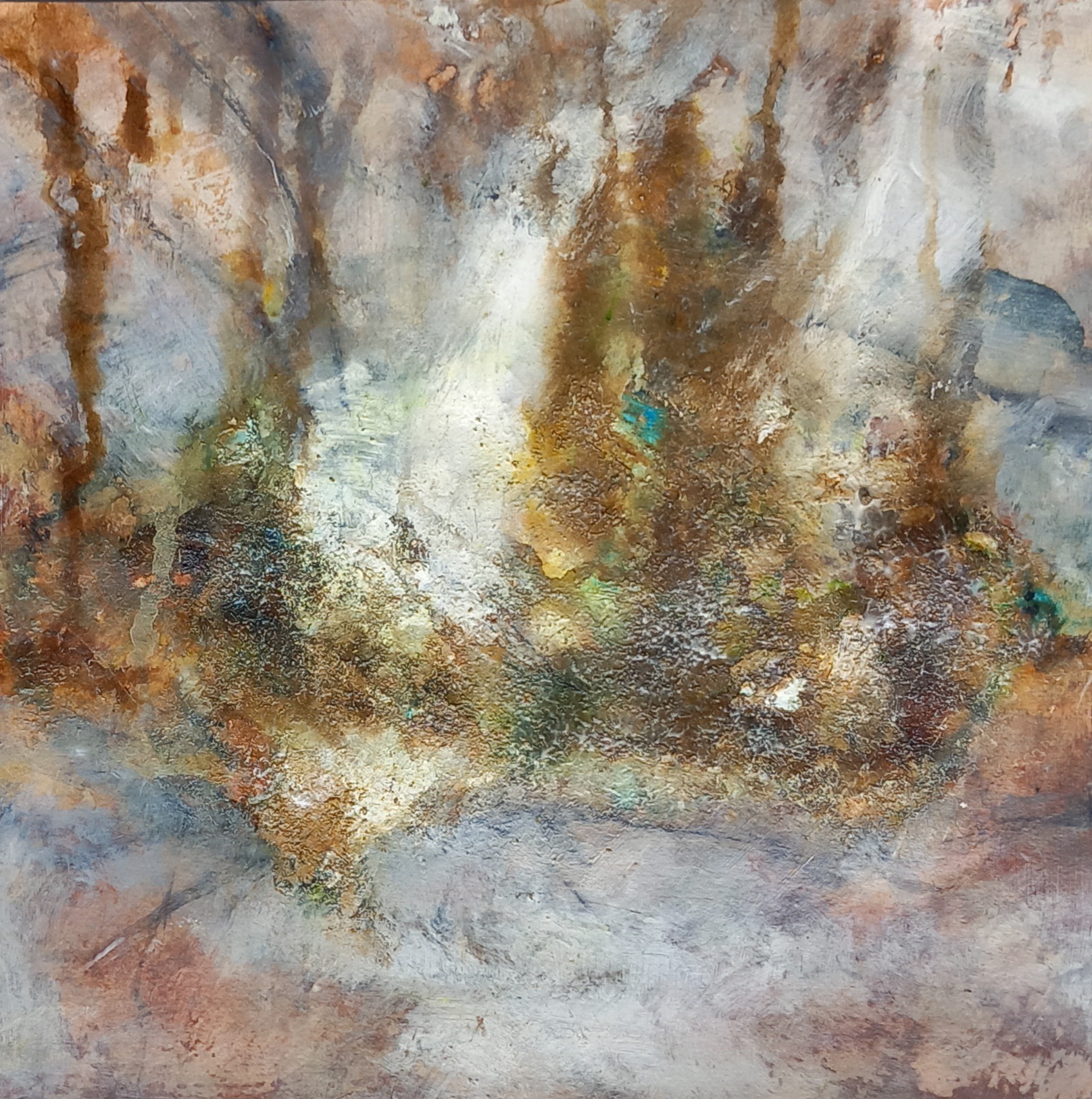
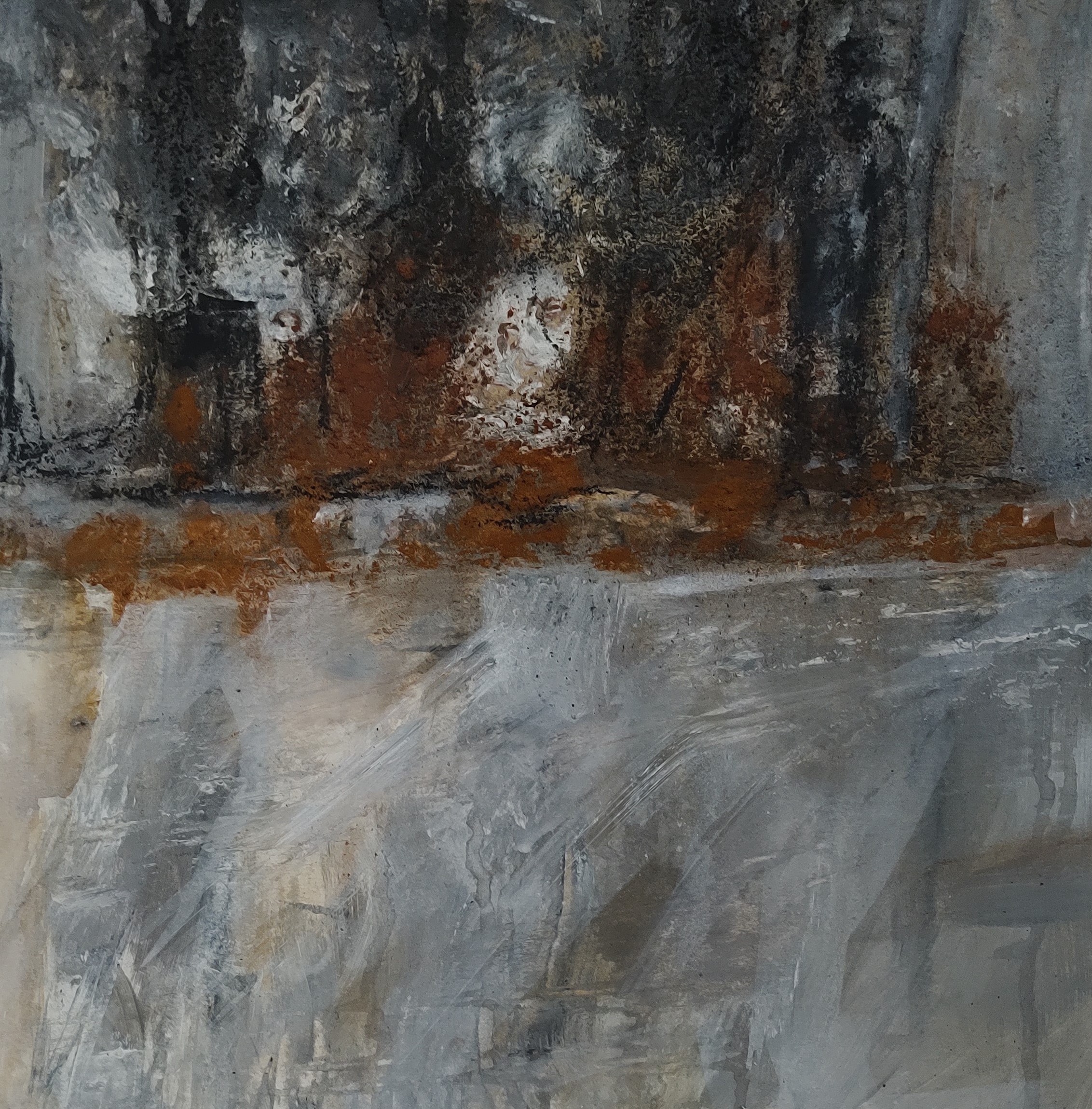
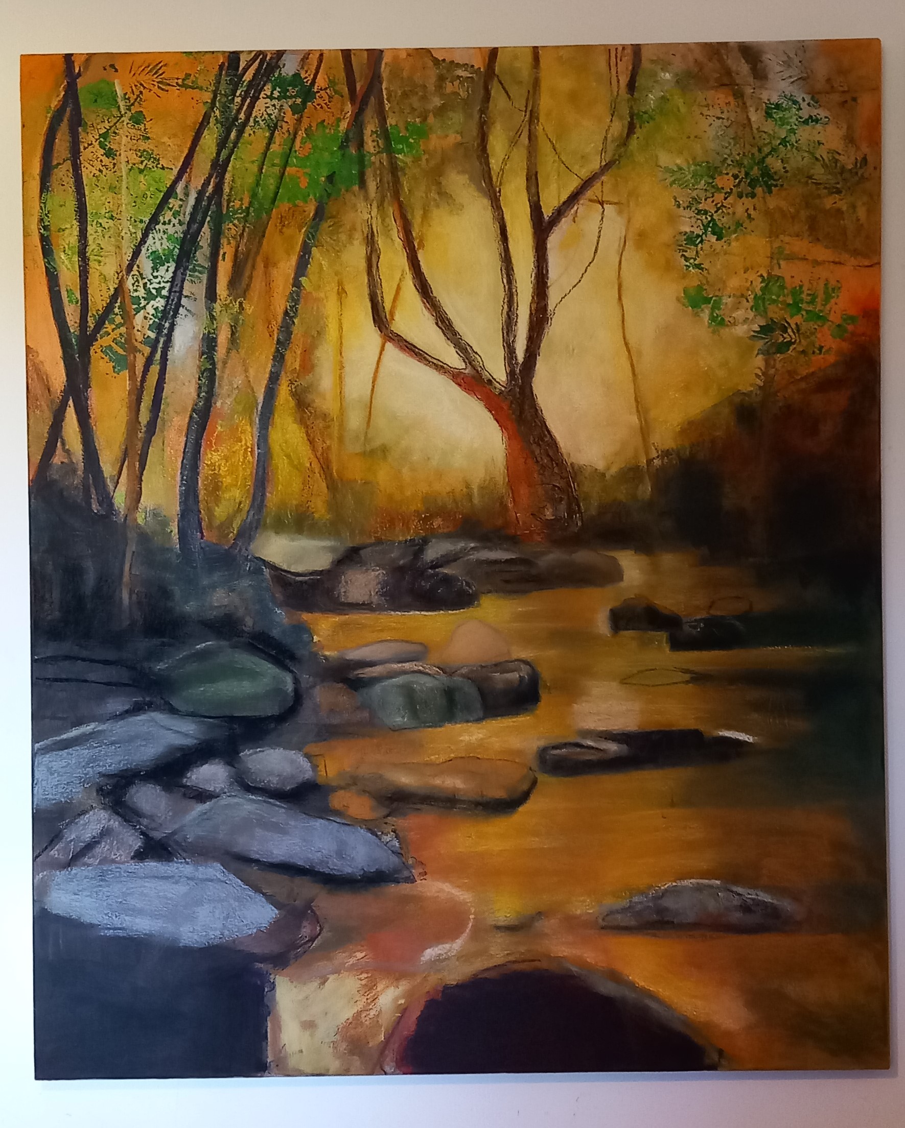
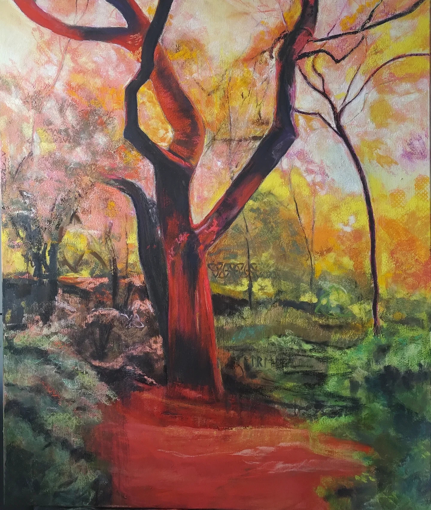
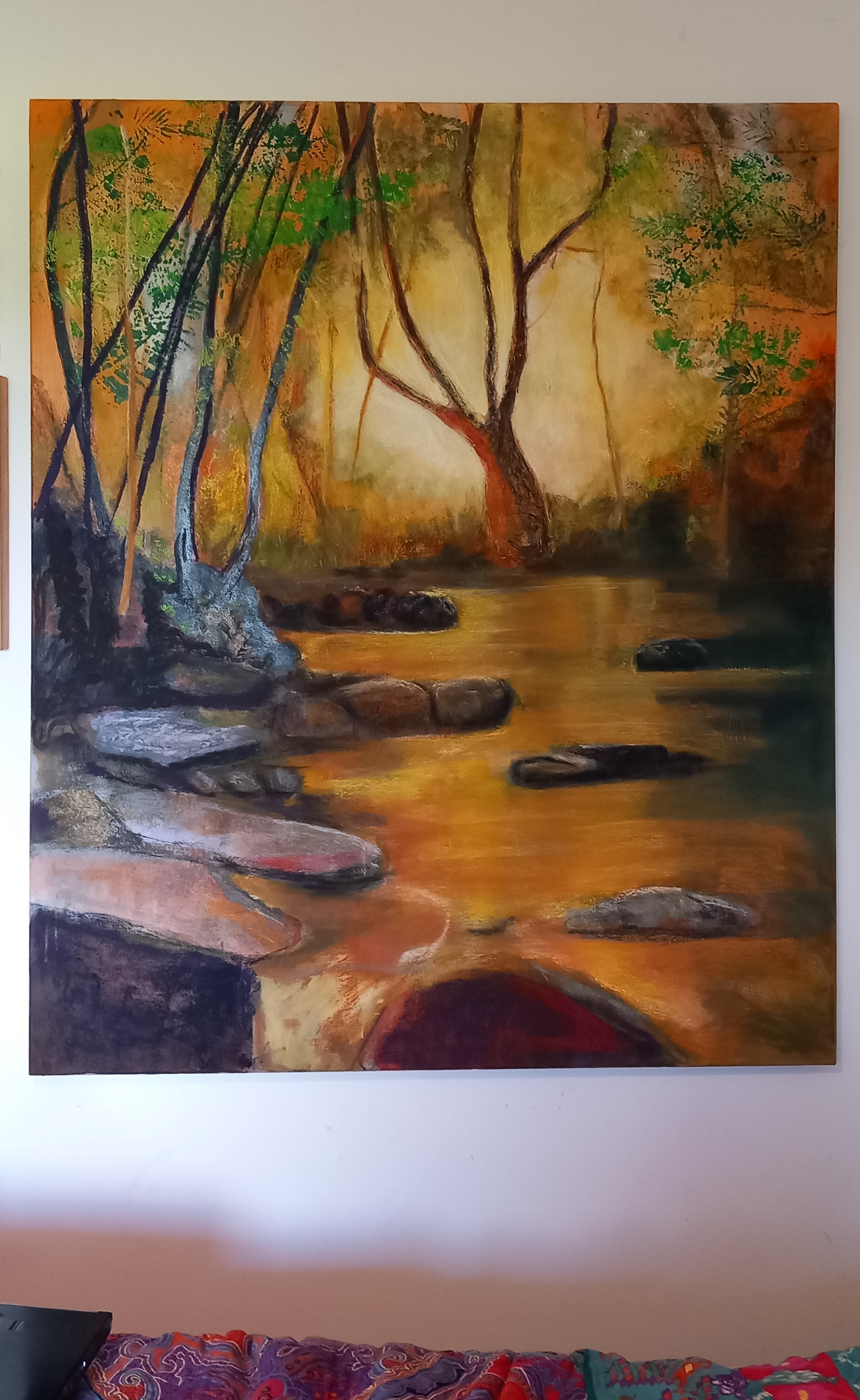
I am trying to prepare a cohesive body of work – focussing on raw earth pigments and natural materials – for this exhibition at the end of November/beginning of December. I have already framed over 3 dozen pieces and am looking at whether or not to completely change the below painting – i.e. paint over it and do an earth pigment abstracted image on top – i.e. obliterate this woodland scene altogether.
Finally – I have to apologise to people who visit my site because of the ads … I just point blank refused to pay again for the non-free template option on WordPress, as I didn’t feel this site was generating any additional business for me – I seem to get more response from Instagram. However, I need to keep my own domain, so this is why I am still posting to the blog here in an ongoing but erratic fashion.
Following are a few pieces that I’ve done recently in preparation for various exhibitions that I’m supposed to be involved with before the end of this year … more on that in next post.
Places’
Set of 4 x 13x11cm abstract landscapes on Fabriano paper using raw earth pigments and mixed media (acrylics and inks).
For this series I used pigments sourced from the incomparable @peteward.artist
Fremington Grey, Gunwalloe Gold, Perranuthnoe Ochre, White Meeth, Leswidden White, Peppercombe Red, Trevellas Green.’
These are small ones, photos show the studio set up while I work and then the finished pieces.
Then I produced these larger ones:
‘Places2’
Set of 3 x 30X30cm abstract landscapes on Fabriano paper using raw earth pigments and mixed media (acrylics and inks).
‘Places – Gold’ – Janice Scott – Raw Earth pigments and mixed media on Fabriano paper

‘Places – Sail’ – Janice Scott – Raw Earth pigments and mixed media on Fabriano paper

‘Places – Trees’ – Janice Scott – Raw Earth pigments and mixed media on Fabriano paper
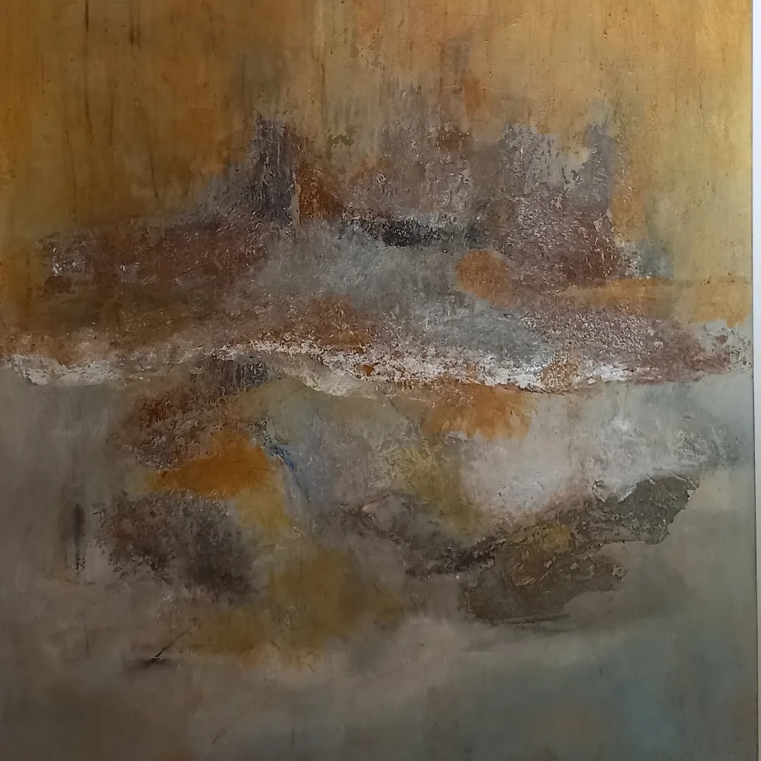
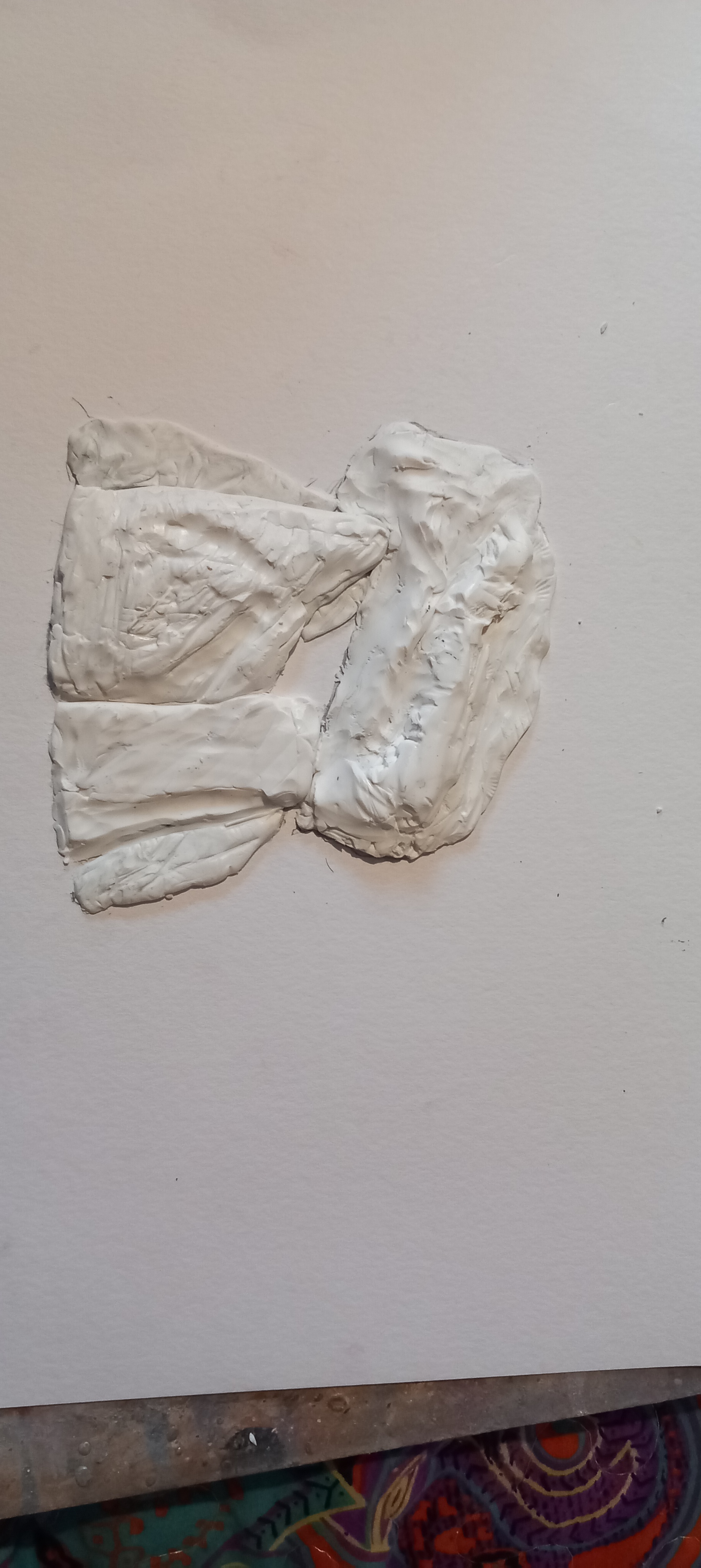
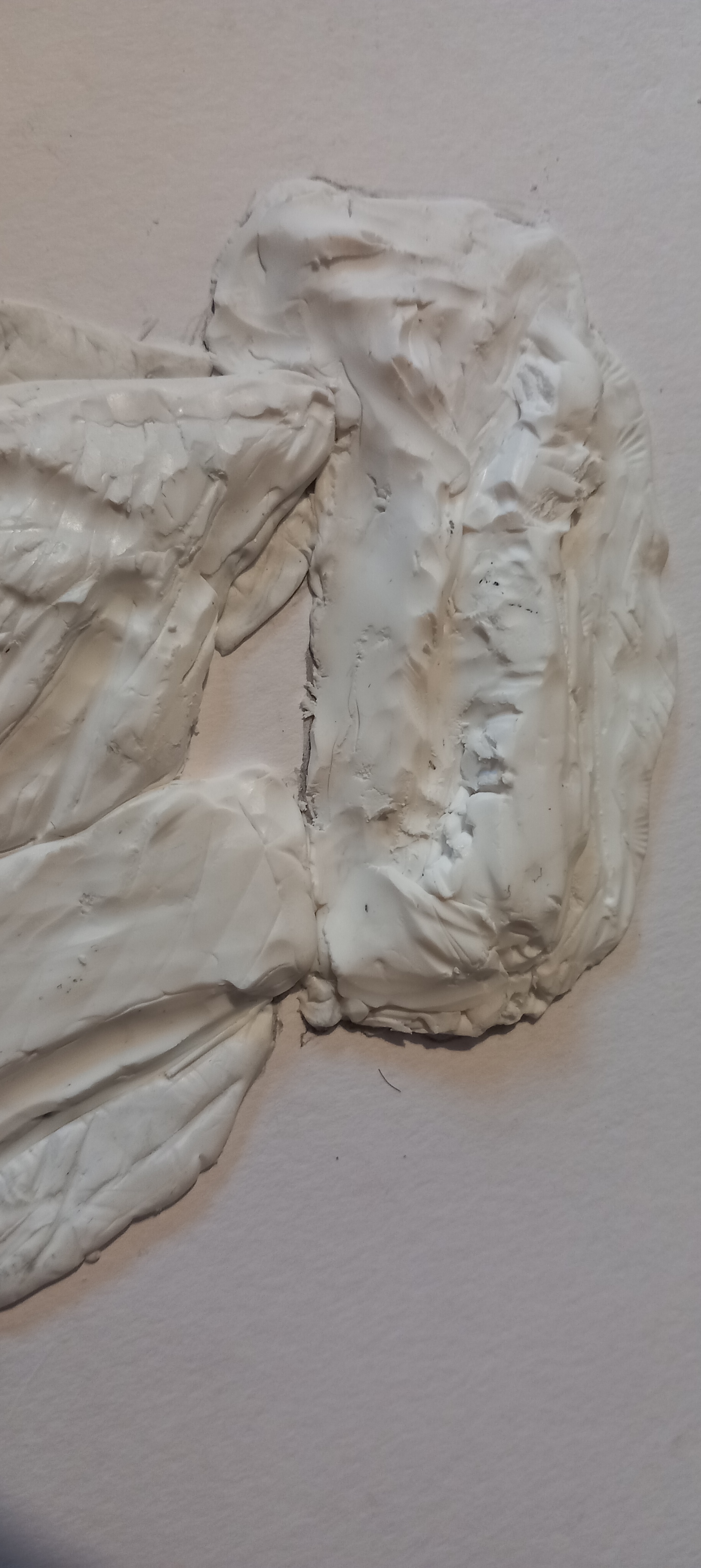
Mixed media on two reclaimed wooden panels – each about 31 x 26cm x 2cm
Bodowyr burial chamber is a neolithic ‘monument’ located in the middle of a field on the island of Anglesey. I visited this dolmen earlier in the year and took hundreds of photos of it. This is more of a homage to the place, a remembrance and I really enjoyed making these twin pieces. One on the left has a transferred /collaged image of the building and the other is a ‘ghost’. Recently, I have been prone to using Celtic symbolism and motifs in my work, however that is obviously incorrect when looking into the history of these ancient ‘structures’ – people of that age would have more likely used spirals or cup marks to decorate the stone.
I started working on this very large canvas just over a month ago (this is the before and after at the start) :
It has gone through over fifty adjustments and is still very much a work in progress but it’s slowly starting to reveal itself to me. Below is how it looks today – lots of work still to do all over the surface – especially now on the left, which is shiny because it’s acrylic paint there and the rest of the painting is soft pastels (which doesn’t reflect camera light).
I hope to have it finished during next week. Once it has been sealed, I have a wonderful handwoven 1″ wide celtic designed tape, which I got from a lady in Turkey and I will use this to wrap around the outer edge of the stretched canvas. This painting will be in my exhibition at ArtFairEast at the end of this year. I’m looking for title suggestions!
WIP – Mixed media on stretched canvas – 1.2 x 1 metres.
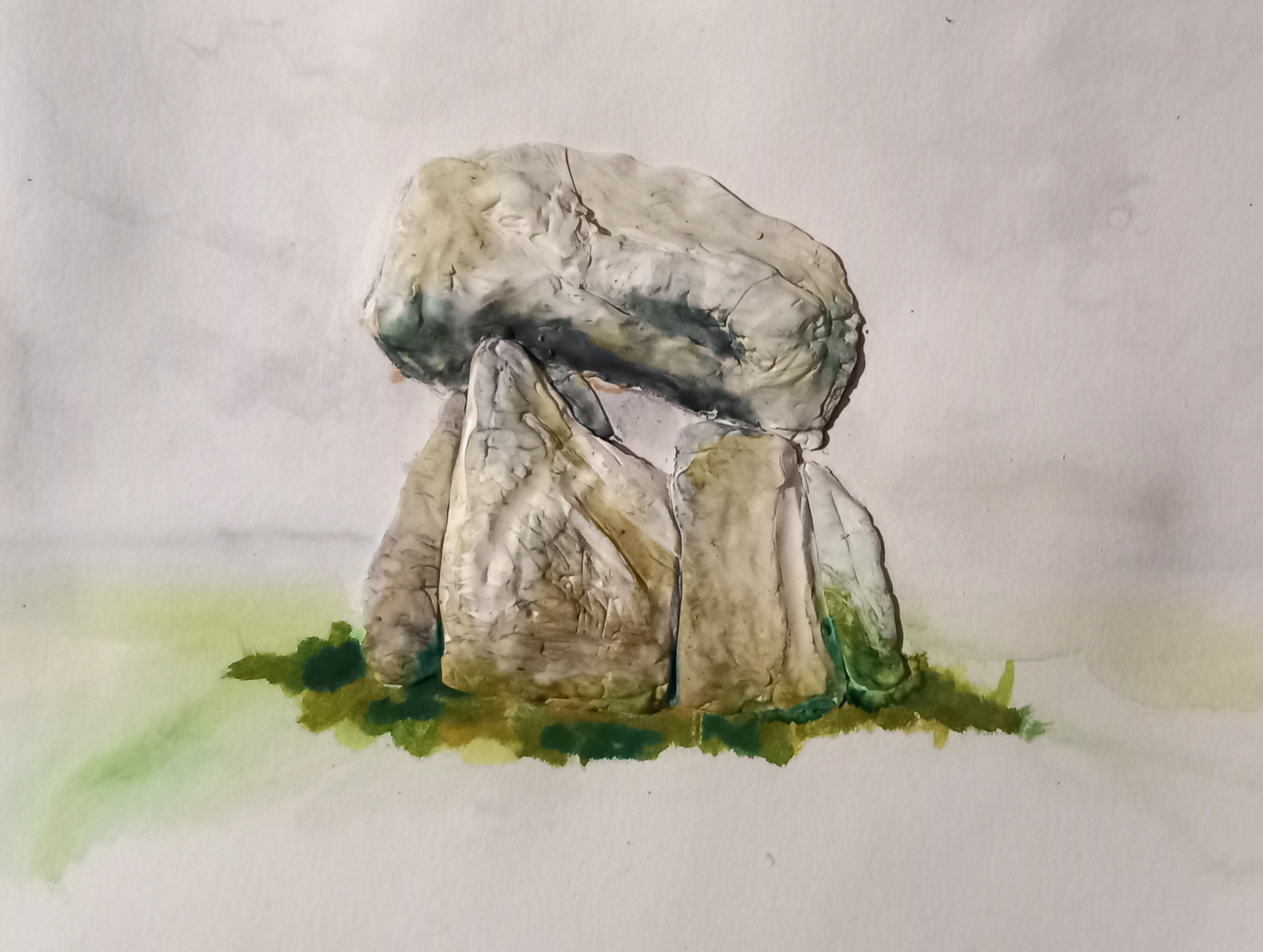
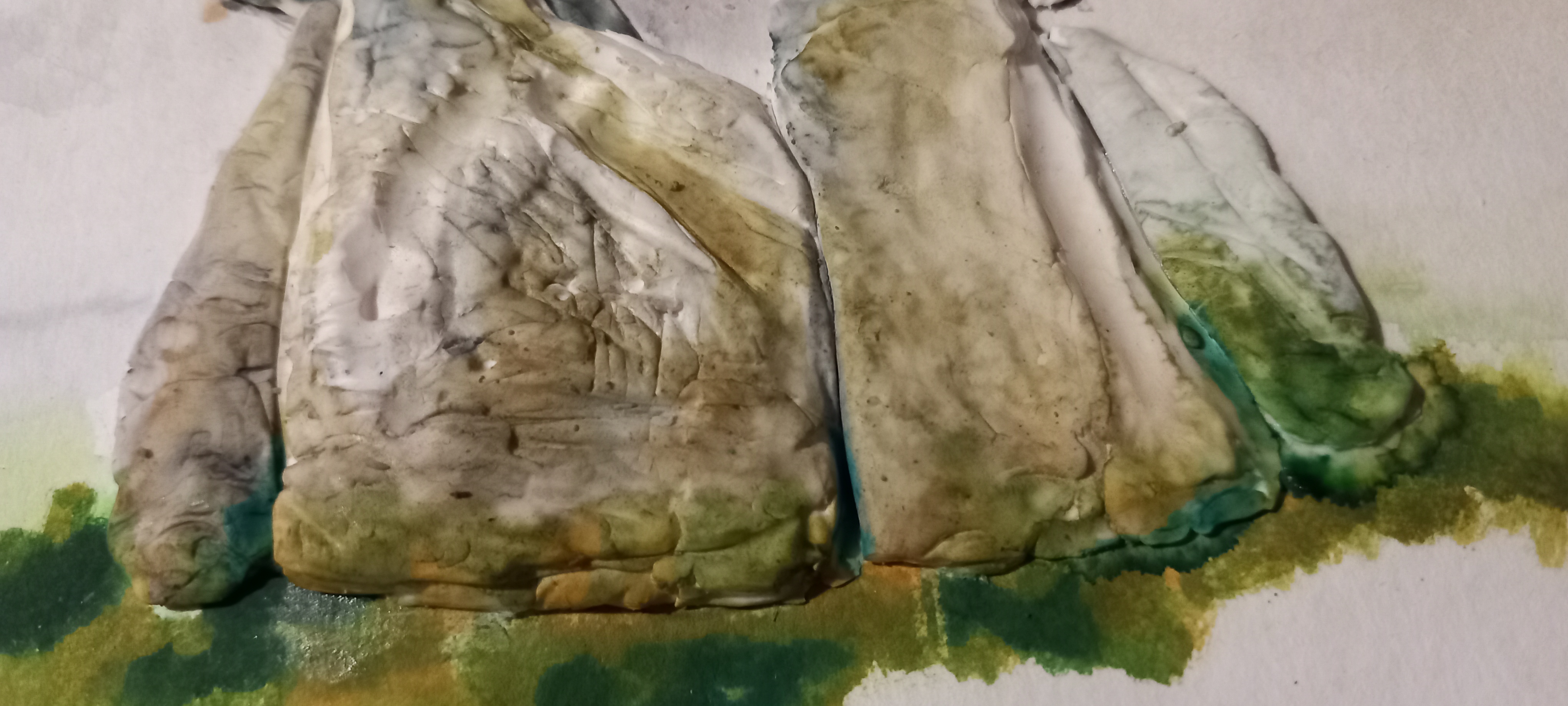
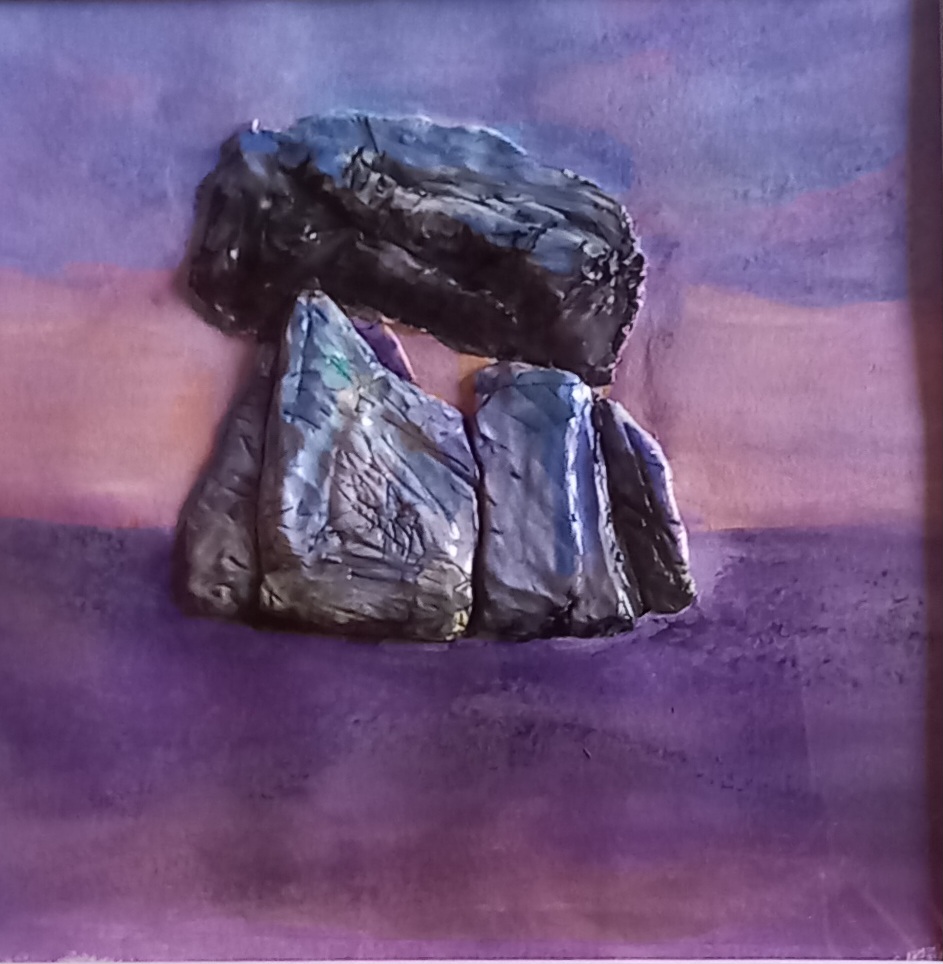
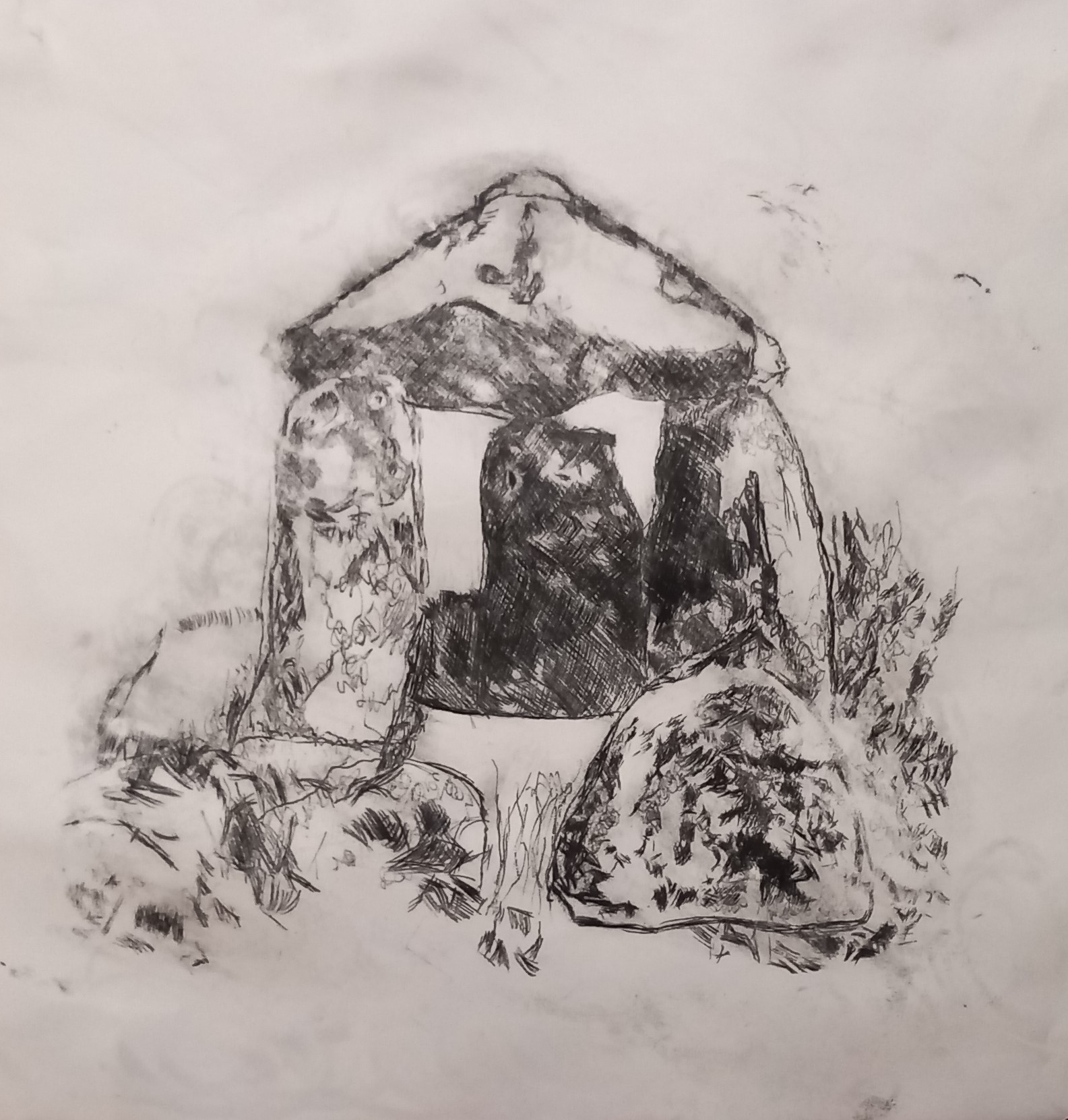
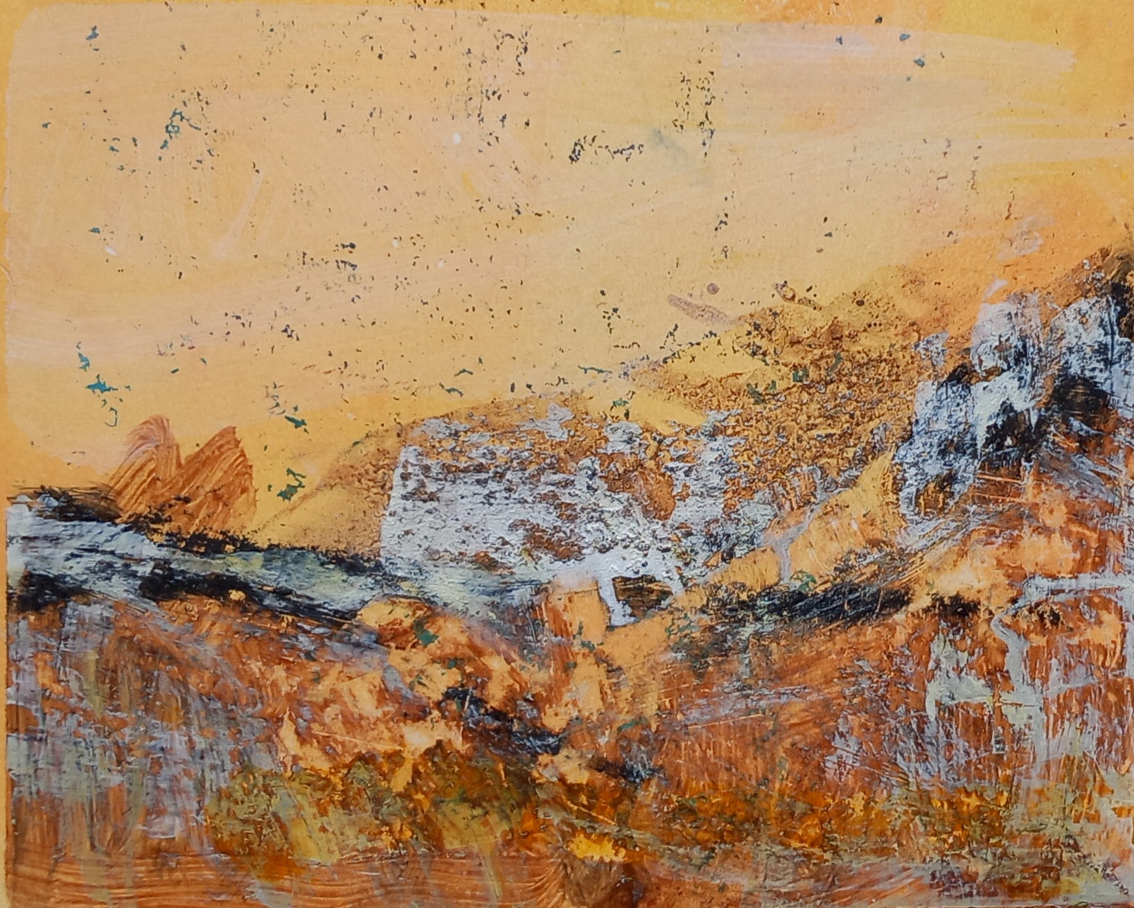
I used an Internet sourced image to work from, which said this place is known as Tirnony Dolmen in County Derry, Ireland -its possible the capstone may have collapsed? I need to visit the site for myself.
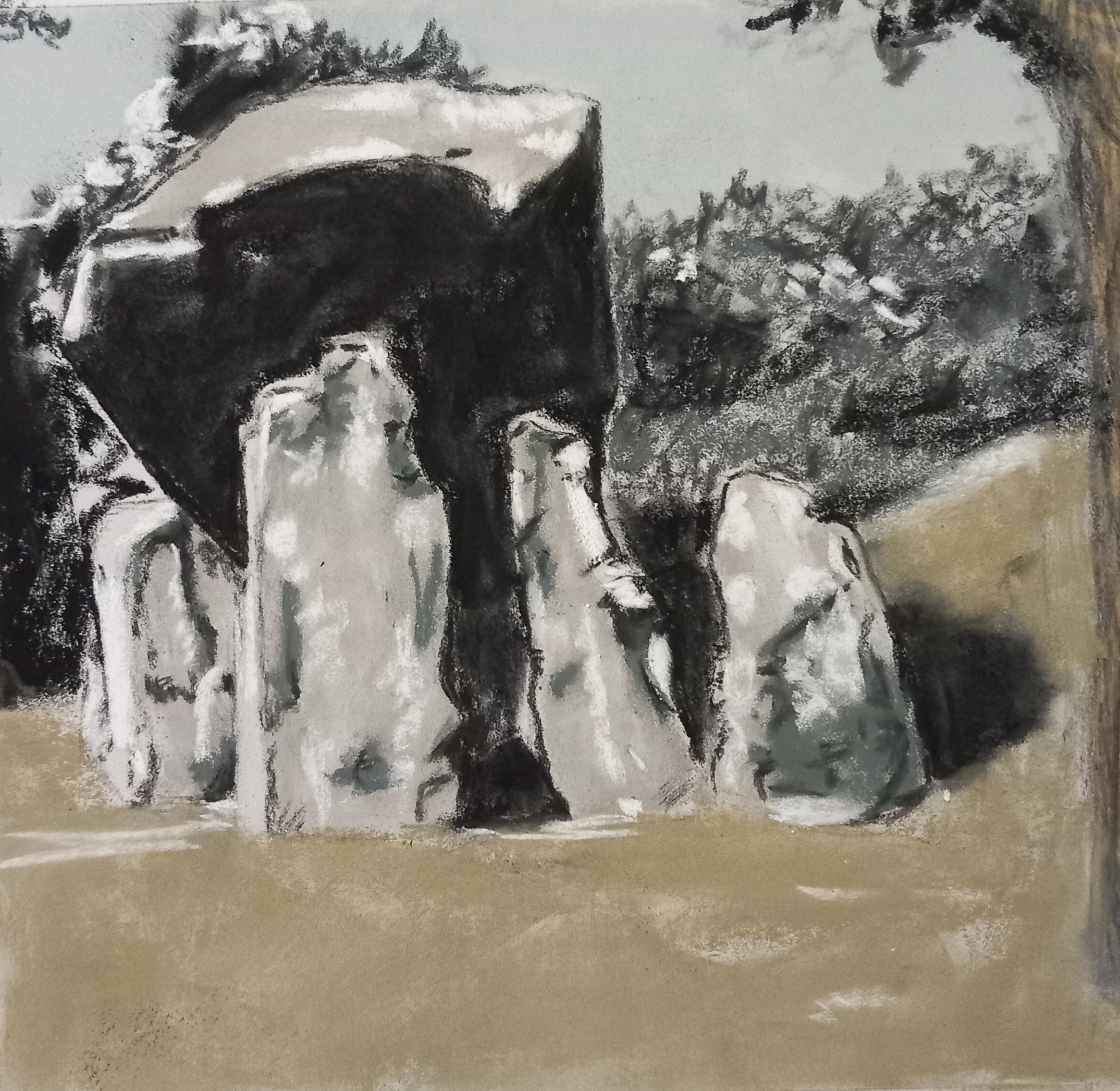
I chose Derwent Tinted Charcoal pencils, Unison, Schmincke and Florence Printmakers (natural Cumbrian pigment) soft pastels on light grey Pastelmat cut to 24cm square.
