Clay Dolmen

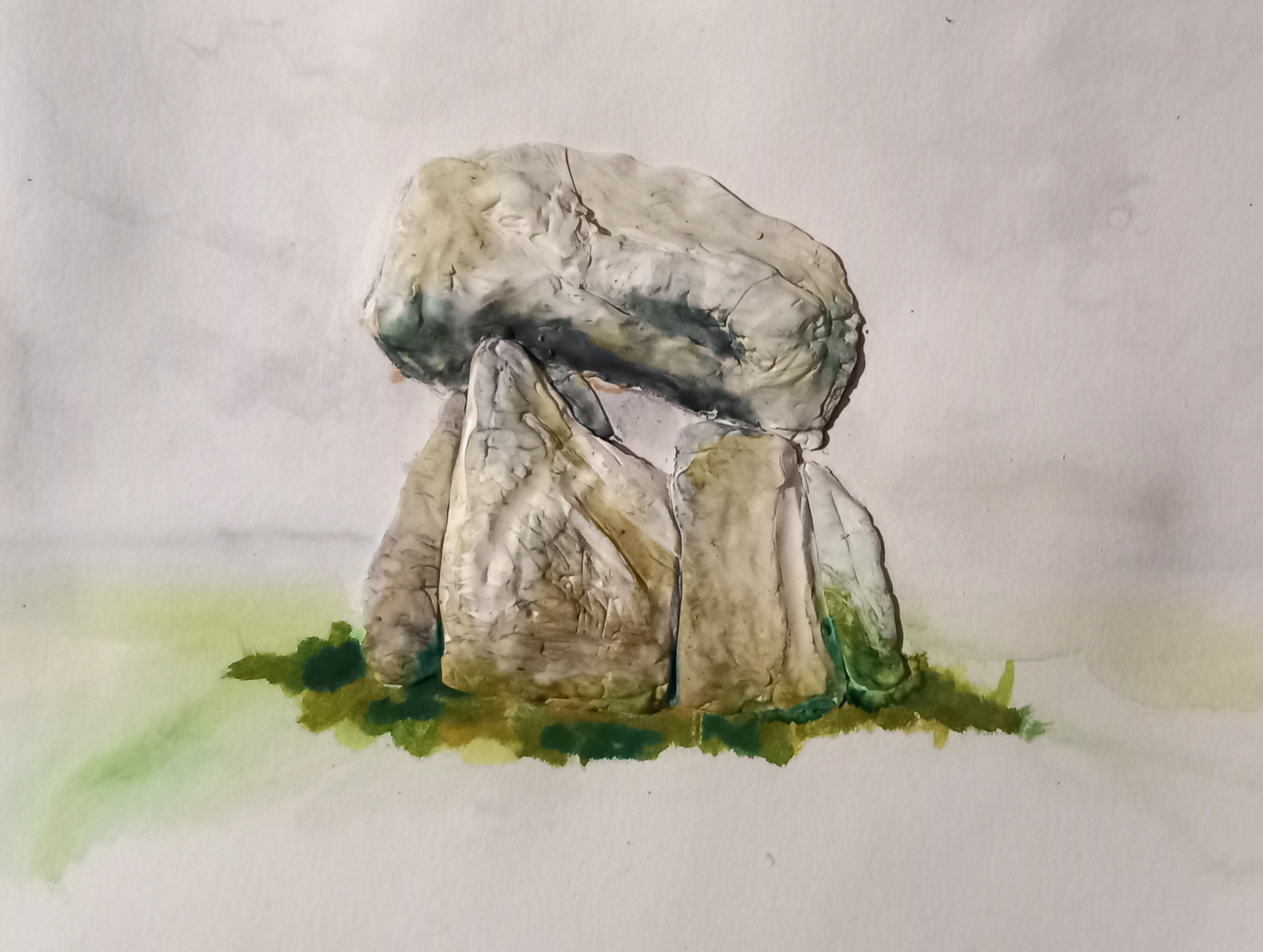
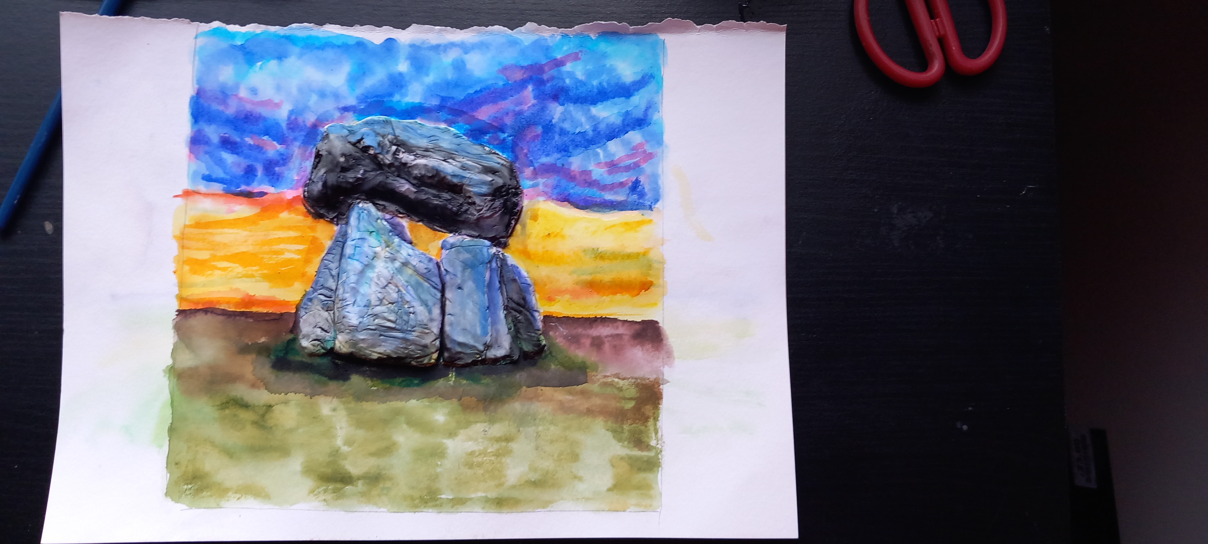
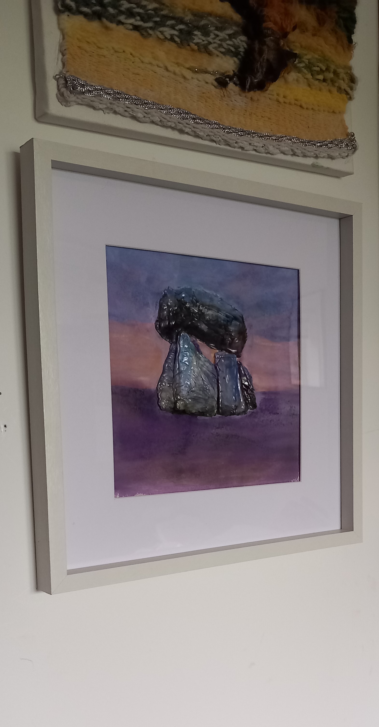
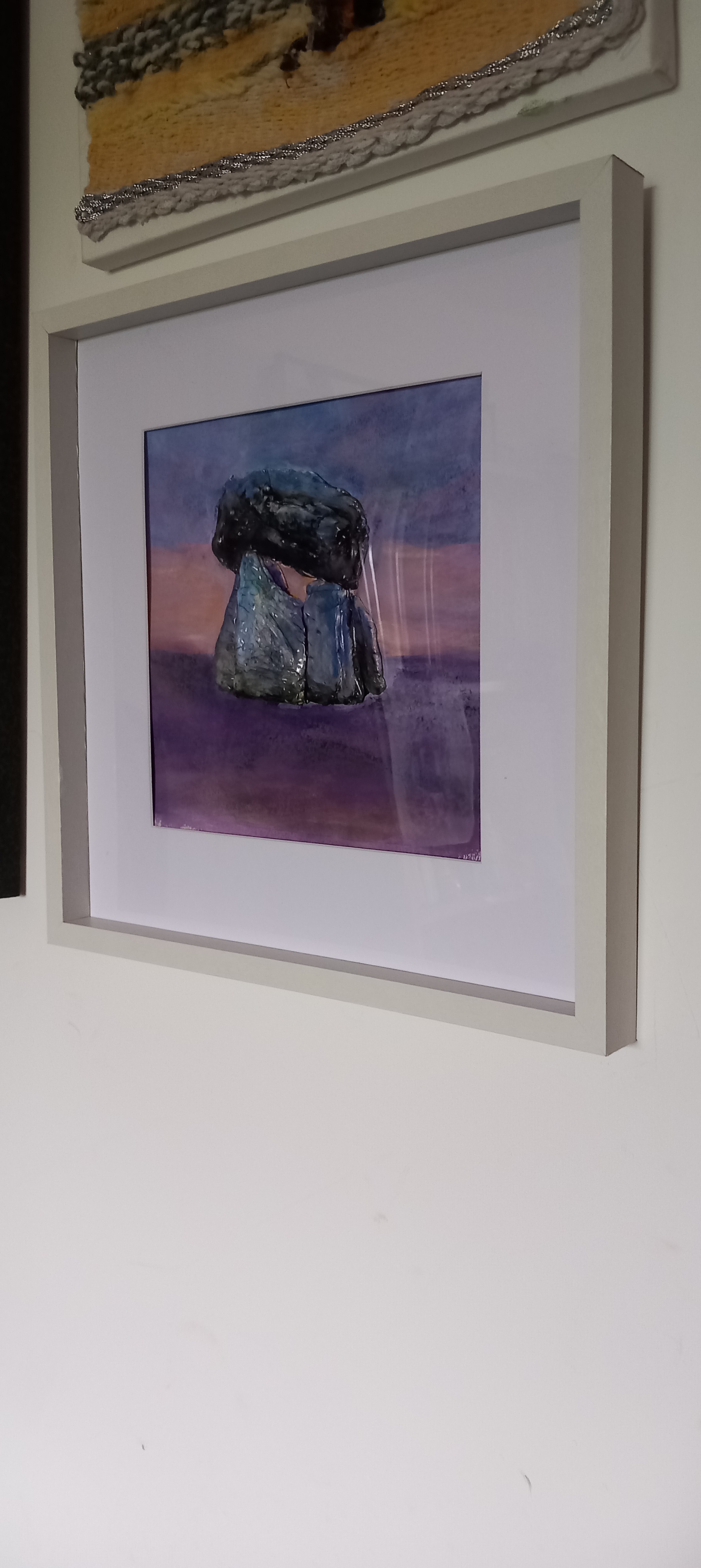
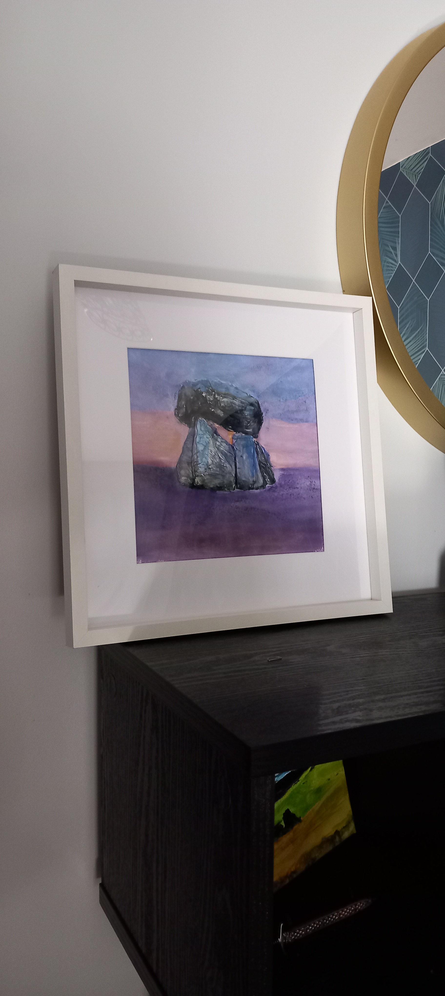
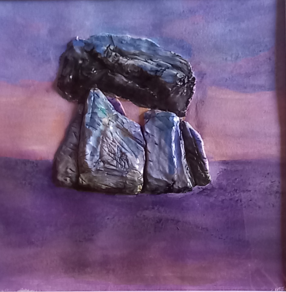
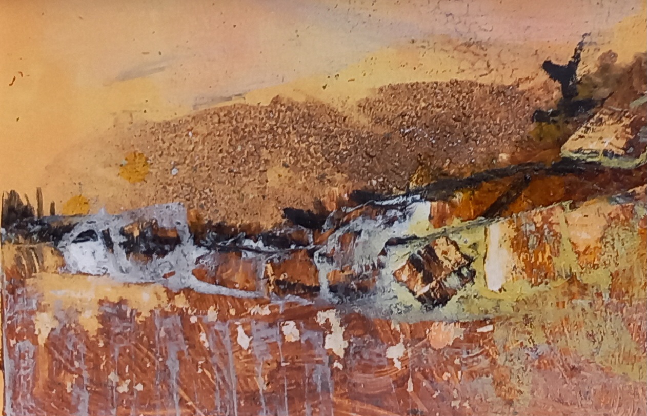
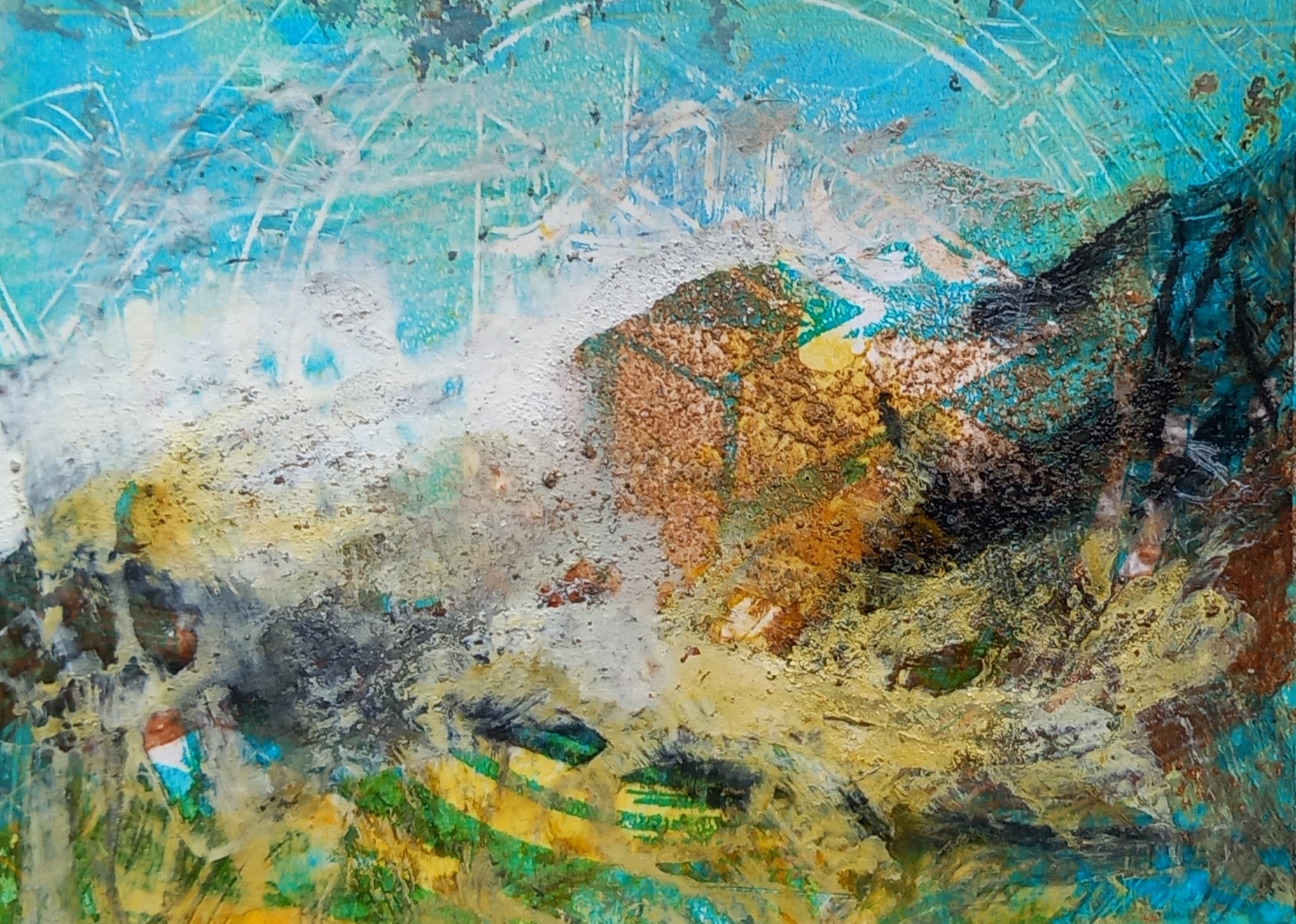
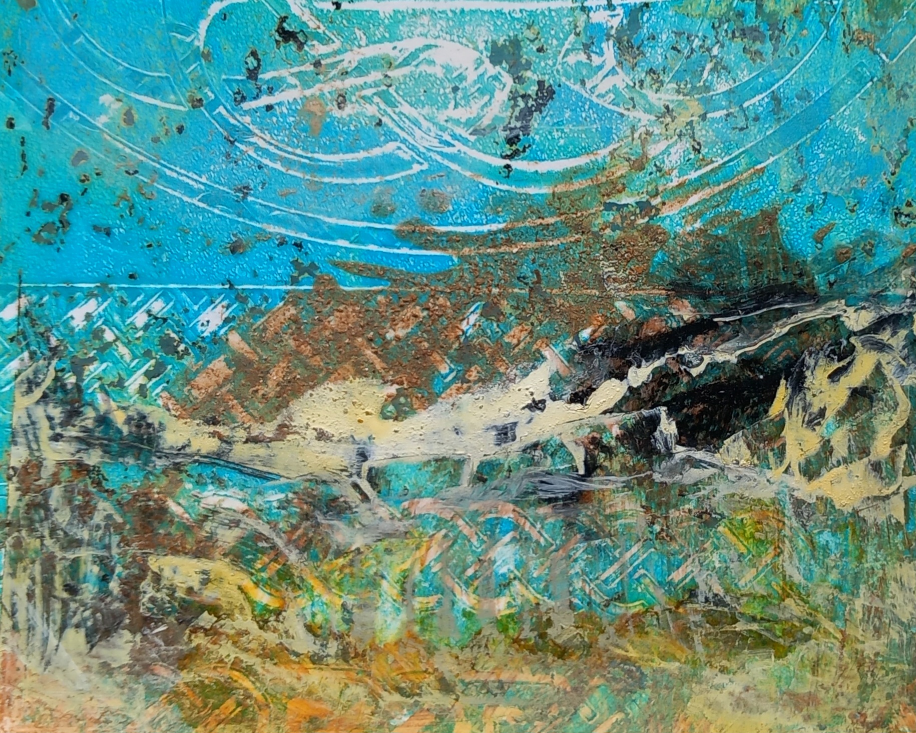
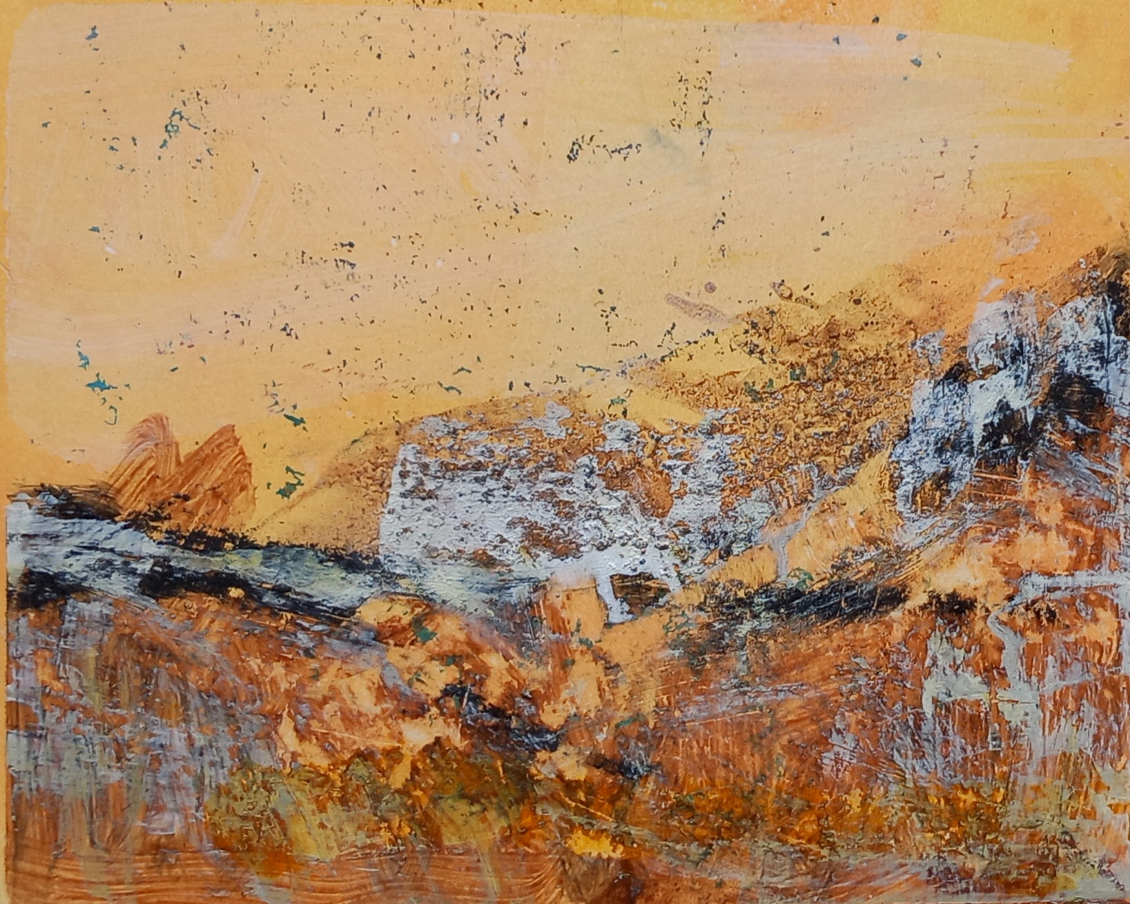
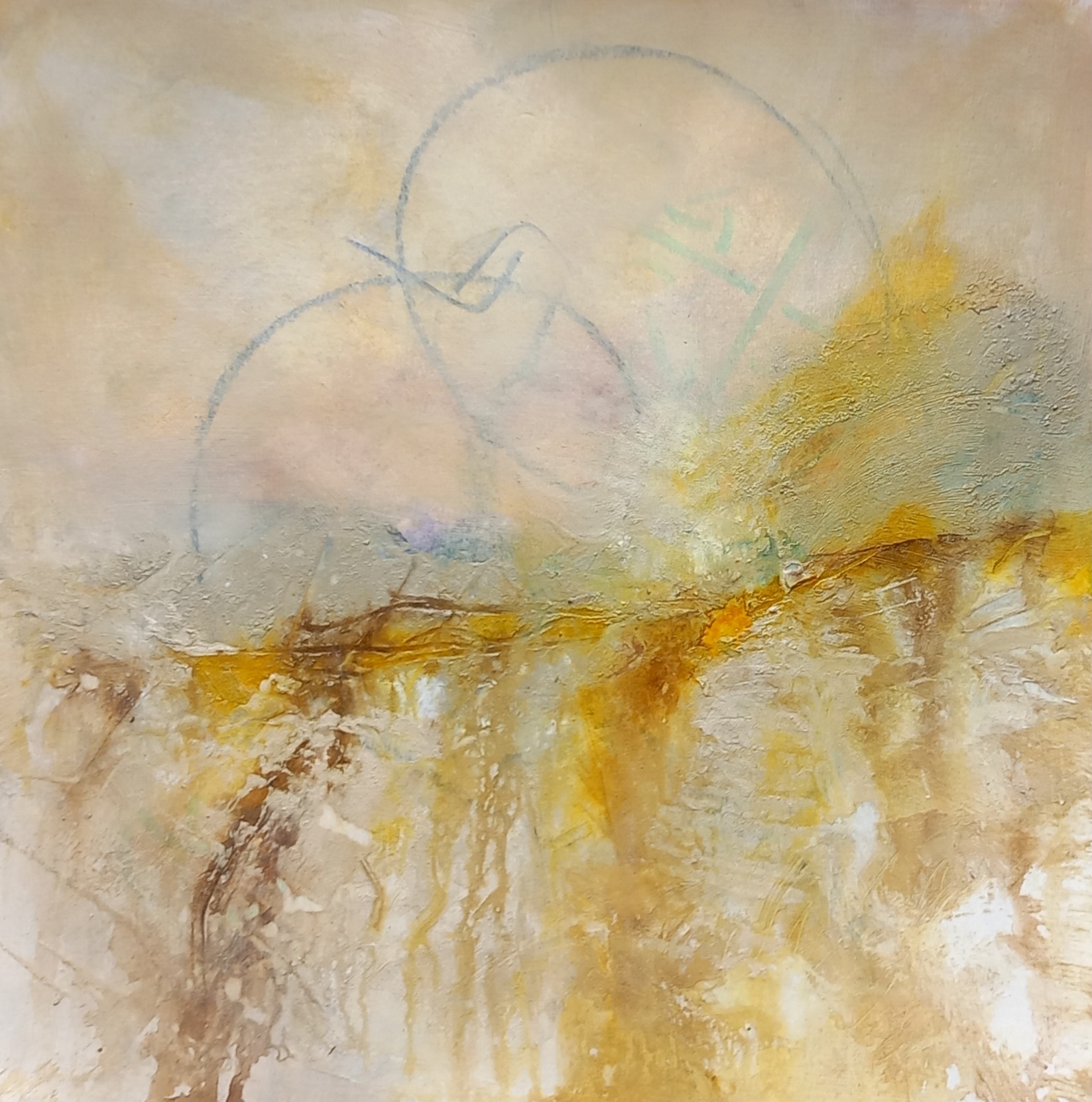
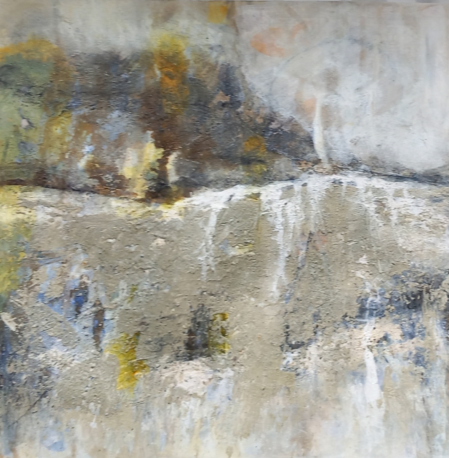
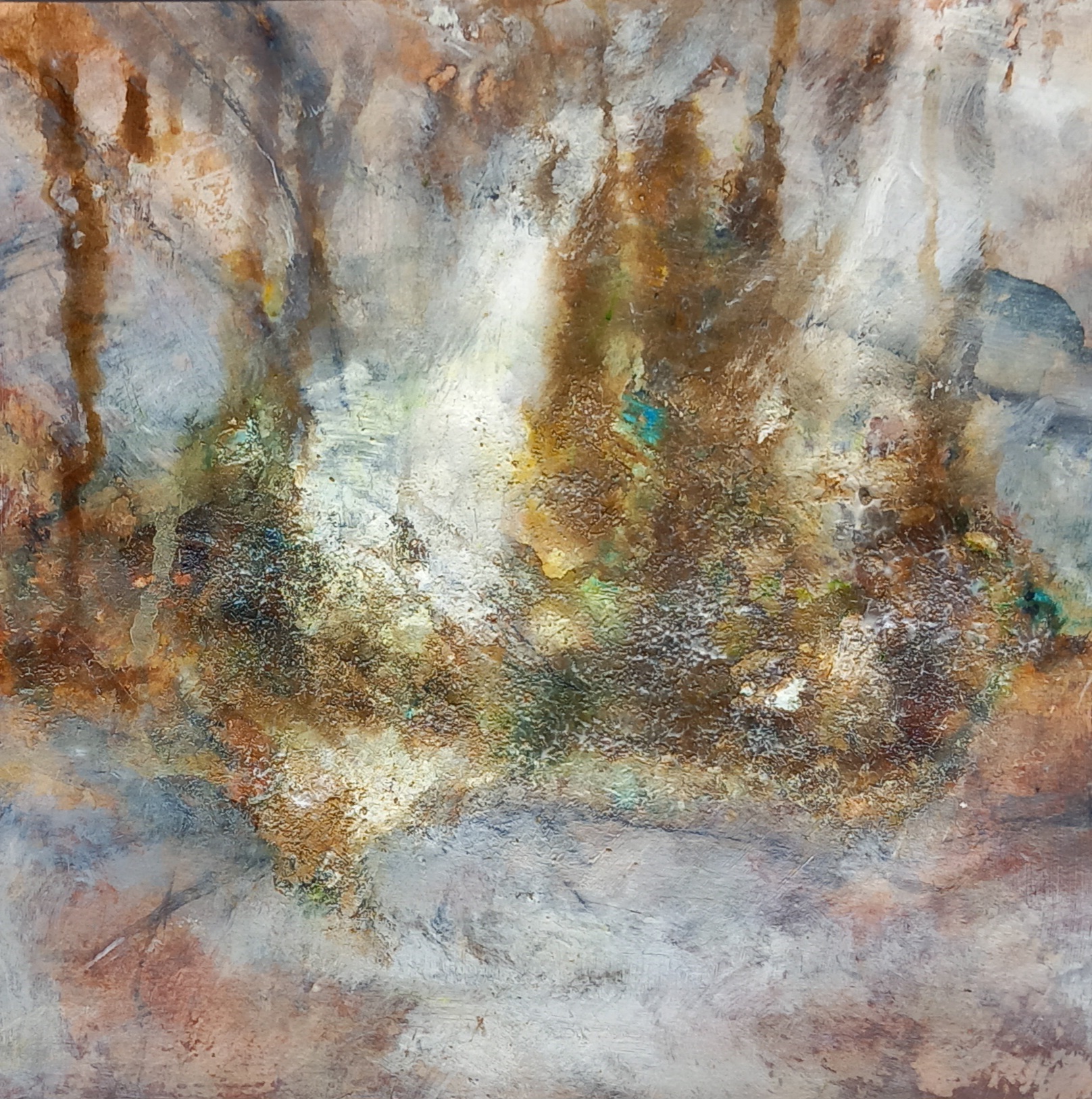
I used a photo of Carreg Samson, which is a +- 5000 year old dolmen located in Pembrokeshire, Wales, as inspiration for this piece.

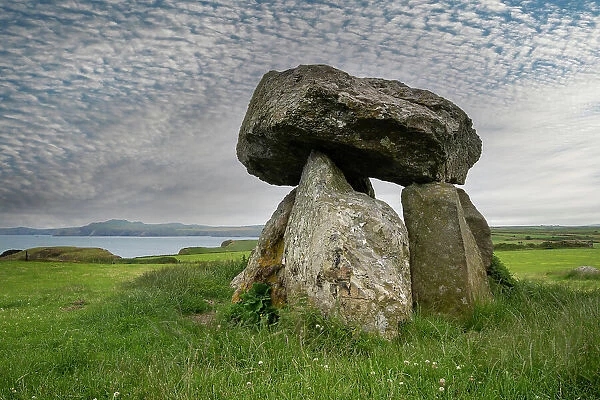
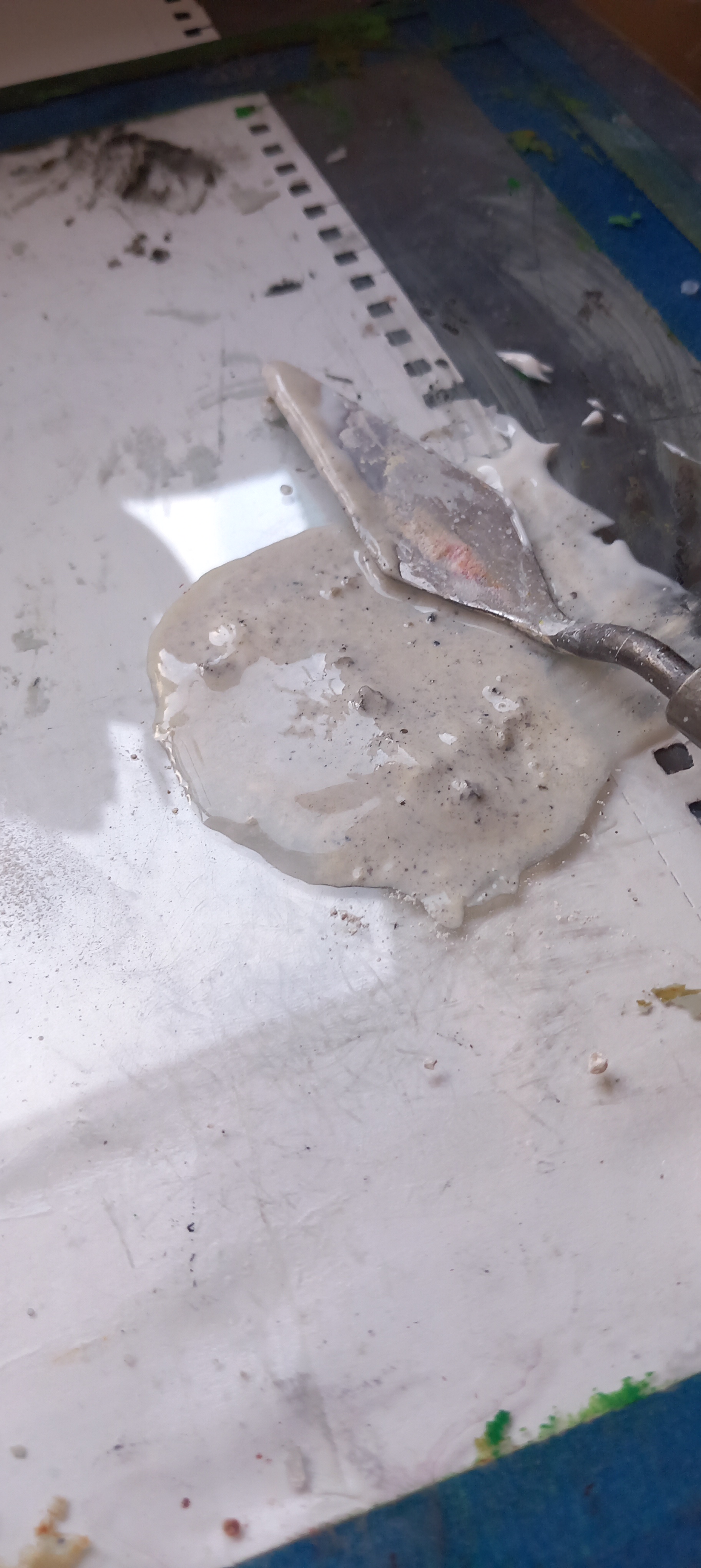
No, I haven’t been to see this dolmen in person yet but it’s on my list. I wanted to try something different in the interpretation – so out from hiding came the Fimo clay …

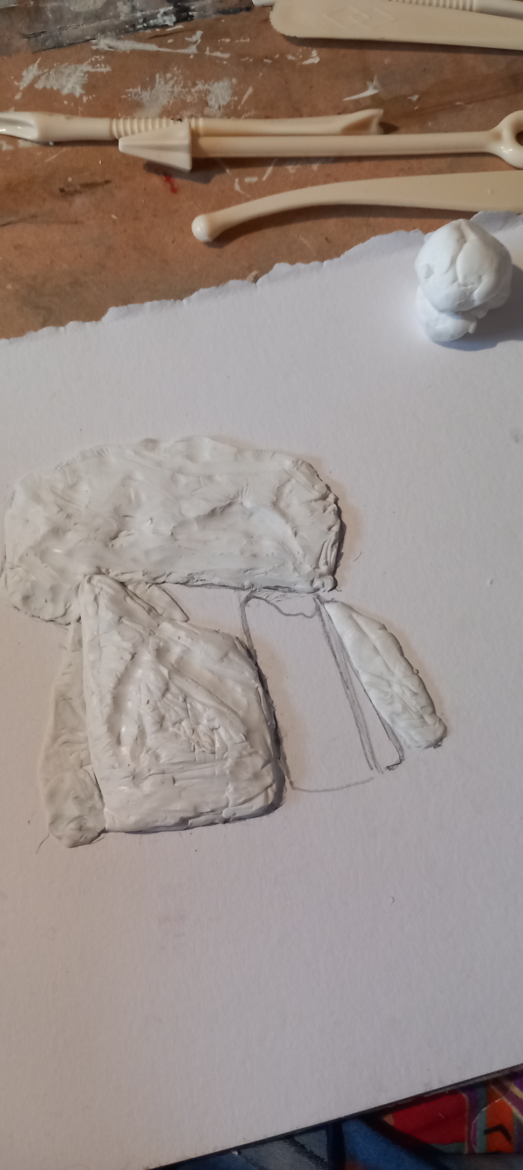
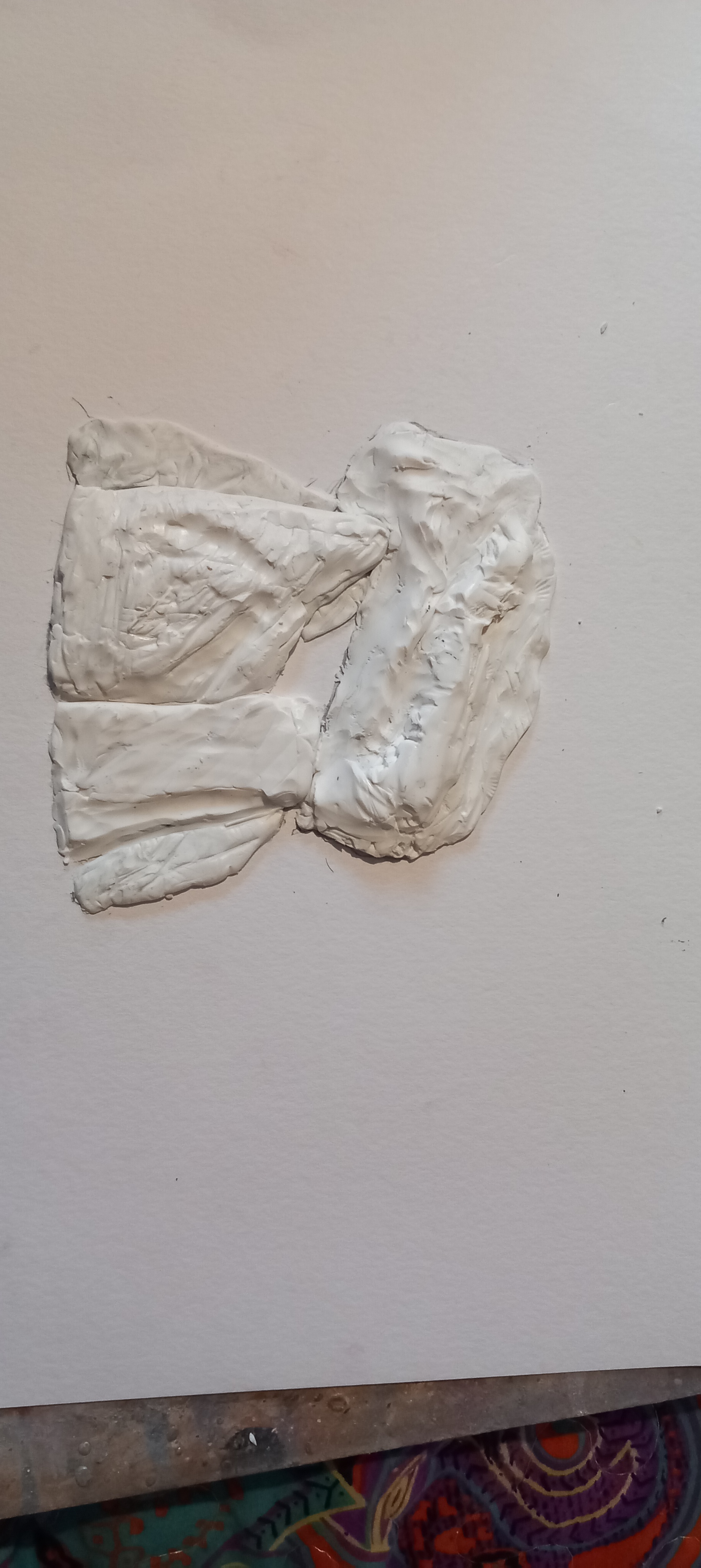
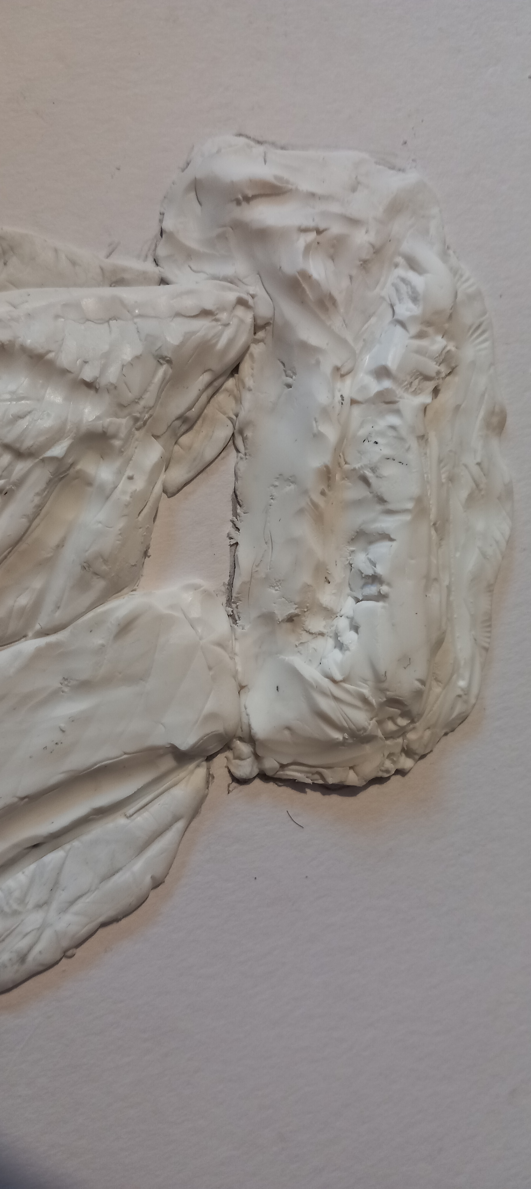
Then after more fiddling, I played around with watercolours on the surface

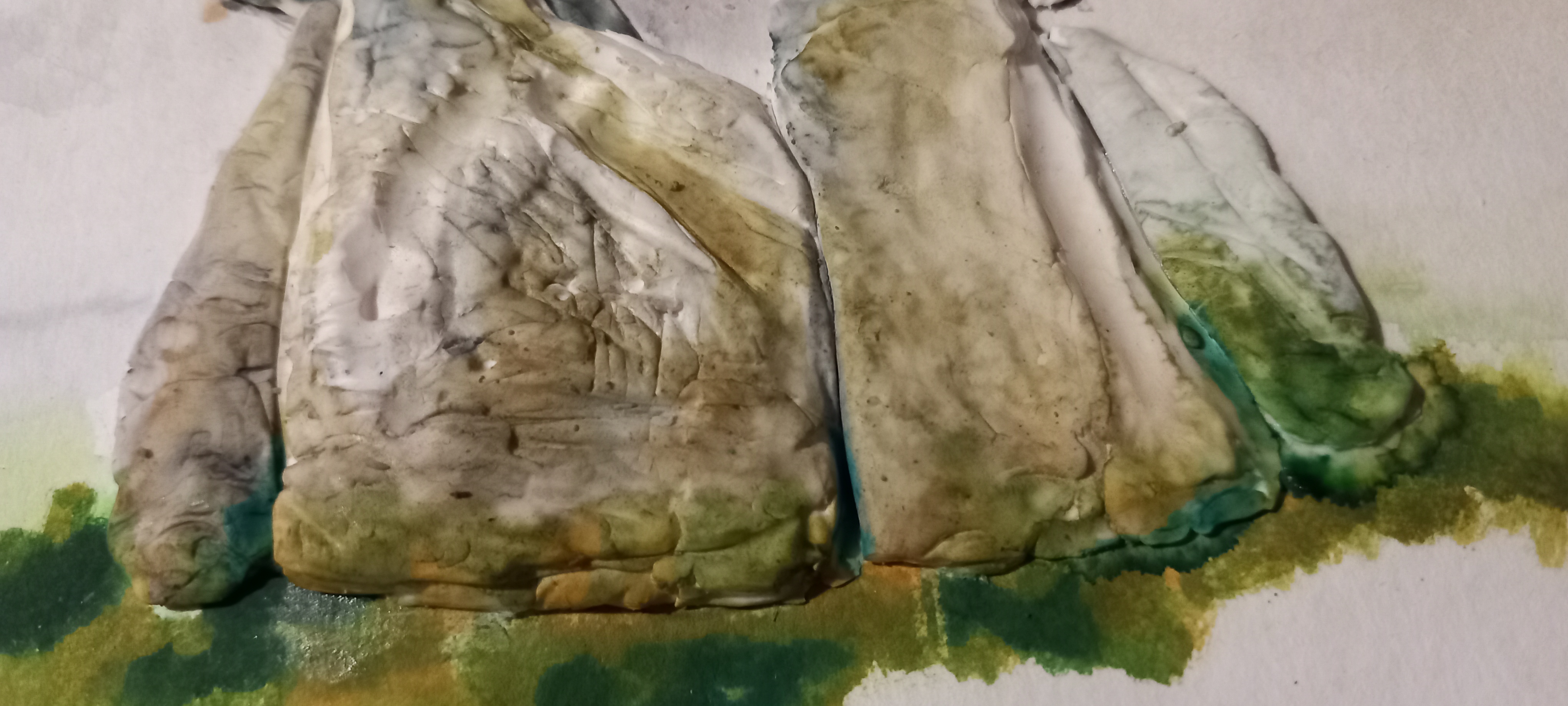
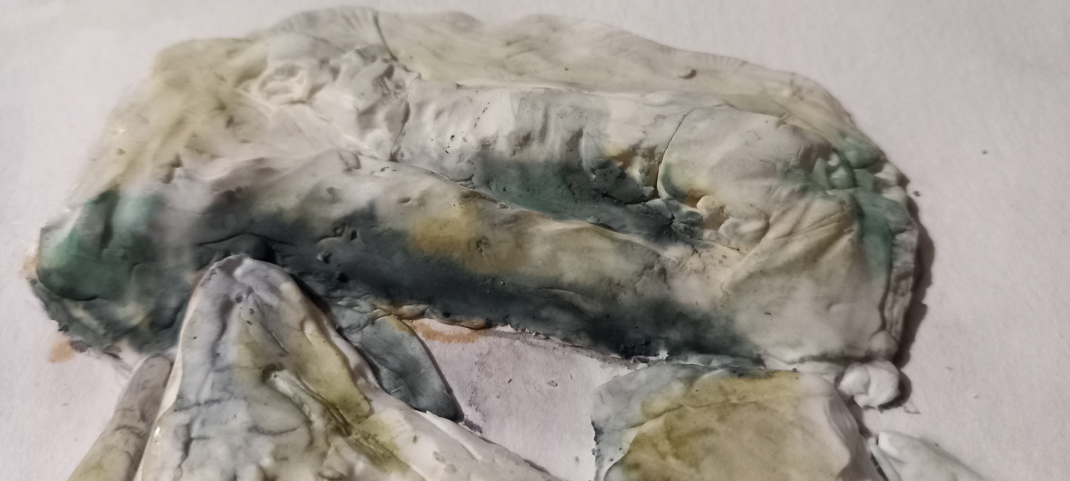
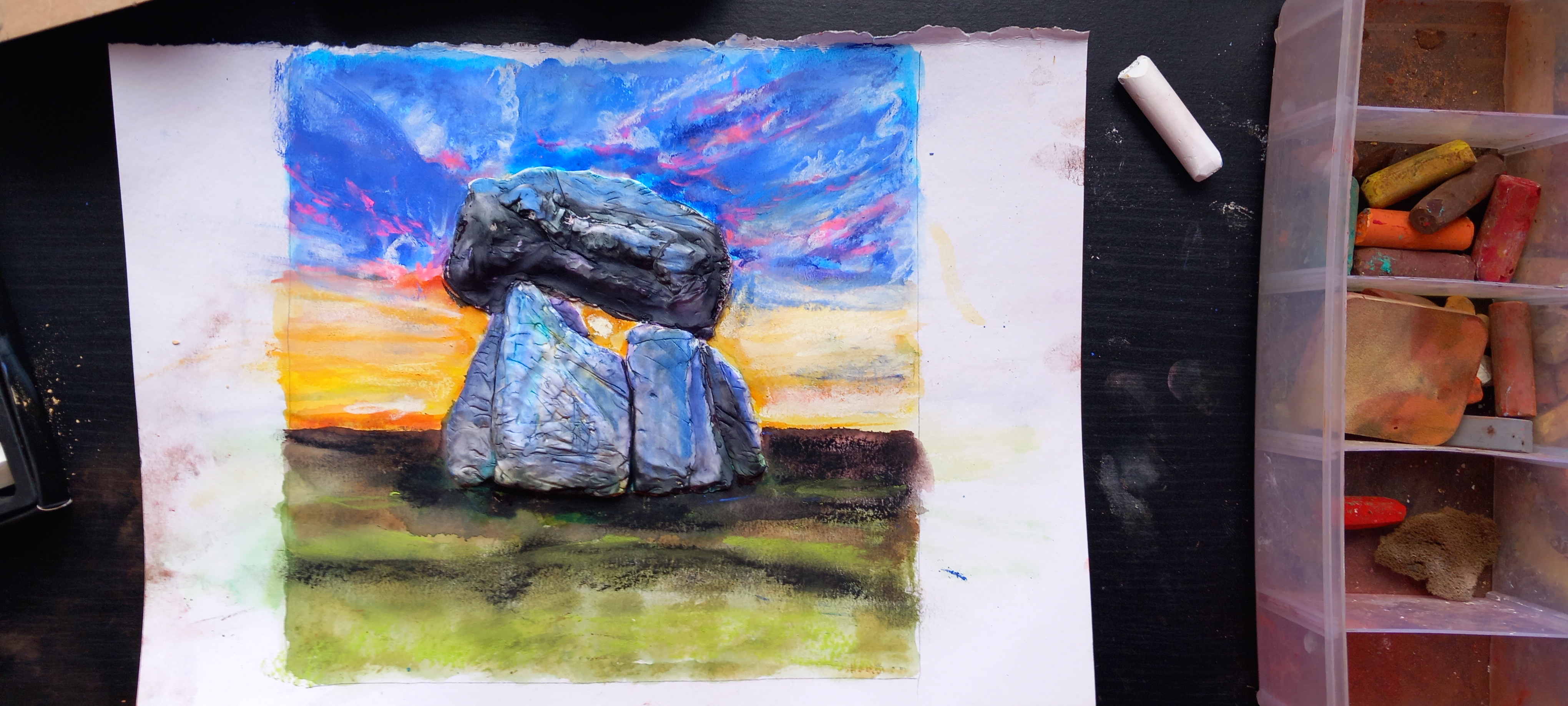
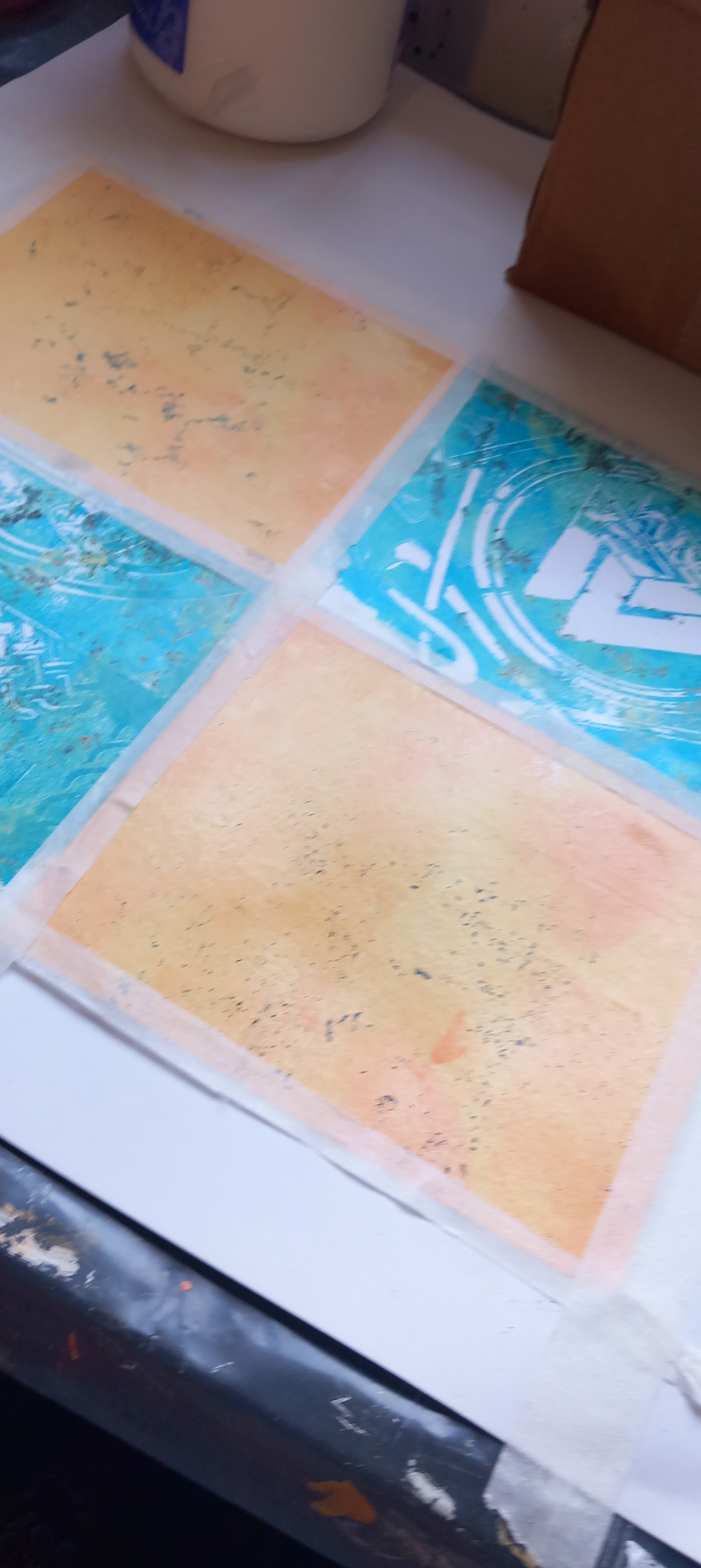
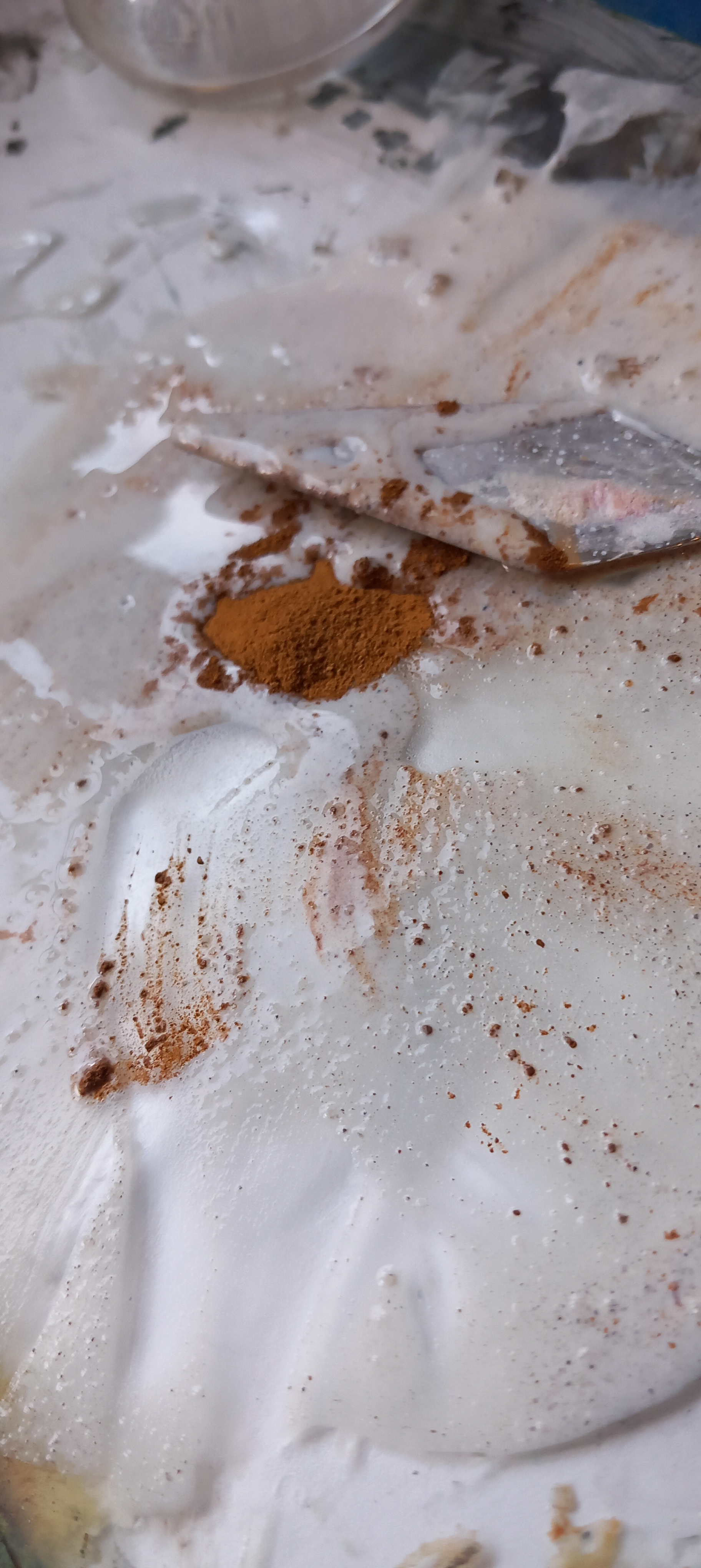
Today,I decided to work more colour into it and went a bit crazy, in the process knocking all my soft pastels all over the floor dammit.

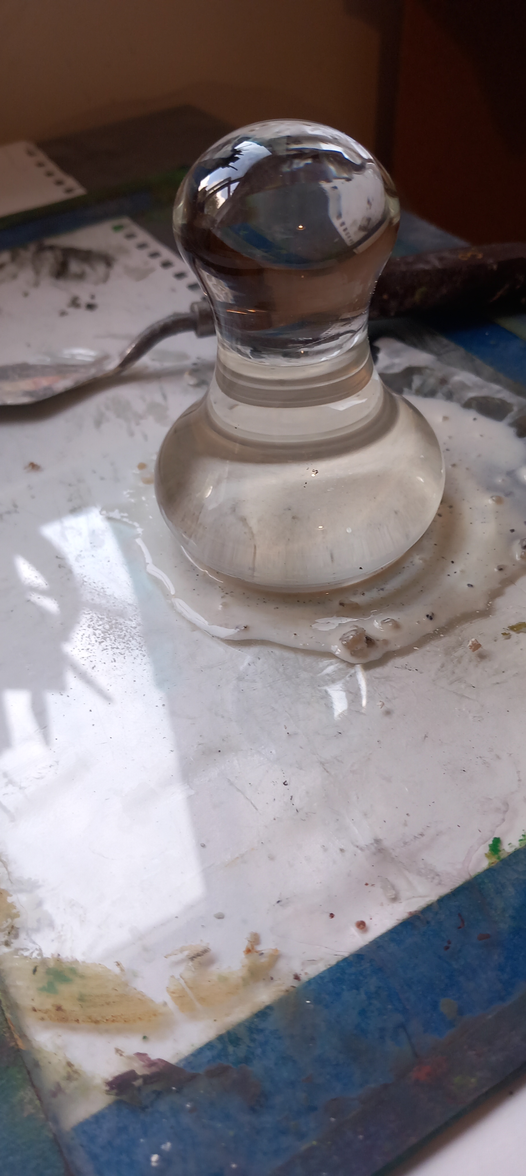
Eventually I decided to tone it all down a tad, layering some white and purple acrylic all over the surface, then spraying with iso-alcohol and water, manipulating the surface with a kitchen towel. I then sprayed it all with Winsor & Newton varnish sealant … so it kinda sparklies!

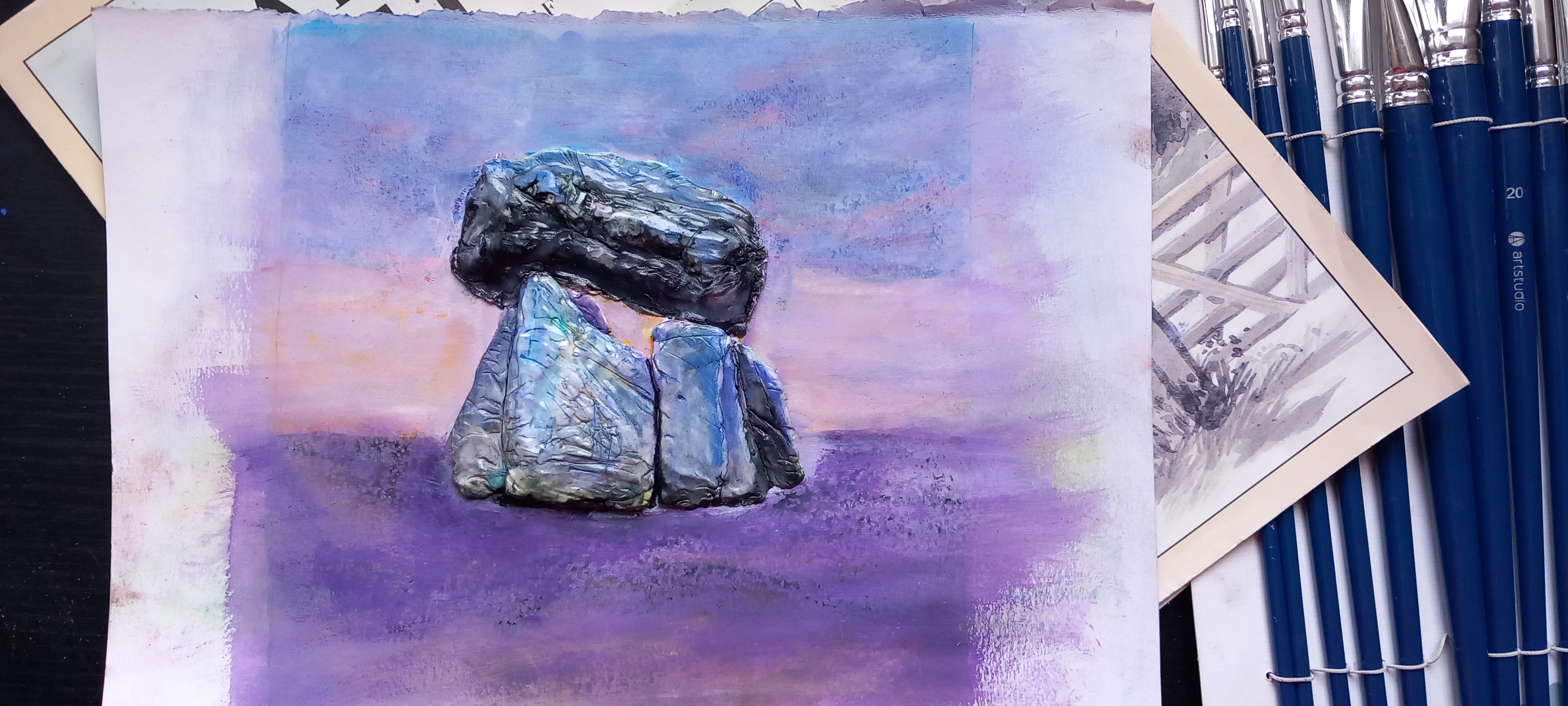
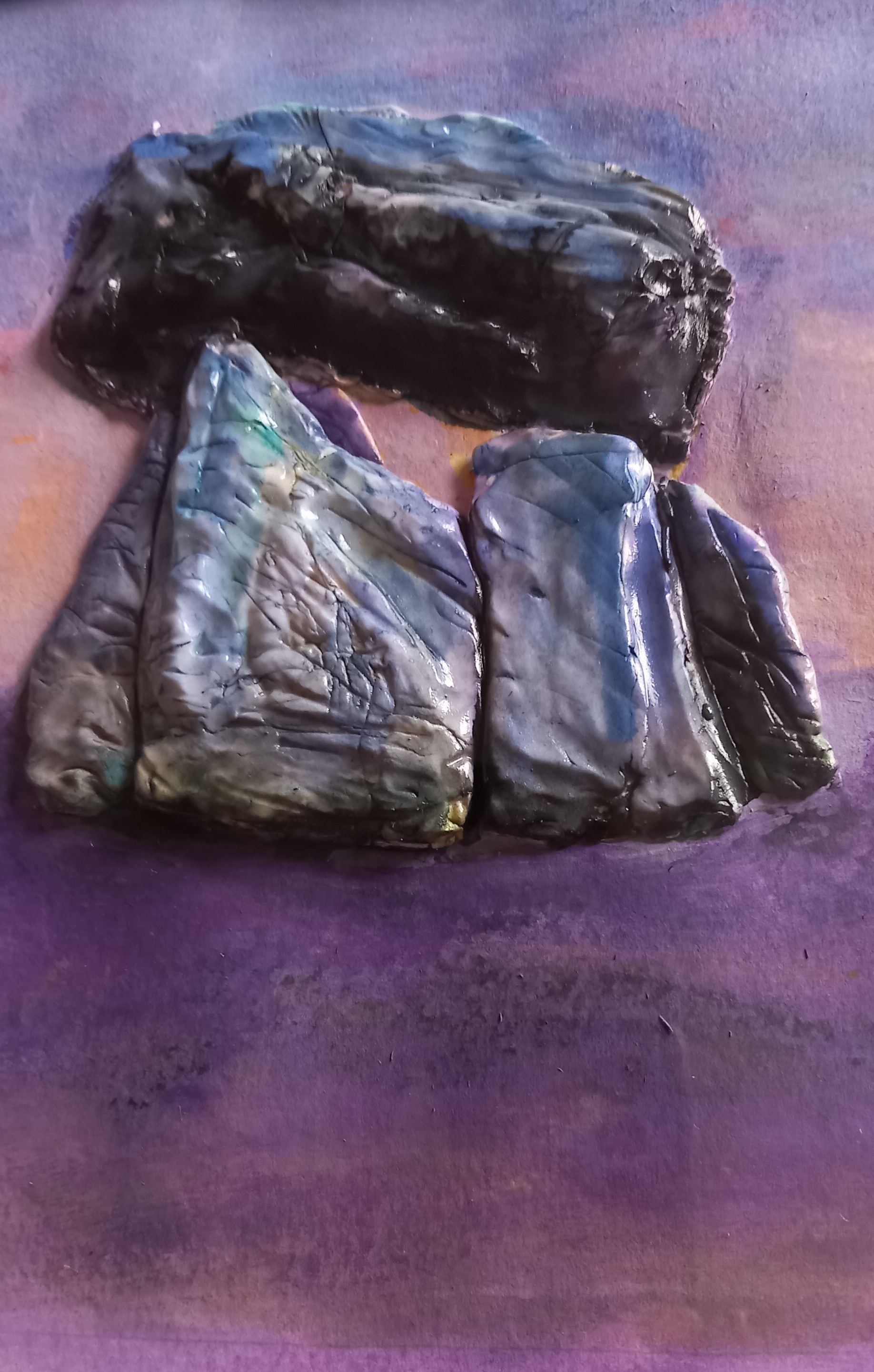
Dumbass that I am, I didn’t take enough photos of the finished thing before I put it in the frame and of course, there is a fair bit of reflection at the moment – hence taking photos from the side but you get the general idea. I kinda love this thing now.

‘Clay Dolmen’ – mixed media and Fimo clay on paper – 30x30cm

Earth Pigment work

Following are a few pieces that I’ve done recently in preparation for various exhibitions that I’m supposed to be involved with before the end of this year … more on that in next post.

Places’
Set of 4 x 13x11cm abstract landscapes on Fabriano paper using raw earth pigments and mixed media (acrylics and inks).

For this series I used pigments sourced from the incomparable @peteward.artist
Fremington Grey, Gunwalloe Gold, Perranuthnoe Ochre, White Meeth, Leswidden White, Peppercombe Red, Trevellas Green.’

These are small ones, photos show the studio set up while I work and then the finished pieces.

Then I produced these larger ones:

‘Places2’
Set of 3 x 30X30cm abstract landscapes on Fabriano paper using raw earth pigments and mixed media (acrylics and inks).

‘Places – Gold’ – Janice Scott – Raw Earth pigments and mixed media on Fabriano paper

‘Places – Sail’ – Janice Scott – Raw Earth pigments and mixed media on Fabriano paper

‘Places – Trees’ – Janice Scott – Raw Earth pigments and mixed media on Fabriano paper

Earth pigment series

I have started a collection of pieces that I am doing now mainly utilising earth pigments. These are small works – some on canvas panels and others on Atlantis 400gsm paper. I have also used encaustic waxes on one of the pieces. It is fascinating using these earth pigments, especially when I am able to grind and process them myself. The experience is visceral and there is a primordial connection when I touch the pigment with my fingers.

Initially, I used finely processed earth pigments from Cornwall and Devon such as Peppercombe Red (280 million years old), Fremington Yellow (40,000 years old) and Fremington Grey (350 million years old)

I then obtained some raw pigments to get a feel for processing them myself:

Below is a tiny test panel where I ground some of the raw pigment myself and used various binders. From top down: Leswidden white, Trevallas green, Gunwalloe gold, Meeth white, Perranuthanoe ochre, Leswidden white, Bideford black

Raw pigment test on tiny canvas

These are some of the pieces that I have created so far:

‘Come with me … to the sea’

‘Come with me … to the sea’ Earth pigments, acrylics and inks on canvas panel. 20x20cm square

‘Take me to the River’

‘Take me to the River’ Tissue collage, Earth pigments, acrylics and inks on Atlantis 400gsm paper

‘Last walk around Mirror Lake’

‘Last walk around Mirror Lake’ Collage, Earth pigments, acrylics, inks and beeswax/ encaustic paints on Atlantis 400gsm paper 29x20cm (however this is now framed and is 45x33cm in the frame)

‘Winter Thaw’

‘Winter thaw’ Earth pigments, acrylics on Atlantis 400 gsm paper 20x14cm

If anyone is interested in purchasing one of these items, or would like a commission, please contact me.

Mixed media on canvas

This is a piece I did recently on a recycled canvas, which had been previously treated to considerable abuse (i.e. covered in concrete and God knows what else). I used soft pastels, inks, pens and then decided to use black acrylic enamel for two of the tree trunks, as I wanted a really black, black for the trunks. I was told that this appears to be a bit on the sinister side, that wasn’t my intention when I did it but I can see that now. Anyway, it’s larger than most of the stuff I’ve done lately.

Dark and light in the forest – mixed media on stretched canvas

I’m also using this post to test out whether it connects and posts to my FB/ Instagram feed. Who knows hey?!

Original Water-soluble Oil Pastels Paintings

Some work I’ve been concentrating on this month – all done on Bockingford paper with Caran D’Ache water soluble oil pastels.   Most are either A3 in size or A4:

IMG_1776

Abstract Field 1

A4 – landscape

IMG_1777

Abstract trees and foreground

A4

IMG_1778

Abstract trees and foreground 2

A4

IMG_1779

Abstract sky

A4 landscape

IMG_1780

Variation on a theme

A4 landscape

IMG_1783

Looking out from Glenfinnan monument

A3 – portrait view

IMG_1784

Abstract forest with black foreground

A3 – landscape

New this week – ‘Gold’

We are settling into our new home and I’m beginning to find more space and time to paint.  This week I completed two pieces, this is the first to get up on a wall:

IMG_1744

Image cropped :

IMG_1744

“Gold”

Acrylics, sand texture, gels and inks on stretched canvas.

Size:  70cm x 60cm x 2cm (approx)  or 27½” x  23½” x 1″


New mixed media

There are many things influencing my outlook on life at the moment – some very positive (like moving to our own house very soon – yay, no more renting!) and others not quite as positive (like waiting to find out if we will be able to permanently care for my baby granddaughter – we will only know the answer to that one at end of July).   My youngest son is also now seriously making plans to move over to the UK to be with us all – so that thought is very much at top of mind all the time and I was thinking about that a lot when I started painting this abstract.   It was great to get back to canvas and something larger than the work I’ve been doing lately.

I used a lot of layers in this work, using inks mixed with structure gel and acrylics mixed with gloss gels and other medium.  It was a cathartic experience,  no matter what happens in life, family are the most important – at least they are to me.  And sometimes family comprise people who are not your blood relatives.  I hold them all close to my heart, they give me light …


IMG_1553 (1024x878)

‘DIVE’

Acrylics, inks, gels, structure gel on stretched canvas.

69cm x 59cm or  27″ x 23″

View of the work on one of my easels:

IMG_1550

Texture close ups  (lots of texture!):

This work is available to purchase.

New mixed media

Quite some time ago I started working on a series of paintings relating to the South African landscape, for some reason I didn’t finish that work.  I decided to go back to one of them over the weekend and this is the result, might still do a bit more tweaking (as always!).  This area holds a very special place in my heart (and psyche).  It is one of the most beautiful parts of the world, glorious in any weather.  This is a view of the ampitheatre from the river below. (My own reference photos)

Drakensberg

For this one I used acrylic inks, soft pastels, then oil pastels on mixed media paper.  Paper size is 16.5″ x 11.5″ (A3), painting takes up all surface of the paper.


Commission – completed

The brief I was given from my client was to paint her a picture of her field, which lies behind her offices and home in a rural area of South Norfolk.  She wanted a representation of the field in winter and depending on how that went, would probably ask me to do another painting of the field in summer.   The field or meadow doesn’t have any major features in it, other than a small coppice of trees and a separate area for her rescued chickens.   I knew that she didn’t want me to include the chickens in the finished painting, so I couldn’t mess about with that idea, which was actually what I wanted to do!  Chickens make excellent subjects for paintings!

I did have a few issues with the process of painting the required picture and had several different ideas of how to approach it.  So, I decided to present her with three versions last Friday and let her decide which one or ones she wanted to keep.

The first one is a realism approach taken from a photograph.  I wanted to capture the wintery light and bare branches, the grass was still quite luminous and deeply green.  This is on stretched canvas – 19″ x 16″.  Acrylics over inks.


Trees R 1

The second painting was more like the kind of style I enjoy doing, especially when it comes to depictions of trees.  Also on stretched canvas, same size (19″ x 16″) but portrait style.   I used an acrylic ink underpainting, topping it off with oil pastels and oil paints.


IMG_1435

The third painting was totally abstract and processed using gels, inks and acrylic paint on an artist canvas board.  This is about twice the size of the stretched canvas paintings.  I forgot to take a photo with my Canon before I took them to the client, and only have this mobile phone photo.

ABstract field

My client was so thrilled with all the paintings that she’s decided she wants all of them!  She is going to get them professionaly framed and then I will return to her home and take photos of these paintings in frames.  I am overjoyed that she really liked all the work, her husband especially liked the middle painting.  She has also decided to feature the paintings in prominent areas of her home – originally she was only going to place the paintings against a wall in one of the corridors leading into her house.

New series – flower studies.

These are the first in a series of flower studies.

All on A3 double gesso-ed acrylic paper.

IMG_1390 (1024x763)

‘Cosmos – mixed’

Oils blended with glazing medium on acrylic inks background.

IMG_1391 (1024x716)

‘Daisies in sunlight’

Acrylics on acrylic ink background.


IMG_1392 (1024x656)

Oil pastels and paints – blended with glazing medium on acrylic ink background.

‘Cosmos -2’

IMG_1393 (1024x660)

‘Pastel poppies’

Oil pastels blended with glazing medium

New painting – with back story.

I’ve titled this one,  ‘On her way’ – it is inspired by the devastating mental health struggles my youngest daughter is currently experiencing after the birth of her baby almost three months ago.   These last few months have been extremely traumatic for all of us but last night, when I went to visit her with her older sister, it was like she was back to her old self again. There is still a lot more work needs to be done but it was the proverbial light at the end of the tunnel I saw last night, as she walked away from us down the corridor to her room.  She seemed to be surrounded by a golden glow and that’s what I wanted to get across in this painting.

IMG_1233

“On her way”

Acrylics, inks, soft pastels on Daler Rowney system 3 acid free acrylic paper.

16 1/2″ x 11 1/2″  (not for sale)


New small painting

IMG_1231 (2)

‘Little Field’

Acrylic inks, oil bars and oil paints on gesso-ed multi_media paper.

This small painting is available to purchase here

I am using this post to test out connection to my existing blog community on WordPress.  I am not certain that my website is visible to you all and I’d appreciate comment if you can or can’t see the website via this post.

My website address is:  http://www.janiceheatherscott.com


Oil Bars

Apologies for such a long time in posting any arty updates – been lots of family things to sort out lately, I’m quite exhausted by all of that, so let’s get on with it hey?

I discovered Winsor & Newton Oil Bars quite by accident and only have a small selection at this stage.  But boy am I enjoying this new found freedom.  I am still doing fiddly small things while I get used to manipulating the oil bars on different surfaces.  These are some of the more recent things I did over the weekend.


IMG_1003 (2)

‘Patchwork landscape with blue’

14.5″ x 10″ or 37cm x 25cm – actual painting size.

Acrylic inks, oil bars and oil paints on acrylic art pad.

Surface worked with sgraffito technique


IMG_1004 (2)

‘Poppy field’

9.5″ x 6.5″ or 24.5cm x 16 cm

Acrylic inks, Oil bars and oil paints on Daler Rowney acrylic paper

Surface worked with sgraffito technique


IMG_1005 (2)

‘Poppy field with buildings’

7″ x 5″ or 18cm x 12cm

Acrylic inks, oil bars and oil paint on mixed media paper.

Surface worked with sgraffito technique

I am also working on a largre canvas piece, as well as a larger landscape piece but these aren’t ready to put up here yet.

Hope you enjoy!

Some new thingies

“New beginning”

Acrylic, inks, gels and pastes on stretched canvas.

17½” x 23½” x ½”

Acrylic painting Janice Scott

Close up of texture.

Acrylic painting detail Janice Scott


“Going for a walk”

Acrylics on stretched canvas

20″ x 16″ x ½”

Acrylic painting Janice Scott

Close up of texture:

Acrylic painting detail Janice Scott

And flip …

DSCN5910

I was moving things around over the weekend and ‘accidentally’ stacked my latest large painting the wrong way up.  When I stood back and looked at it, I realised that it is far more dynamic this way up and has more sense of presence.   There is something almost cathedral in the illusion of space.   To me it feels like I am standing on a snow covered street looking up the road  – either side at very tall buildings.  What do others think?


Doodling


DSCN5888

“In the field”

10″ x 8″

Acrylics, Inks, collage, gels, gold foil on acrylic canvas board/panel.

Close ups of texture:

DSCN5890 DSCN5892

I’ve been in a bit of the creative doldrums since I returned from South Africa, artistically speaking.  Pottering about with clay hasn’t really helped, it’s just made me work small and that’s not what I’m about.  I decided yesterday that I needed to put all the clay away and get back to er ‘making art’ … lest I forget how.

Again, I’m working small, so I wasn’t feeling very confident.   I started working with tissue and forming the texture, the ground … I wasn’t really sure where I was going other than I wanted the little panel to express a feeling of wide open space and emotional depth.     Then I got to thinking about the other evening when my daughter and I were travelling home from doing our shopping.   It’s almost harvest time here and the wheat and barley in the fields is very high, golden brown and thick.   In this vast expanse of golden beige, there he was just popping his head out of the grasses to have a look around.  So he became the inspiration for this final bit of rather naive collage.

I hope to be able to get going with a very large canvas I have sitting around downstairs next week, it’s calling to me.