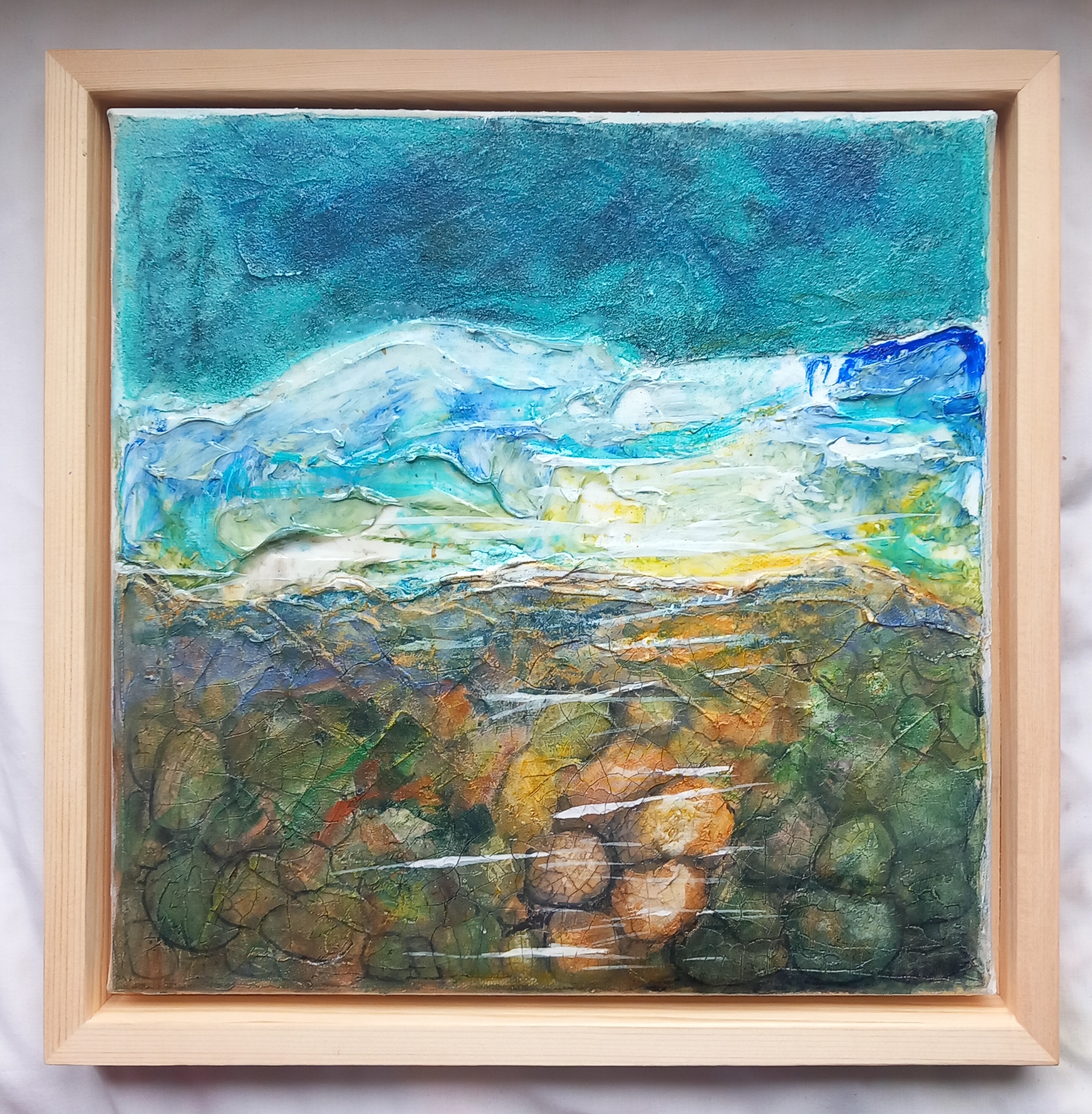
I have just returned from my trip through Wales and Ireland up to Iceland. Yep, it was pretty epic. I took gigs of photos and videos, which I’m sure will be the source of inspiration in my artistic life for a long time to come! The photo above was taken at Dynjandi Falls, which is in the Westfjords area – I thought this was the best place to be throughout the whole trip, completely fell in love with it. The Westfjords region is very remote and I understand they are trying all sorts of initiatives to get people to come and settle there … so that’s on my to-do list at the moment.
The flip side to all this gallivanting around is that I caught the plague bug, so am now in isolation until it goes away. I’ve not had it too bad, just a lot of sneezing, coughing, blowing nose …
‘Petrified Tree, Karoo’ Earth pigments and mixed media on Arches oil paper 23x31cm
I keep seeing this place in my mind and remember sitting on such a tree many, many years ago eating sandwiches and drinking coffee … we were on a road trip from Johannesburg to Cape Town. I’d never seen a petrified tree before, let alone sat on one, which was just casually dumped there on the side of the road. And to think that piece of stone, which once was a tree, was in the region of 300 to 250 million years old.
For this painting, I used Cobra oil medium with the pigments. Colours used: Trevellas Green, Burnt Umber, Fremington Yellow ochre, Peppercombe Red, Leswidden white, Fremington Grey, Bideford Black, Perranuthnoe ochre. Soft pastels. All on Arches Oil paper – CP Fine 100% pure cotton, 300gm. 23x31cm
I am really enjoying working with these ancient materials and mixing them up with contemporary polymers. I have ordered a 1m square canvas which will be used for a commission, so looking forward to working on that!
‘I remember (part 1)’ Janice Scott Mixed media on paper 30x30cm
Continuing my exploration into natural pigments and the theme of liminality – in my case I am exploring the threshold between raw earth pigments and commercially produced art materials. For this piece, I used: Earth pigments: Trevellas Green, Peppercombe Red Natural pigment pastels by Florence Paintmakers Sennelier Soft Pastels Montana Gold Professional spray paint – Bronze W&N acrylic paint and inks Resin pigment inks Charcoal Fabriano Unica 50% cotton 250gsm white paper (torn to size)
I have started a collection of pieces that I am doing now mainly utilising earth pigments. These are small works – some on canvas panels and others on Atlantis 400gsm paper. I have also used encaustic waxes on one of the pieces. It is fascinating using these earth pigments, especially when I am able to grind and process them myself. The experience is visceral and there is a primordial connection when I touch the pigment with my fingers.
Initially, I used finely processed earth pigments from Cornwall and Devon such as Peppercombe Red (280 million years old), Fremington Yellow (40,000 years old) and Fremington Grey (350 million years old)
I then obtained some raw pigments to get a feel for processing them myself:
Below is a tiny test panel where I ground some of the raw pigment myself and used various binders. From top down: Leswidden white, Trevallas green, Gunwalloe gold, Meeth white, Perranuthanoe ochre, Leswidden white, Bideford black
Raw pigment test on tiny canvas
These are some of the pieces that I have created so far:
‘Come with me … to the sea’
‘Come with me … to the sea’ Earth pigments, acrylics and inks on canvas panel. 20x20cm square
‘Take me to the River’
‘Take me to the River’ Tissue collage, Earth pigments, acrylics and inks on Atlantis 400gsm paper
‘Last walk around Mirror Lake’
‘Last walk around Mirror Lake’ Collage, Earth pigments, acrylics, inks and beeswax/ encaustic paints on Atlantis 400gsm paper 29x20cm (however this is now framed and is 45x33cm in the frame)
‘Winter Thaw’
‘Winter thaw’ Earth pigments, acrylics on Atlantis 400 gsm paper 20x14cm
If anyone is interested in purchasing one of these items, or would like a commission, please contact me.
I follow Pete Ward on IG and recently ordered some of his own hand foraged/processed and packaged earth pigments from the Cornwall area where he lives. I chose Peppercombe Red, Fremington Grey and Fremington Yellow Ochre. Pete very kindly added Fremington Burnt Umber at no extra cost .. so I could play☺️
I decided to do some very basic quick tests. I don’t have Gum Arabic, so just used water to make the watercolour paint and then did a strip where I dropped some isopropyl alcohol onto it. I also used Pebeo Binder and finally Galleria structure gel, which is not dry in the photos, so I’m keen to see what it looks like dry. Here are some pics of the experiments
I ground the yellow ochre pigment a little onto my glass mixing plate with the back of a spoon, which did make it quite fine but to be honest I prefer it in the state I received it. The grittiness makes it a more primordial experience!
I did a very small study on Atlantis 400gsm paper adding some white and black acrylic.
‘Winter thaw’. Earth pigments and acrylics on Atlantis 400gsm watercolour paper.
I love the natural texture and colours. I will be doing more work with these pigments on canvas.
I am working on quite a few different things all at once. This is an experimental abstract piece, using inks and soft pastels.
‘You’ll remember me’ Soft pastels and inks on Pastelmat A3
The coursework for Painting 2.1 (Ideas Lab) through OCA is really fun and I’m having a great time messing about with stuff that I wouldn’t normally do. Here are a few images of latest work that was done using various media on canvas panels and monotyped paper – Glitch.cam app, encaustics, shellac, soft pastels, acrylic enamels, polyfilla, inks, tracing paper, A3 Lightbox …
Digital FellingNot what it seemsPull Up a SeatBoudicca’s Way v1Down but not OutEncaustic trees and leafBoudicca’s Way v2Boudicca’s Way v3
I took this piece round to its new owner today and it’s already up on the wall! He’s really pleased with it (and so am I) .. I think it’s happy and serene, hopeful and peaceful.
The term ‘imposter syndrome’ is a relatively new one, I wish I’d known about it when I was twenty-five. I’ve been painting, drawing and messing about with creative media since I was 16. Some of the stuff I put out is kindly bought by my small group of patrons and I am really thankful for that. I don’t sell regularly enough though, so because of that I have difficulty referring to myself as a ‘professional artist’. But I am one I guess! It’s so weird. I am not a professional artist in the sense that I have a full-time working job as an artist, with my own studio. But I do produce art on a regular basis – well every day – and it amasses all over the house. It gets framed sometimes. It gets stored away in boxes. I destroy some (actually most) of it. I re-do some of it. If I had a studio, it would be full of work.
My bedroom is a workshop – the bed occupies a large enough part of the room because it’s a three-quarter sized bed and the room is tiny. The bed becomes an extension of my working table and for most of the day it is covered in art equipment or materials. I try to fill the bed with pillows and cushions, so it looks more ‘bed’ like but the art stuff always wins and eventually the pillows are on the floor as they get replaced by canvasses, brushes, glues, gels, paints, plastic bags … you name it. When I’m working on something large, the whole room becomes engulfed and it’s a battle to find my way around in there, if I turn too quickly I’ll send something flying onto the carpet. My carpet is covered in smaller rugs – which are strategically placed to cover the odd mark from a pastel that fell there last week, or I dripped some paint there last year. My room smells perpetually like the inside of a warehouse – turps, oils, isopropyl alcohol, gels and most recently Golden Pastel Ground, which whilst being a bloody marvellous product, smells something horrid!
One of these days, when I hit the big time and win the Euro Millions, I’ll be able to have my own place again, with its own studio room (oh, how I miss my house in Benoni … sigh) Until then, I’ll just keep telling myself (quietly in a whisper) that I am an artist. No-one else could live amongst all the junk in my room and be happy!
I was asked if I would produce a canvas painting – the inspiration was an Internet sourced photo:
I’m always a bit nervy and unsettled when I have to do something based on someone else’s photo and ‘specially when it’s quite a complex image, as is the case with this one. That said, I really love this image and the feelings it evokes. I’ve looked up at trees like these many times, so it is a special feeling to be able to try and recreate that scene on canvas. I chose to make this painting on a 80x60cm linen stretched canvas. First thing to do was prime it in a burnt gold colour, before painting the ‘sky’. (The gold colour serves two purposes – it stops ‘painter nerves’ 🙂 and also makes the blue ‘glow’, so it’s not so flat)
Priming the surface with acrylics – first burnt gold and then blues, with texture
I added some texture while the blue paint was still wet (dabbing it with a kitchen towel, which I didn’t realise had ‘heart’ shaped motifs on it .. duh.) Once the blue was dry, I started painting the main shapes, using acrylics.
Underpainting – acrylics
For me, this subject matter works better with soft pastels. However, you cannot apply pastels to a canvas surface without first giving it some form of coating, other wise the pastels will just drop off. I discovered that Golden make a ground specifically for this purpose, so I purchased a small tub. I have never used this Pastel Ground before and wasn’t sure if it would provide enough surface grip or ‘tooth’ for the pastels but I have to say that this stuff is amazing! It is best diluted and applied with a sponge or large brush (I used a brush). I applied about three coats in various directions. It dries almost clear, so I could see the underpainting quite clearly. Then I started applying pastels.
Pastel applications being built up on top of the Golden Pastel Ground
I was still a bit unsure about the pastel ground, not knowing how much pastel I could work into it but really I am so impressed! I could also work the pastels in with a brush, using water. I included watercolour brushpens, fine markers and pastel pencils to create more definition of the shapes. I’ve resisted the urge to draw or paint in millions of tiny branchlets, as that is not indicative of my style. Anyway, I am quite happy with it, this is the end result today:
‘Look up’ Mixed media, soft pastels on stretched canvas 80x60cm
My client is very pleased with it, so I will now give it a few more coats of fixative and possibly also apply some Winsor & Newton matt spray varnish, as a final protective layer. This was great fun to do!
Been trying out some ideas on various papers recently, mainly using watercolour brush pens out in our local woodland (towards coursework)
T wood – en plein air
It was really cold and windy on the day I chose to go into our woods. So yesterday I decided to stay inside and use oils, which I haven’t played with for ages but the ice seemed to come into this painting, despite all those hot colours.
Untitled. Cobra was oils on Arches paper +-A4
Today I tried something else:
Untitled- Cobra ws oils on Arches paper.
And again, the ice was there again … I think this is a subconscious response I’m working through, to what I saw in this:
I had another go at one of my favourite scenes .. evening storm over fields (from one of my photos). I’ve done this in soft pastels, oils and now trying out the @Chromatek watercolour brush pens that I got yesterday
These brush pens are great value for money, the set is well packaged and contains a wide spectrum of colours. The set also includes 3 blending water brushes, which was great for me because my old one has had it. The set comes with a good quality water colour paper pad and links to instructional videos, for those who are rusty with watercolours (like me) .
‘Evening Storm over the fields’ Watercolour and ink
I was rummaging through my stuff today and rediscovered this oil version of a soft pastel painting I did a while back. This is A2 on paper .. I’m looking at doing a print of this, anyone interested?
Email me please ☺️
‘Evening Storm over the fields’ Oil on paper A2 (original)
I’m having a bit of a directional crisis at the moment and would appreciate some feedback. I recently approached a local gallery for representation and whilst they absolutely love my soft pastel work, they are reticent to take my work on – basically because they battle to actually sell soft pastel landscapes. Whilst the bulk of their comments were really inspirational, I was left wondering whether I’m going in completely the wrong direction.
I also know, from experience, that pastel works do not sell – no matter how much everyone raves about them, that applause doesn’t often translate into hard cash. So, should I stop working with this medium and concentrate on developing my style with acrylics or oils?
Anyone who knows me, understands that I do not enjoy working with oils but I decided to have a go with a scene from outside my window yesterday. This is the source image (quite heavily pixelated):
I toned the paper with an acrylic wash first – I used Arches for Oil paper, which is just about the best you can get and cracked on.
I use water-soluble oils – mainly Cobra. After waiting for it to dry up a bit overnight, I fiddled about with it some more today and this is where I am now:
Looking out across the winter fields
I frigging hate it! It needs so much more ‘honey’ – it’s not glowing. I know that if I did this in soft pastels, it would definitely glow and have a bit of spark. The way it looks now (to me) seems dull and lifeless. I will probably fiddle about with it more, perhaps with a honey glaze, not sure yet.
I then decided to re-do a soft pastel work that I did last week – this one:
And for this attempt, I used acrylics. This is the result:
‘Sunlit autumn stream – acrylics’
How I test myself with this is to try and take almost the same amount of time that I would have done when making the soft pastel painting. So I forced myself not to fiddle about too much (with the acrylic). I did not use the best quality acrylics, they are student grade. I toned the paper a burnt ochre but now when I remember, I actually used a green toned paper for the pastel one, so maybe that’s why the acrylic version isn’t sparking as much.
Here they are side by side:
Aargh! Come on, give it to me on the nose (I can take it) – should I pack it in with the soft pastels or what?
I ordered some Sennelier Pastel Card and it arrived today.
It is very different to Clairefontaine Pastelmat, which has the texture of velvet. This Sennelier card is like a fine grit sandpaper, which has both disadvantages and advantages. It holds A LOT of pastel but because it is so rough, tends to make the pastels crumble, something I’ve never experienced with Pastelmat.
Anycase, for my test piece I did this:
Sunlit Autumn Stream Sennelier soft pastels on Pastel Card , Caran D’Ache pastel pencils
I used the dark green toned Pastel Card and it is 24x32cm or 9.5 x 12.5 inches
Here is a selection of my favourite pieces done during the last plague year (hopefully it’s the last one hey?!) – some of this work was done for course exercises. Thank you for everyone’s support, inspiration and kind comments.
Found a scrap of Pastelmat, so of course had to do something ‘woodsy’ to it …
The set upGetting there‘Shelter’ soft pastels on Pastelmat 24x9cm
I really like trying chiaroscuro effects with pastels. This is not as loose as my other woodsy pieces – maybe ‘cos I was working on such a small piece of Pastelmat and that tends to make me fiddle about. Anyway it was fun to do.